K Display
Font Design
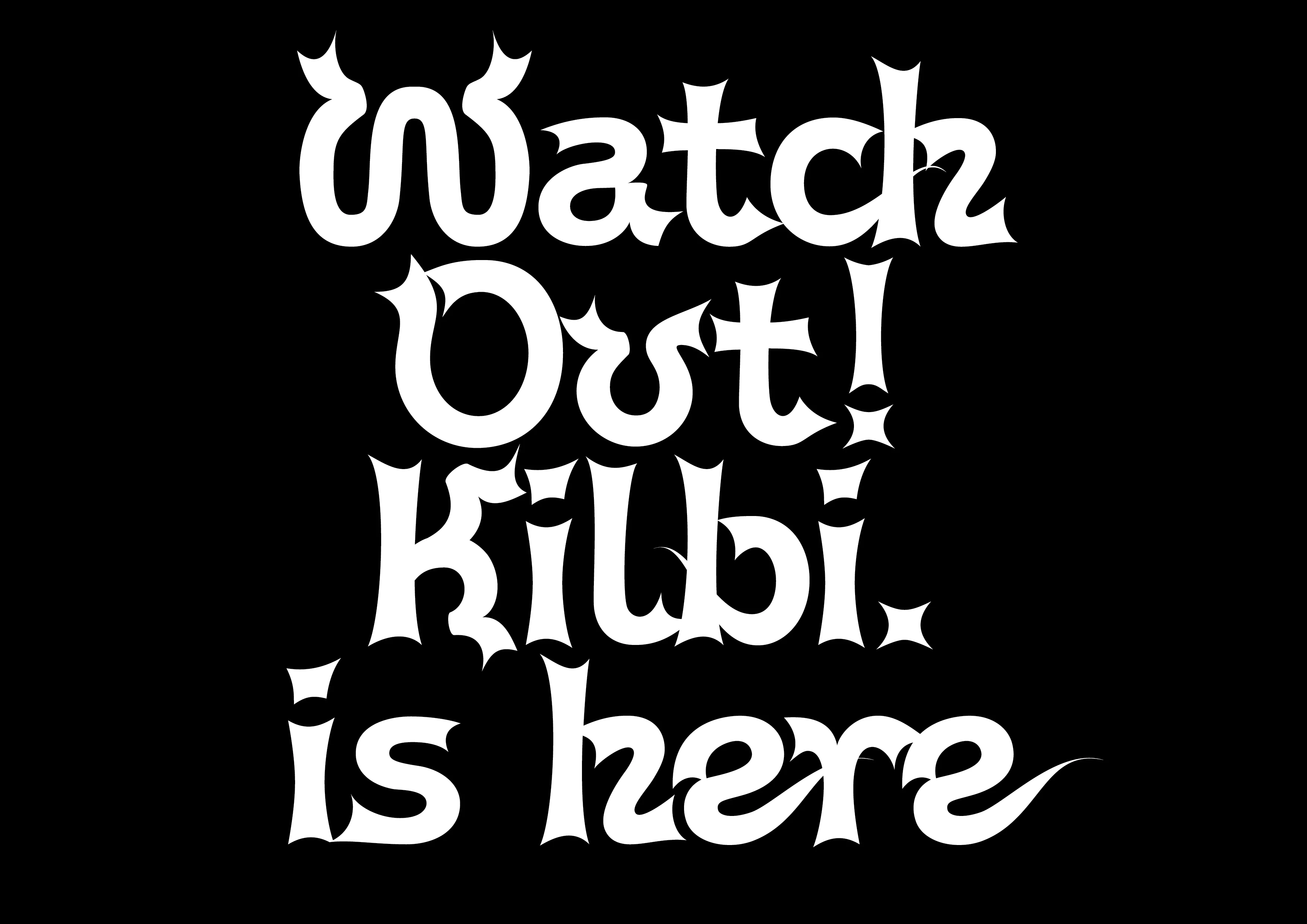
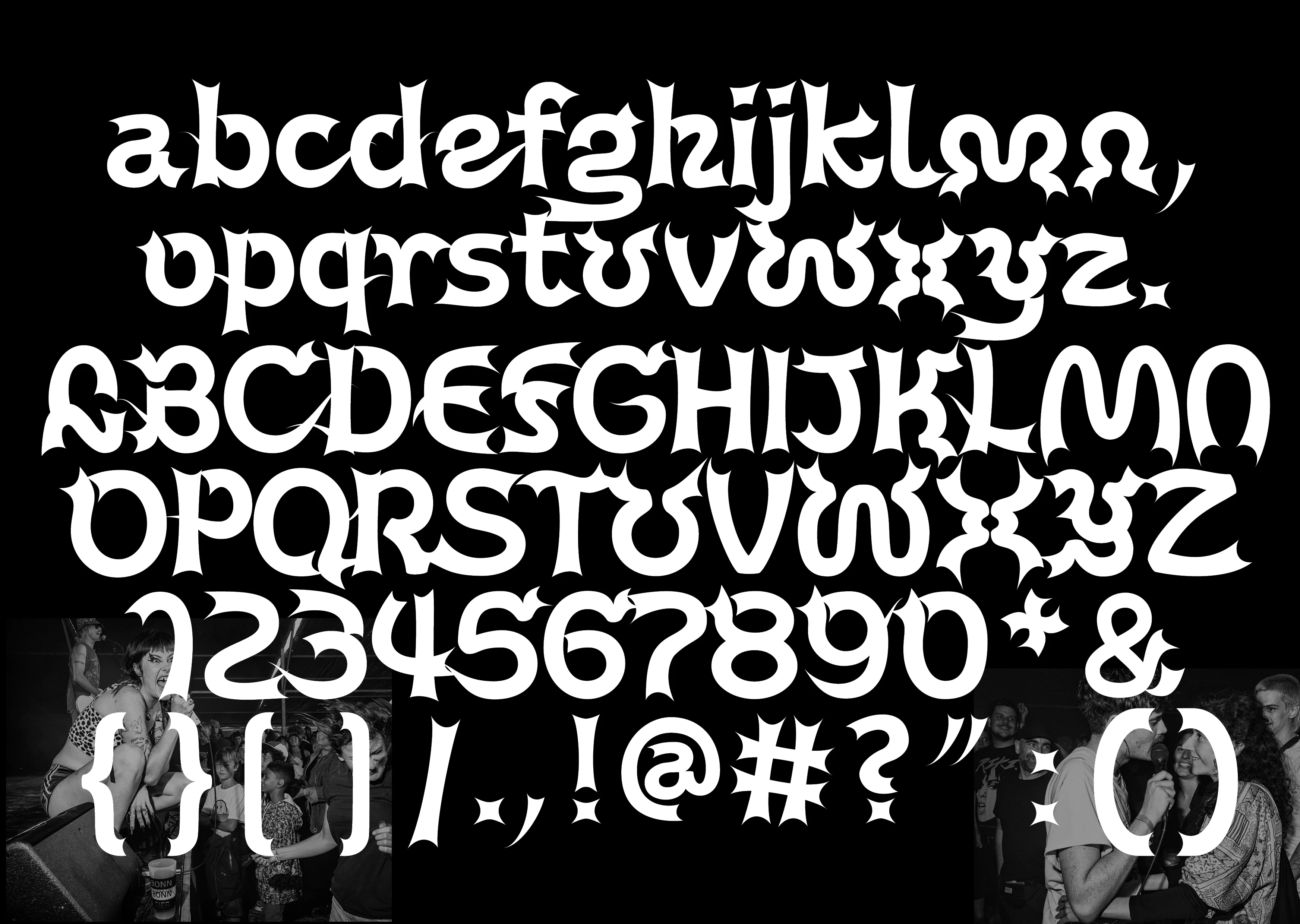
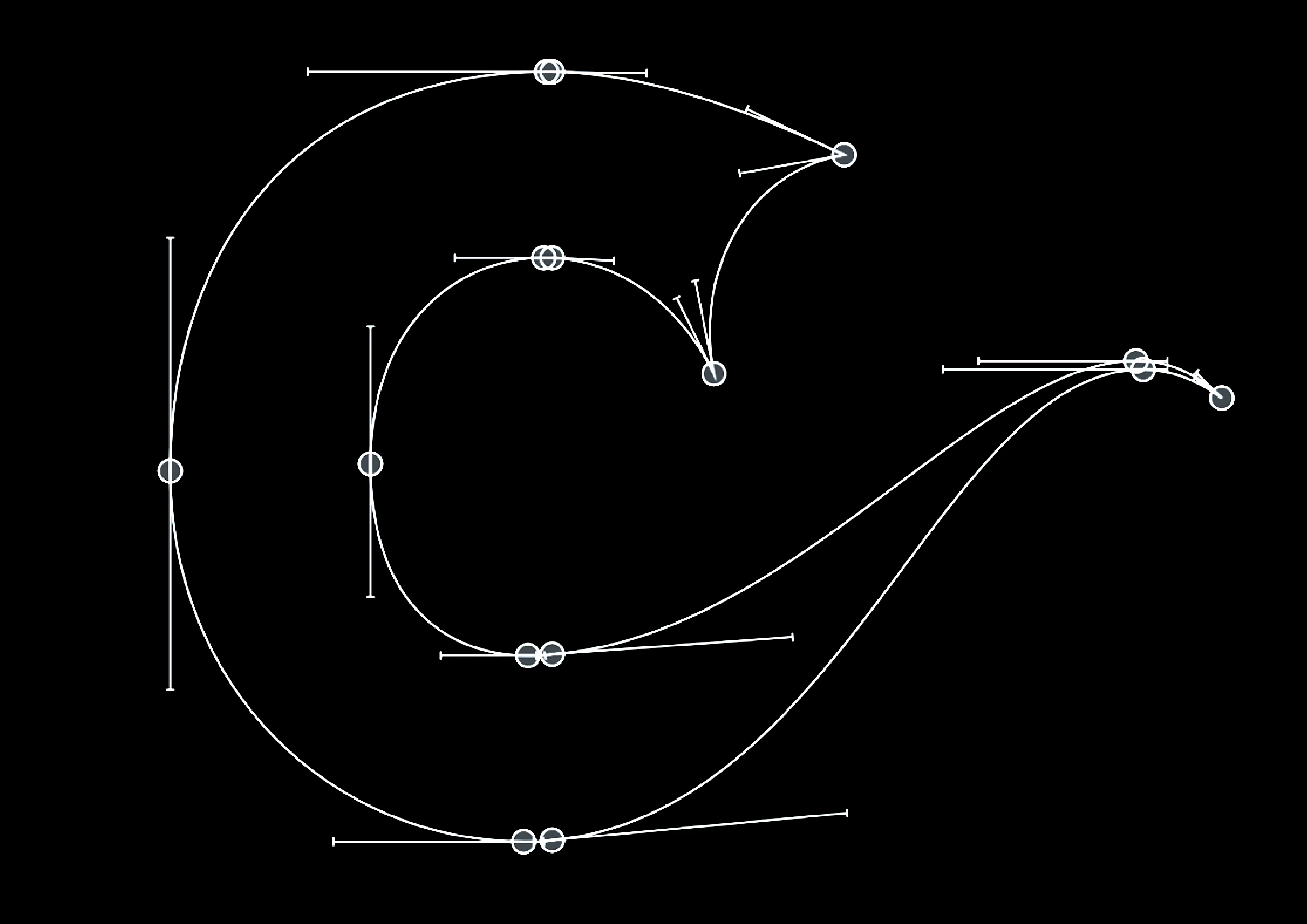
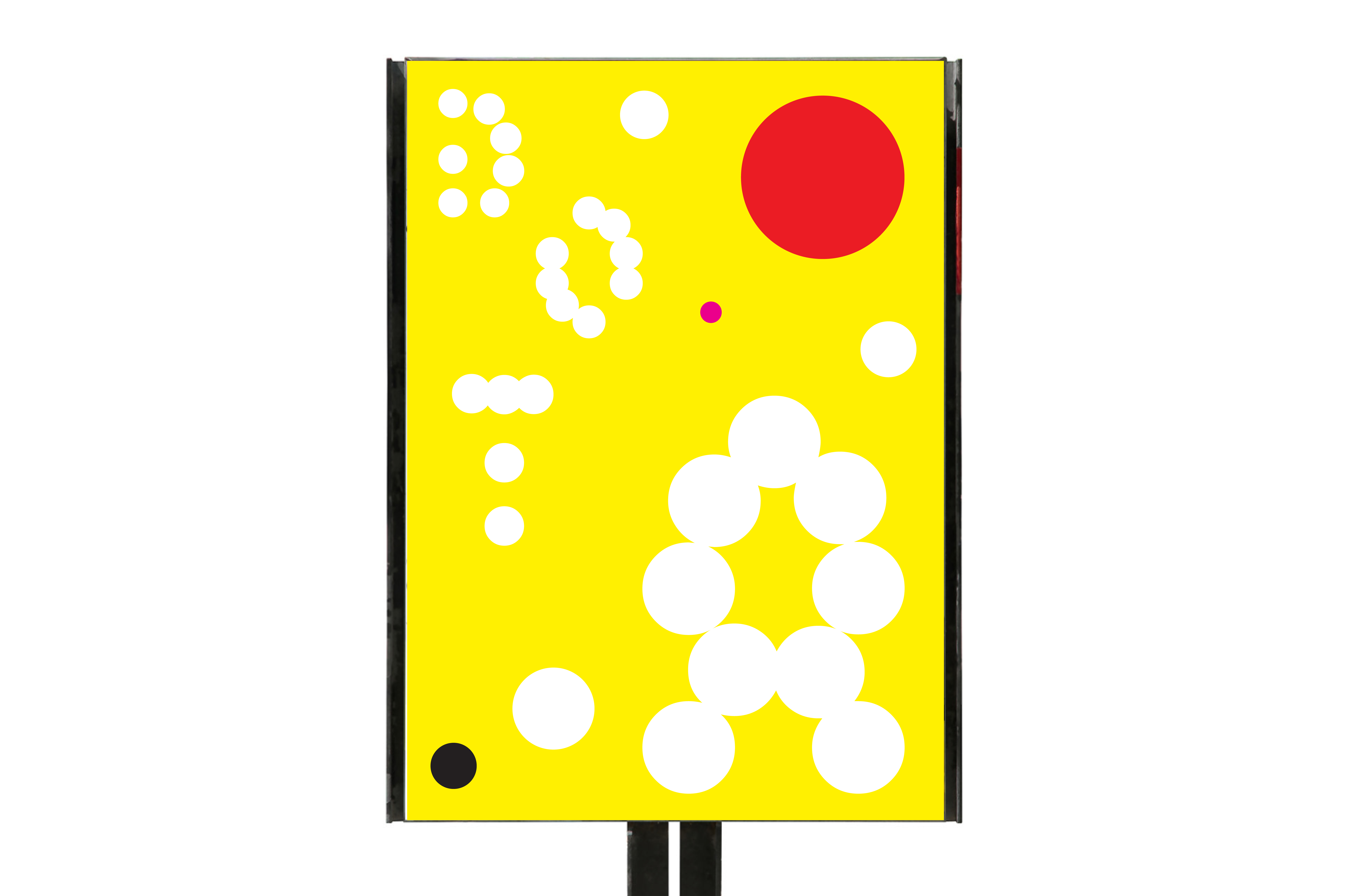
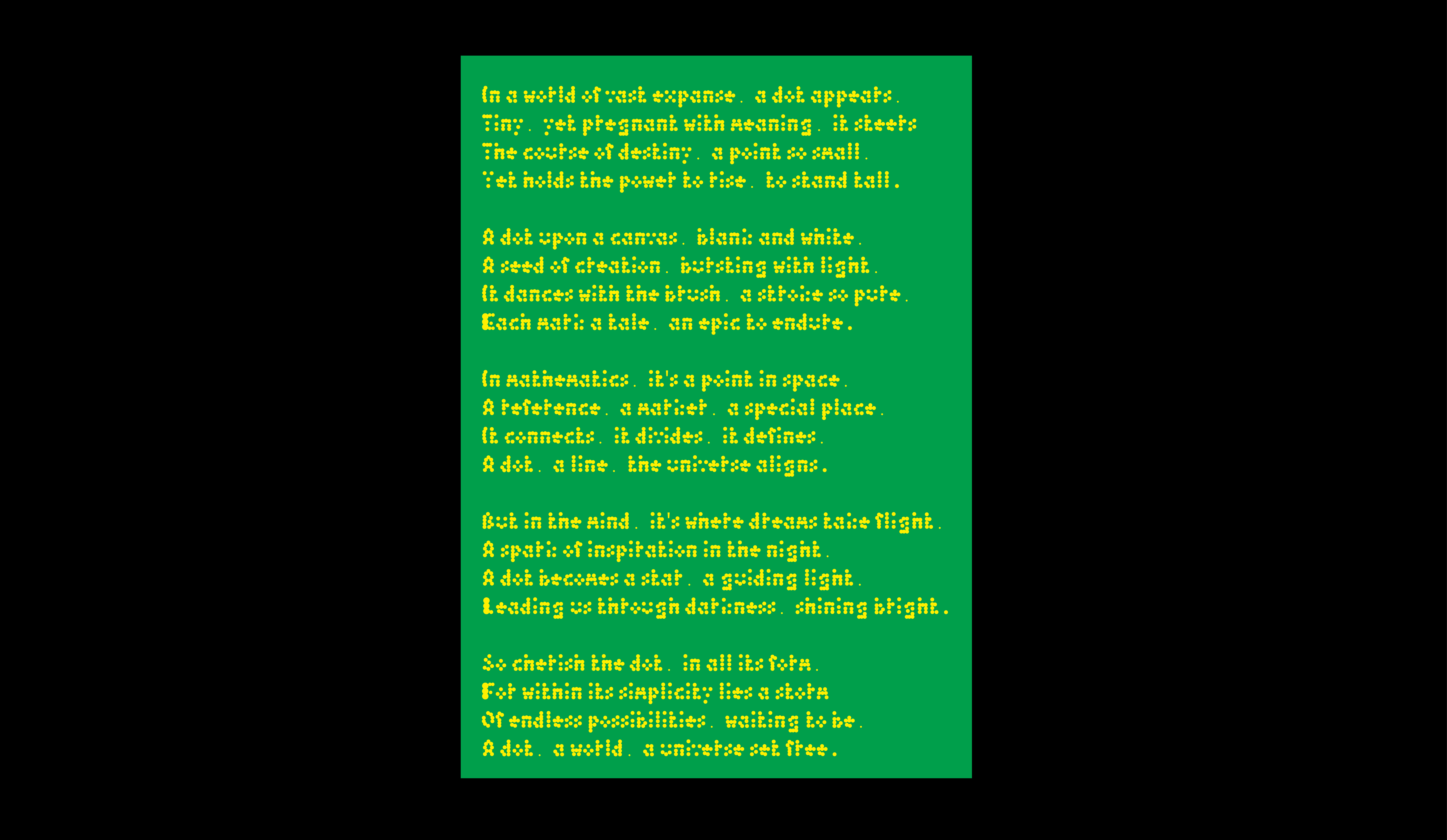
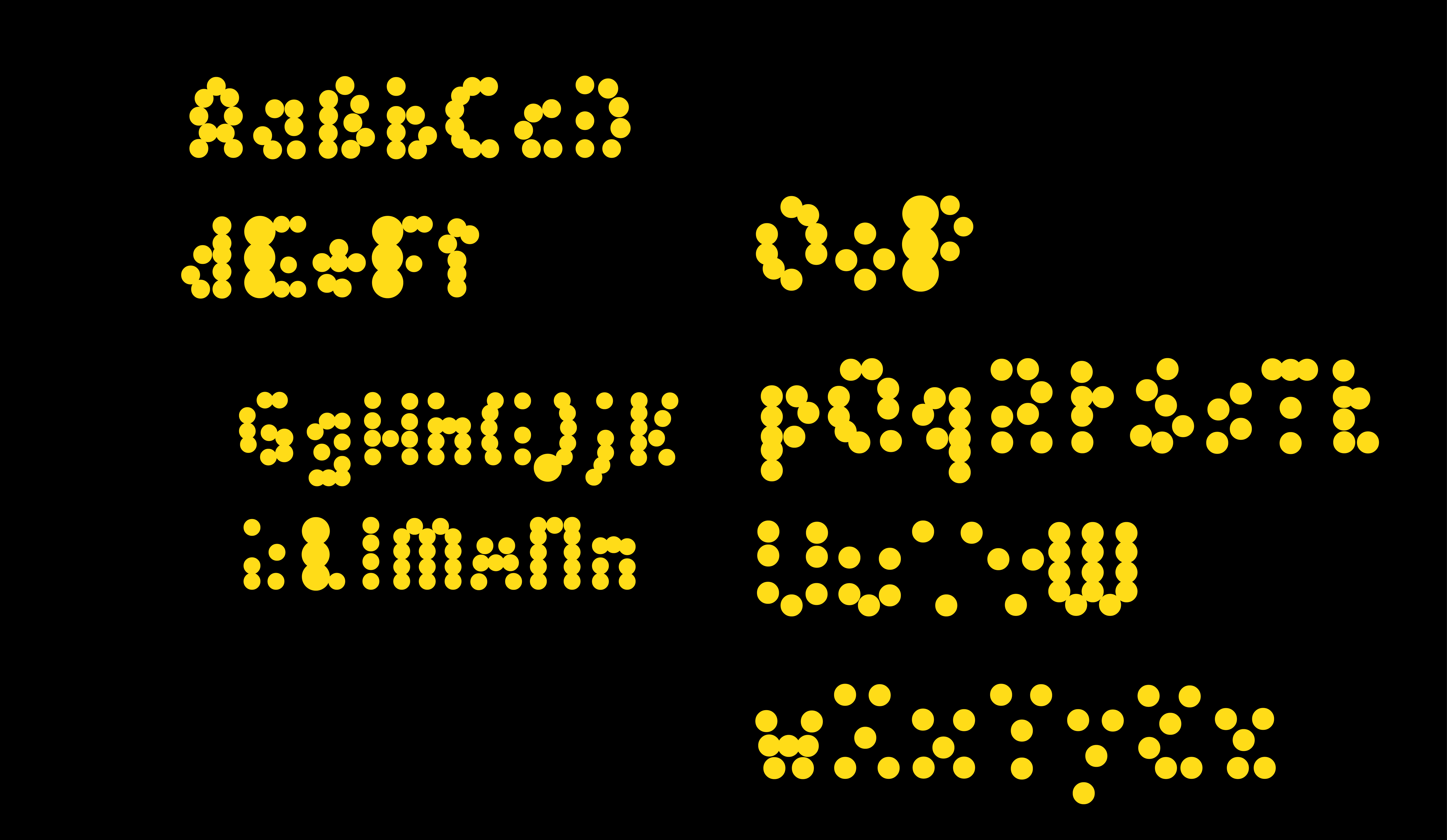
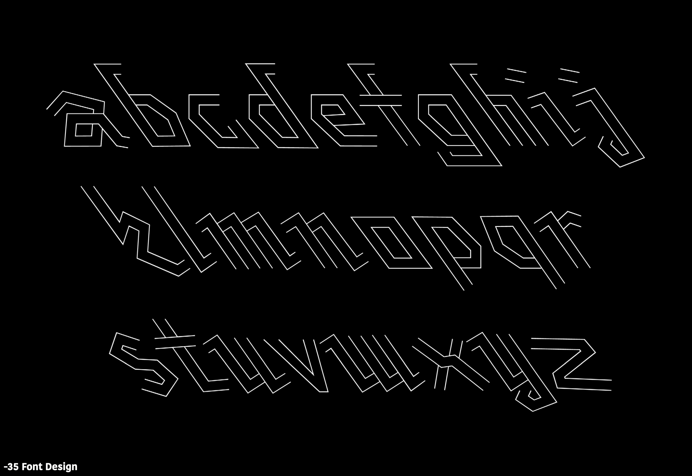
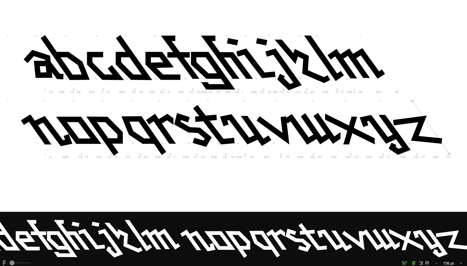
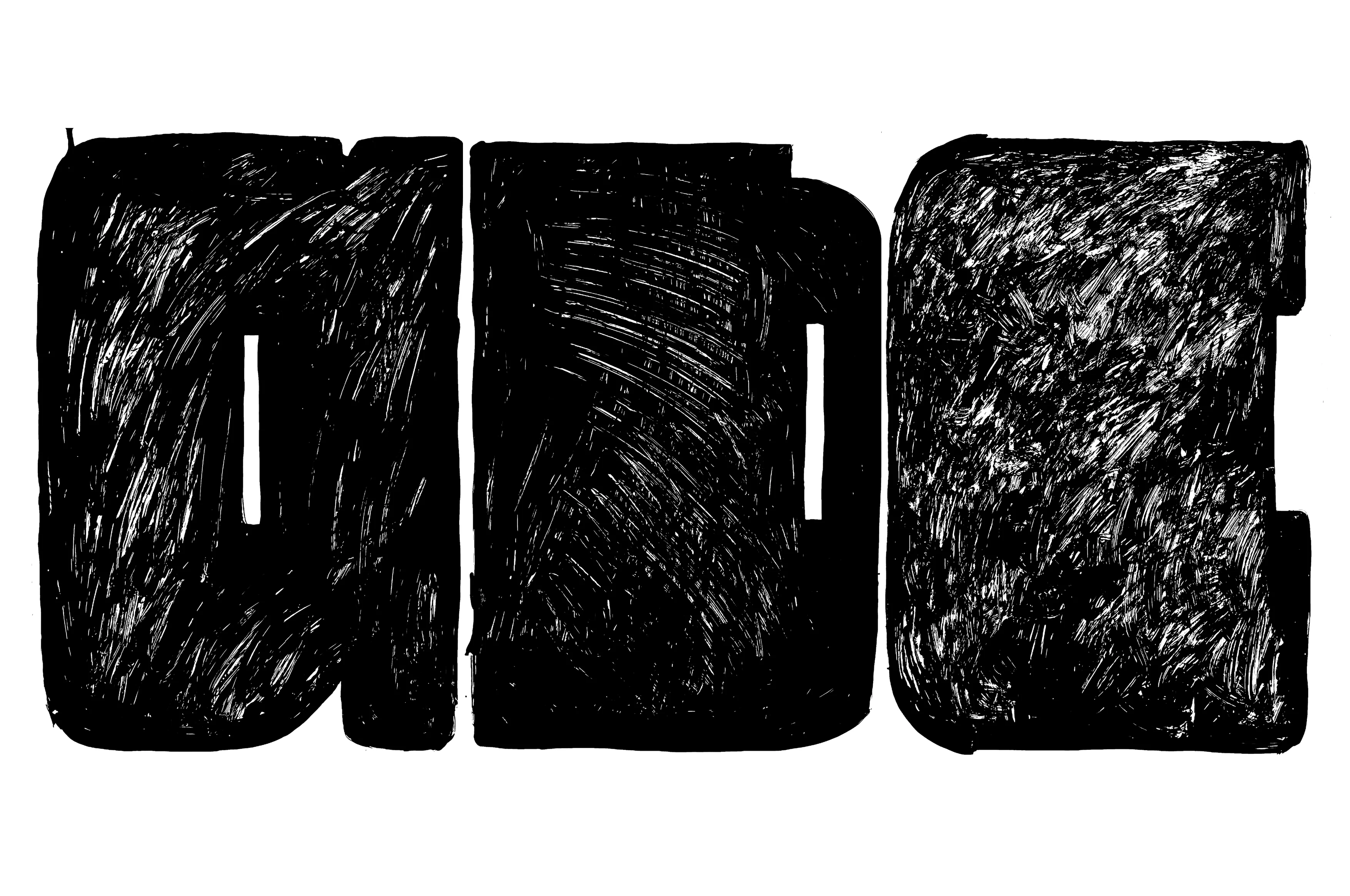
The "K Display"(Bad Bonn Kilbi music festival) is an experimental display font made by me for the Type Design class under the mentorship of Giliane Cachin, Clement Rouzard, David Keshavjee, and Sylvan Lanz in Zurich, Switzerland.
Nolikes
Digital Product
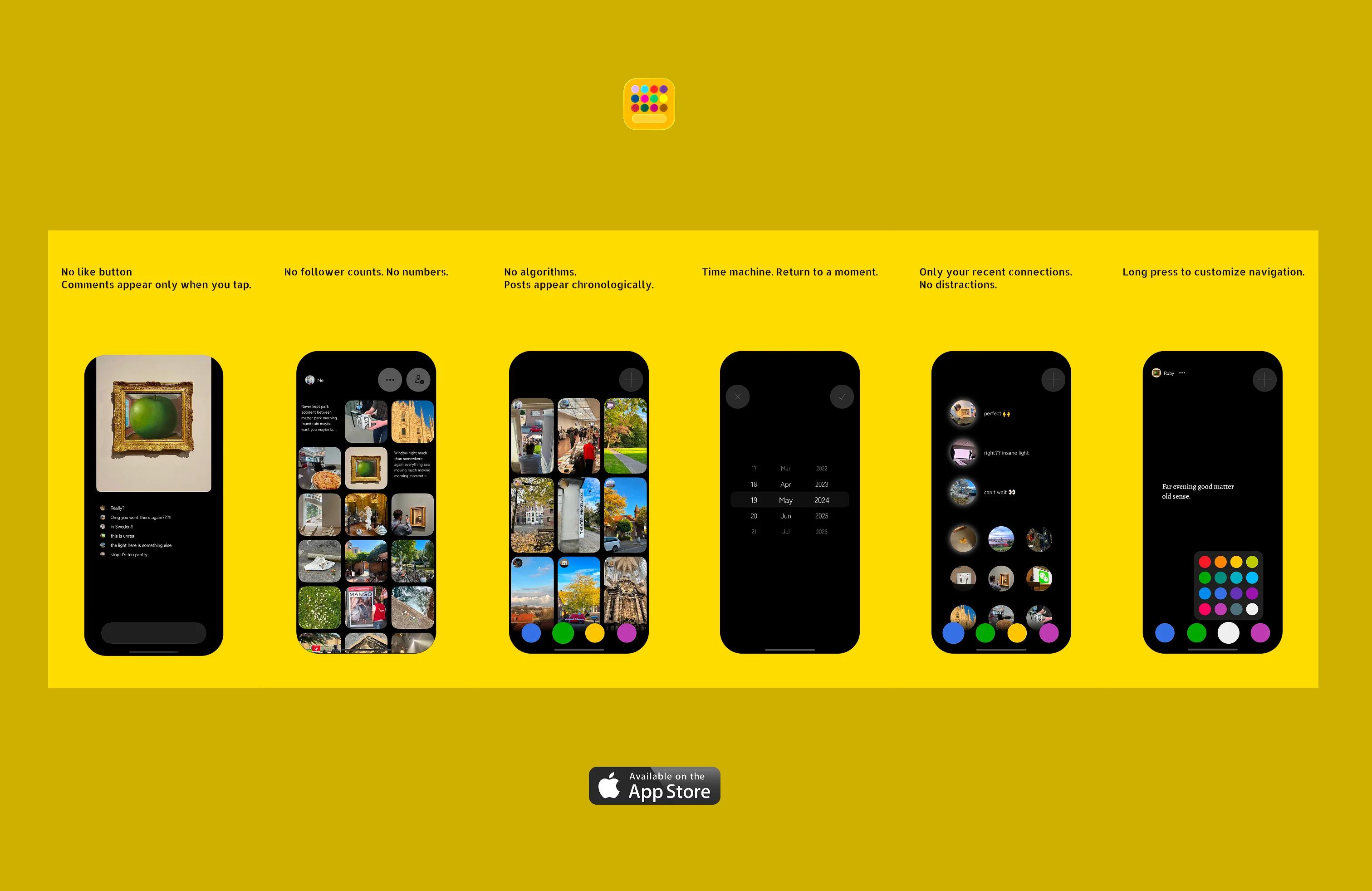
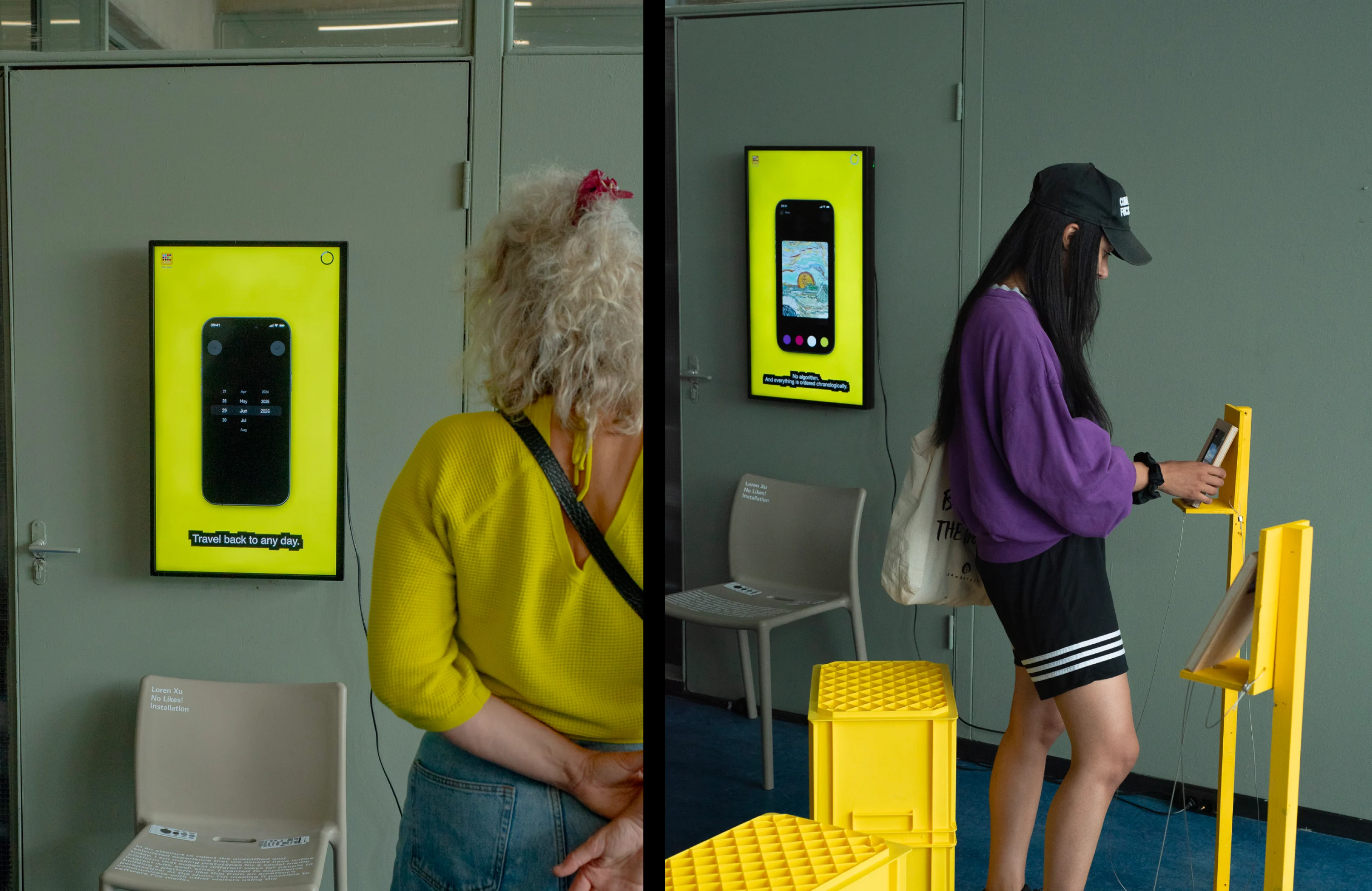
I often think what does a like button even stand for in current society? This feature seems to have strayed from its original concept. If we were to remove one of the most taken-for-granted features, how would people reorganize their behavior? Instead of simply questioning existing platforms, I wanted to experience the process of building one myself. I am imagining and prototyping an alternative app for people who are looking for minimalist digital experiences but still want to feel connected. 'No Likes' is my experiment. Through this project, I explored the relationship between mobile devices and digital imagery, and the wider possibilities of interaction.
(watch intro video)
Imagine Chatting, Differently
Digital Product
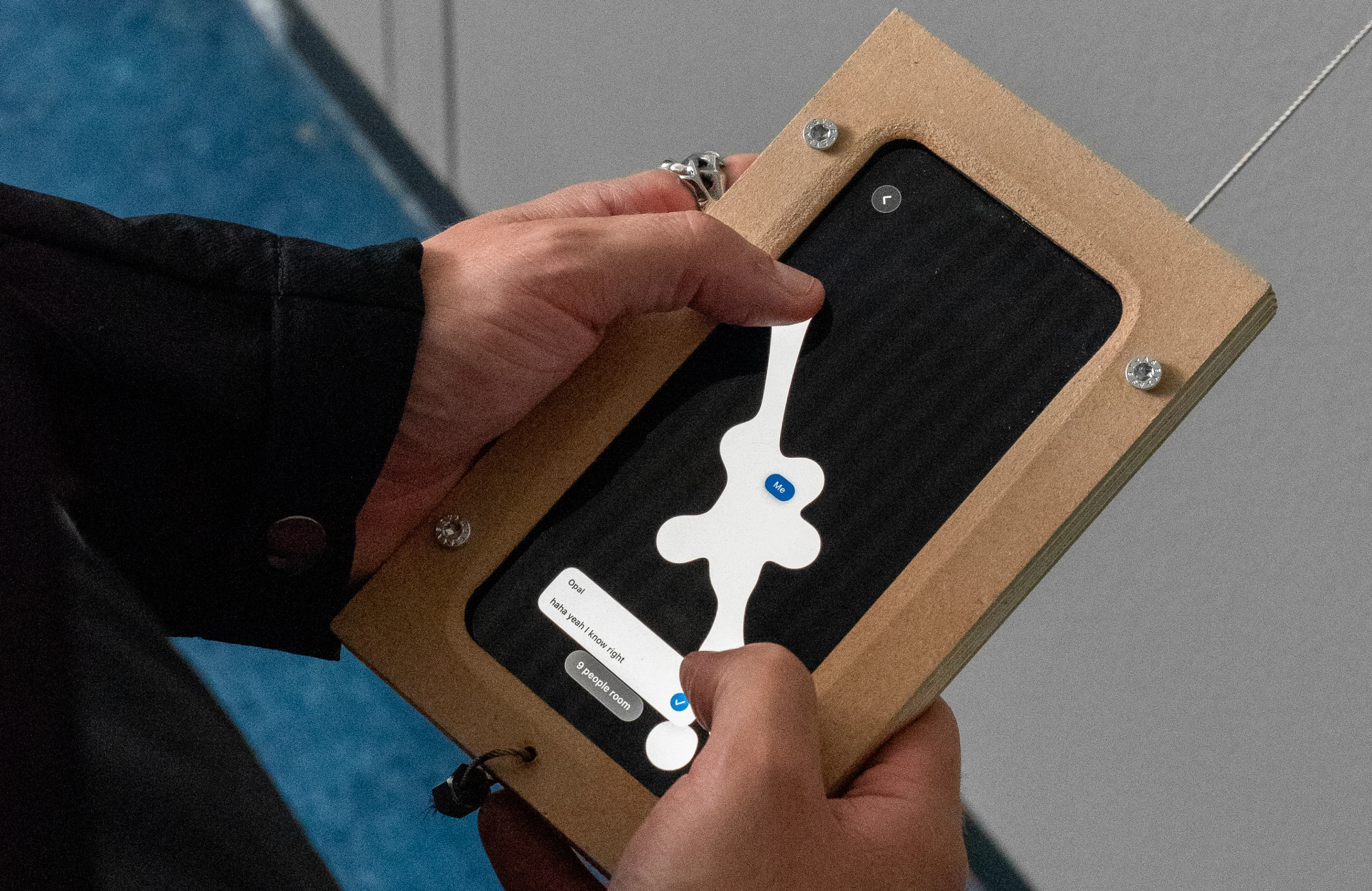
What if presence itself was the interface? Chatting begins not with a tap, but with proximity.
Each bubble represents a real, live friend — when they go offline, the bubble disappears. Connecting bubbles together starts a conversation; with two or more bubbles combined, it becomes a group chat.
Each bubble represents a real, live friend — when they go offline, the bubble disappears. Connecting bubbles together starts a conversation; with two or more bubbles combined, it becomes a group chat.
Pixels Generator
Digital Product
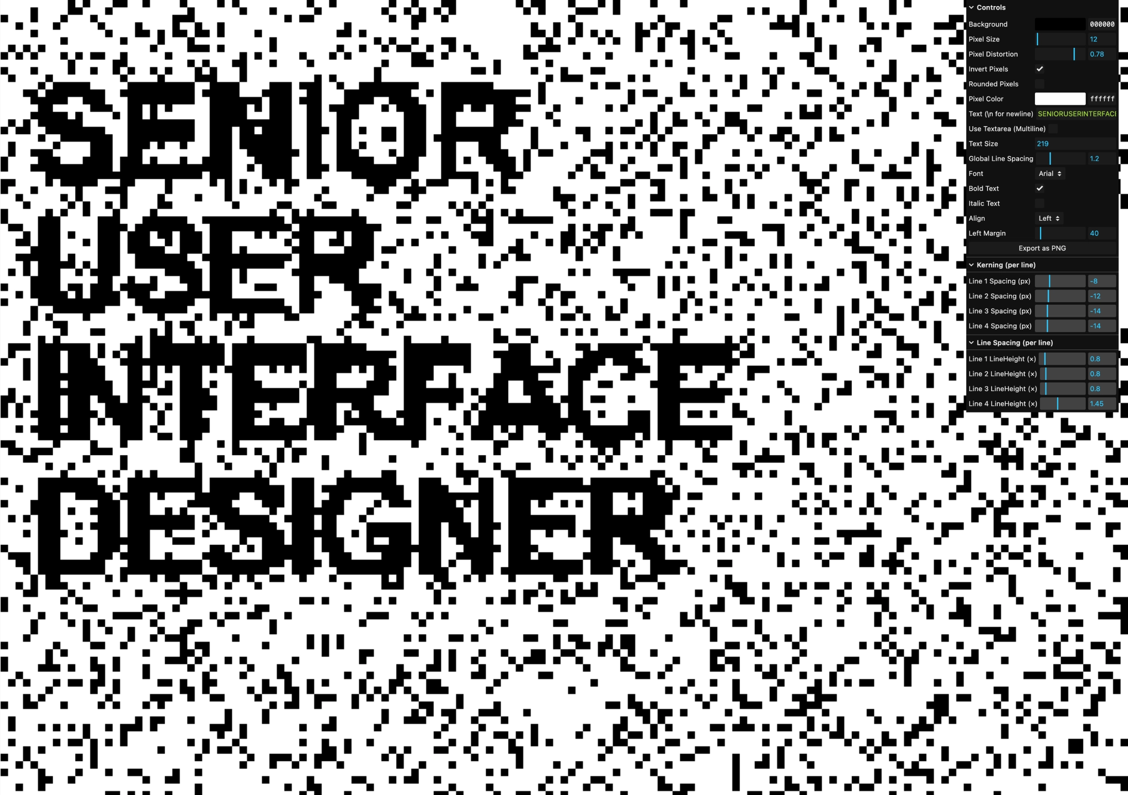
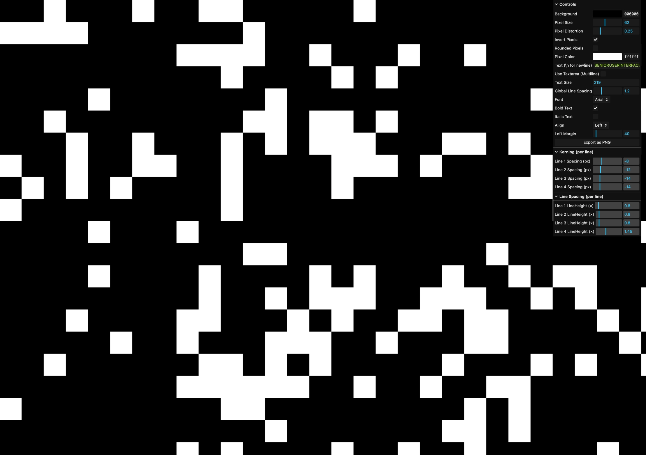
Drawing on the idea of weaving pixels into every visual we see — which aligns with Fabrique's new branding concept — I created this generator to produce custom pixel art for their hiring campaign.
Revival Type Practice
Font Design
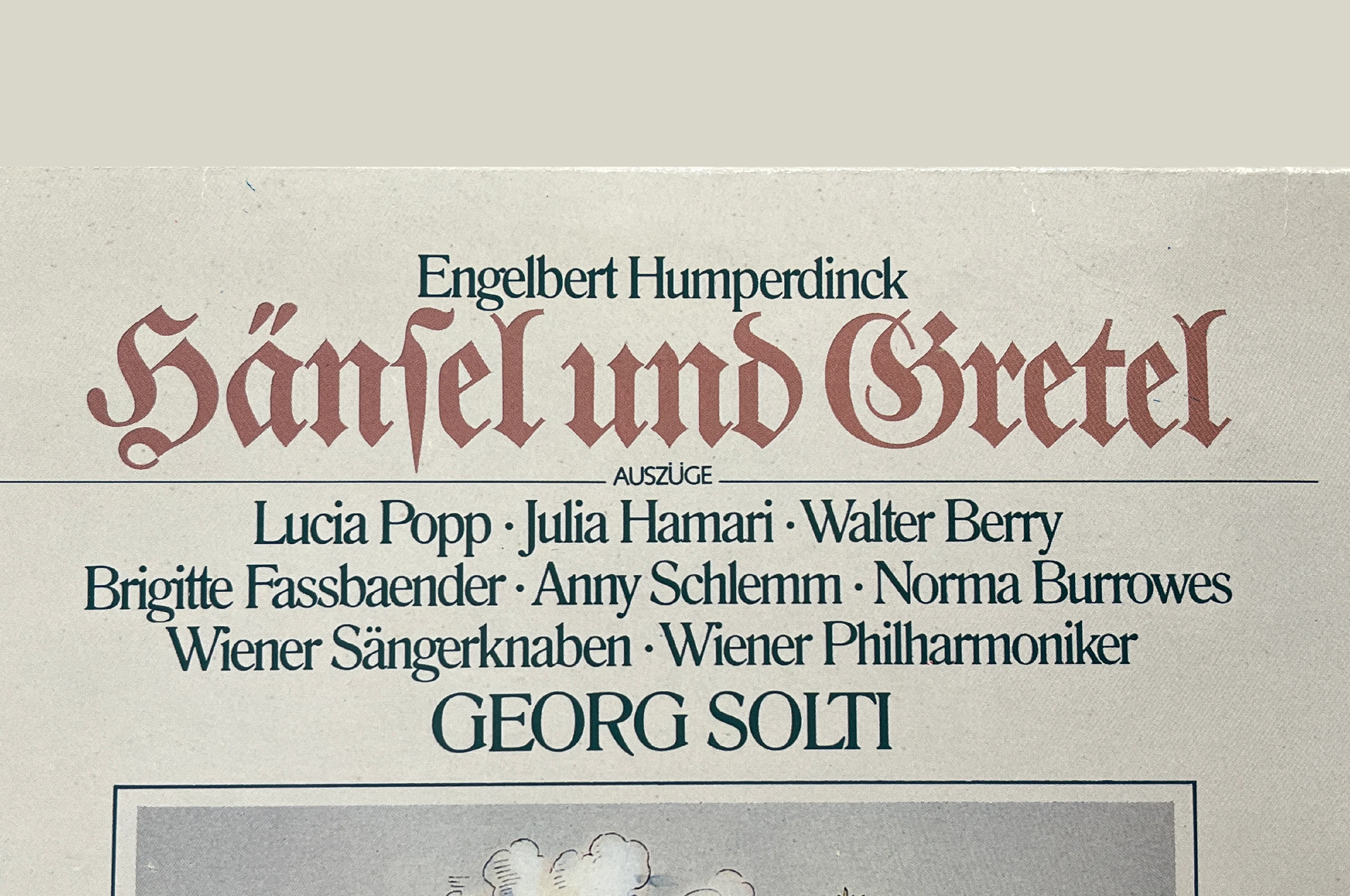
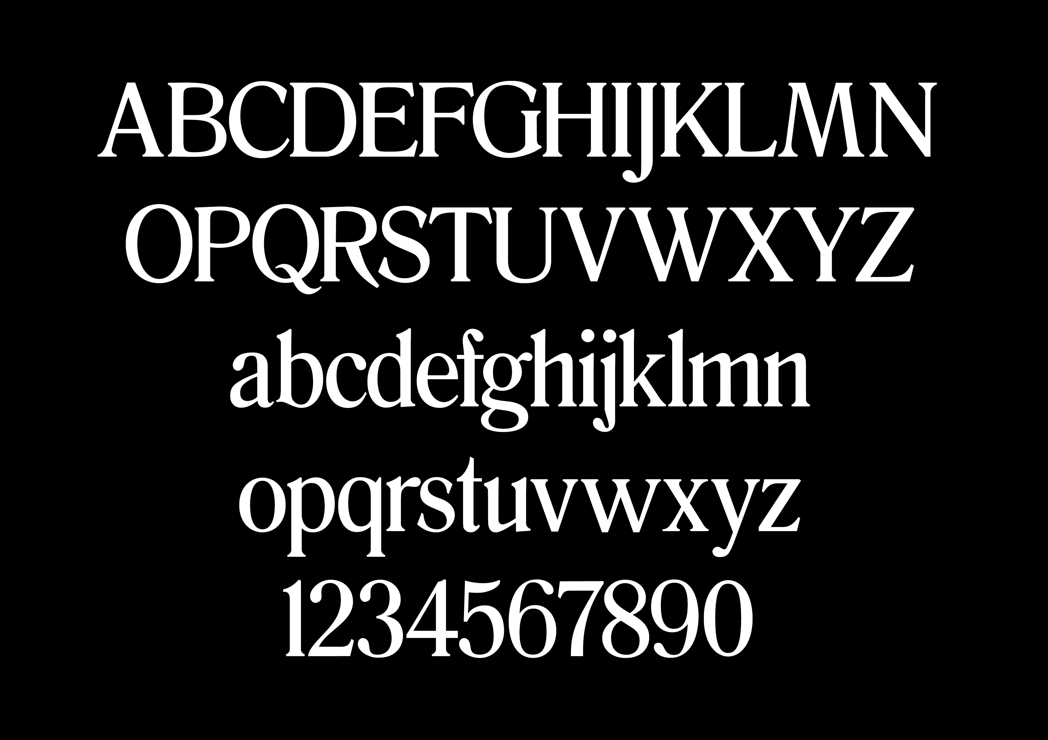
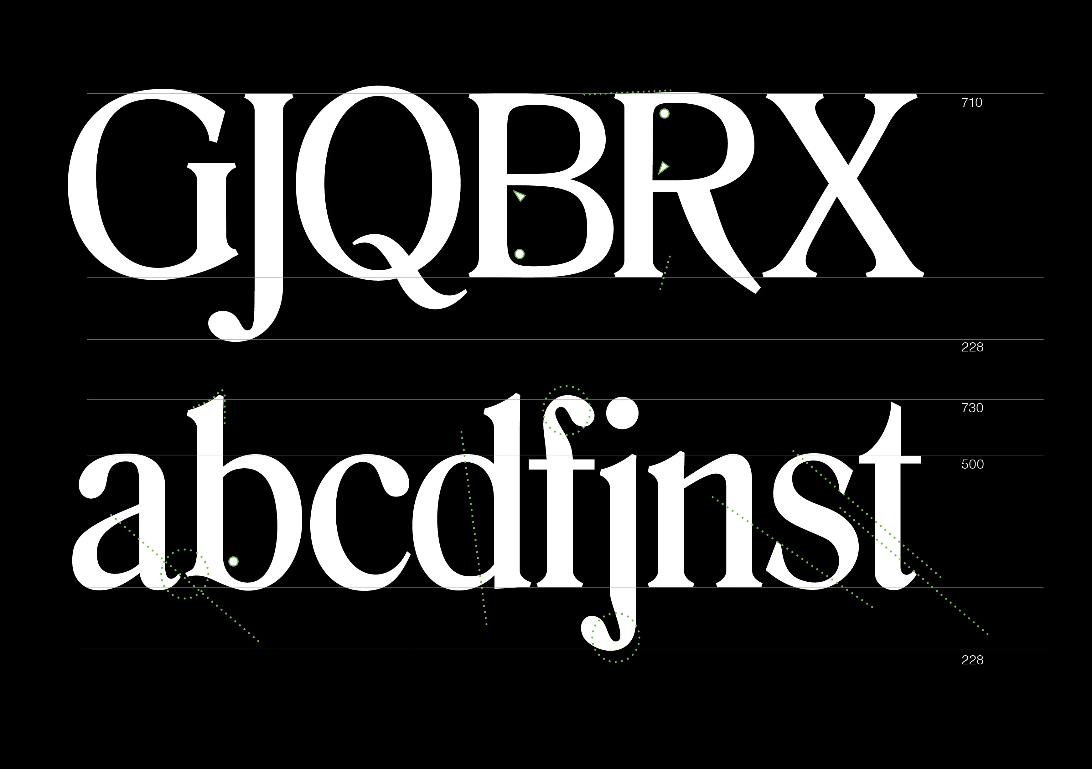
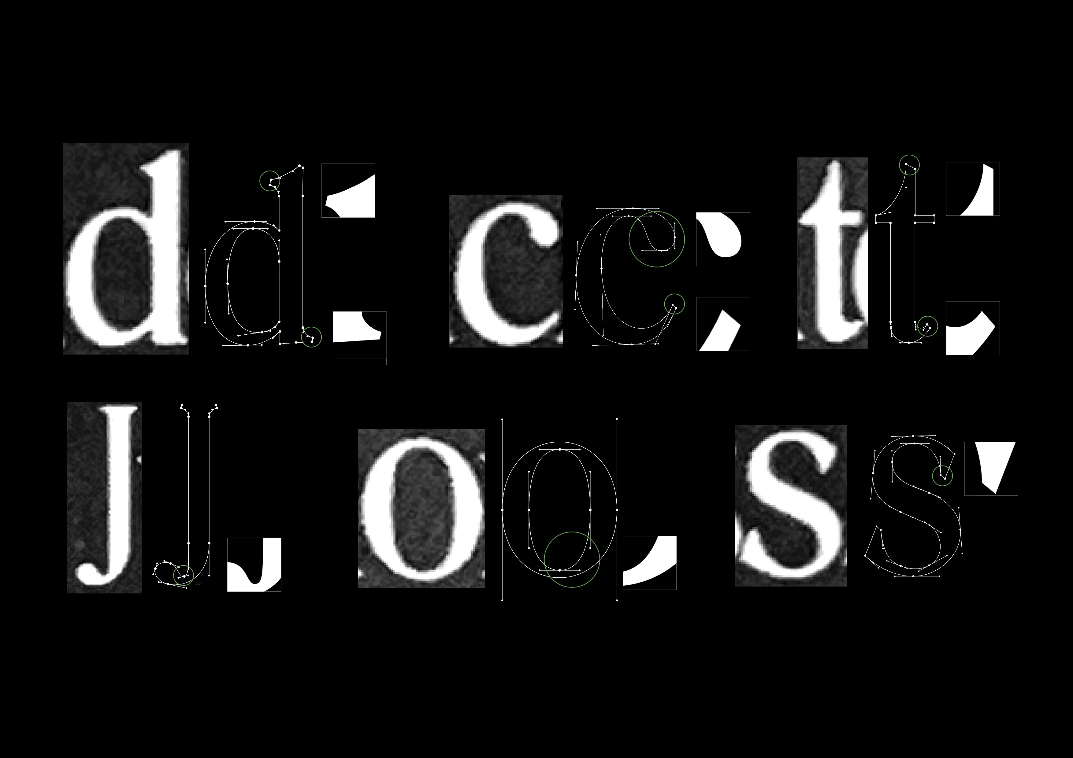
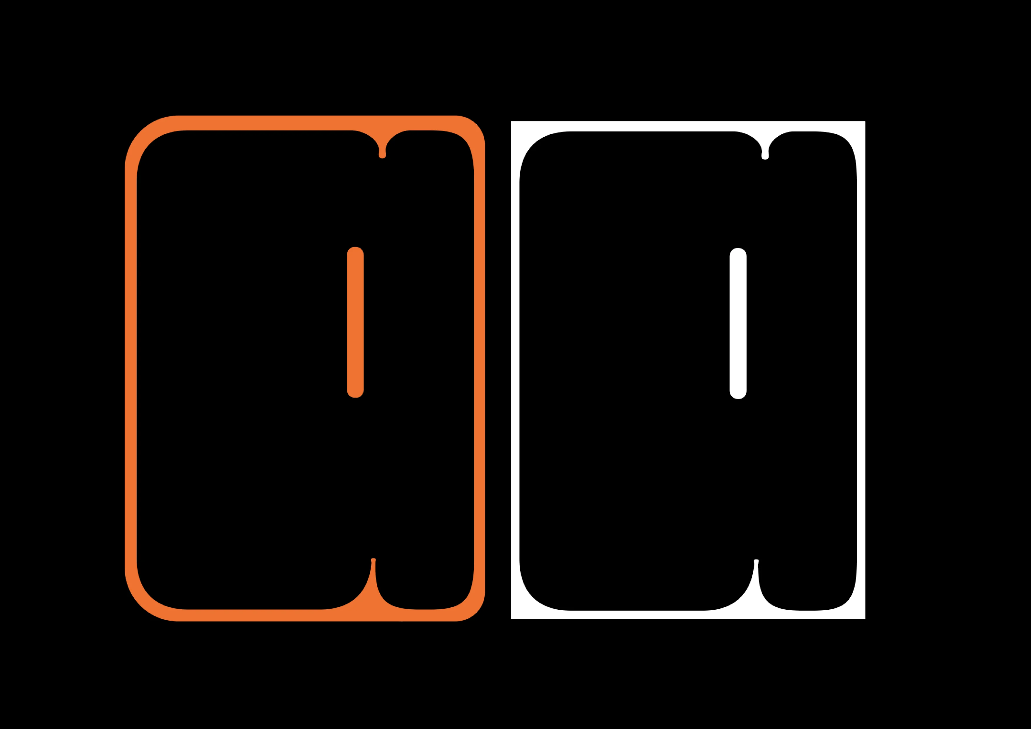
During my exchange at ZHdK, I would often go to the library whenever I had time, checking out vinyl records because I found their covers always full of beautiful fonts. Soon after, I decided to create a revival font to practice my type design skills.
Pattern Generator
Digital Product
Instead of moving scattered elements one by one, I developed an automated tool to save the team a lot of time.
What should the student lounge look like?
Interactive Website
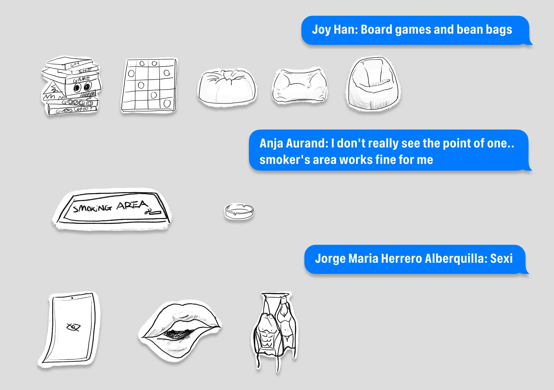
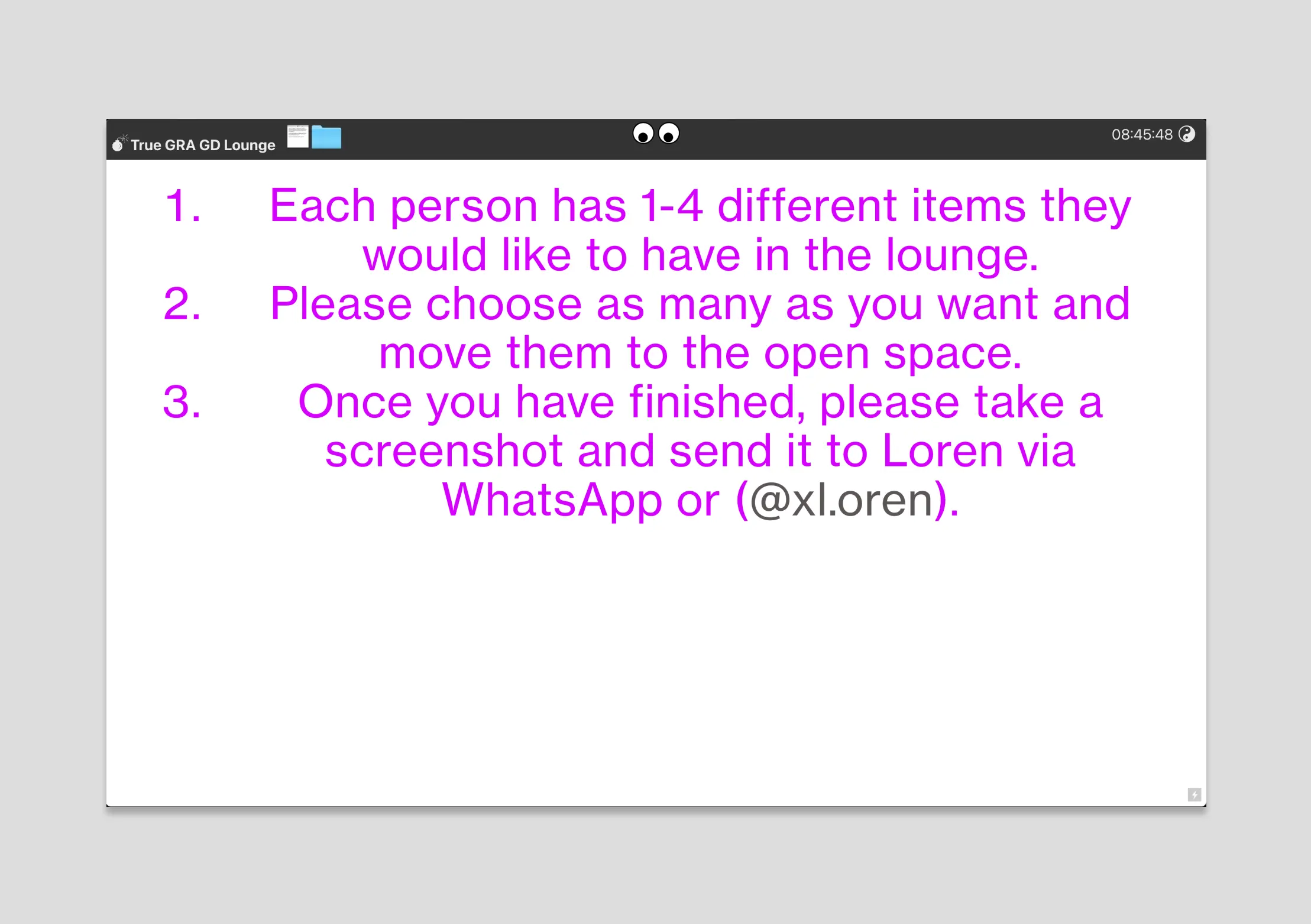
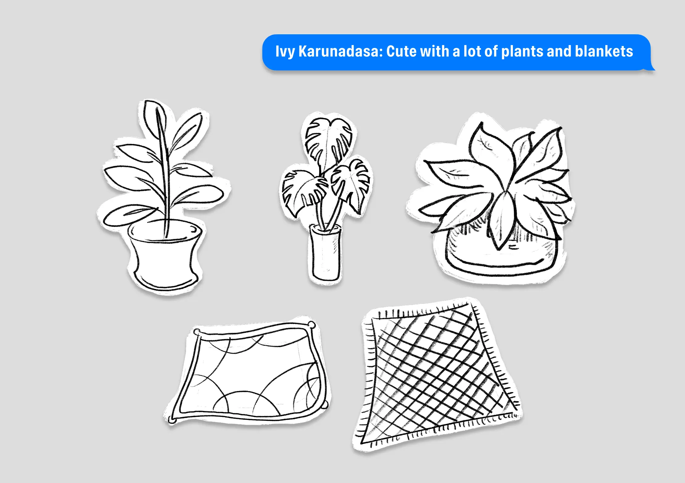
This project was made for a data visualization class at the Gerrit Rietveld Academie. To make the results clearer, I drew everything the students wrote on the list, then invited classmates to design the lounge by moving these interactive stickers.
Minitype
Font Design
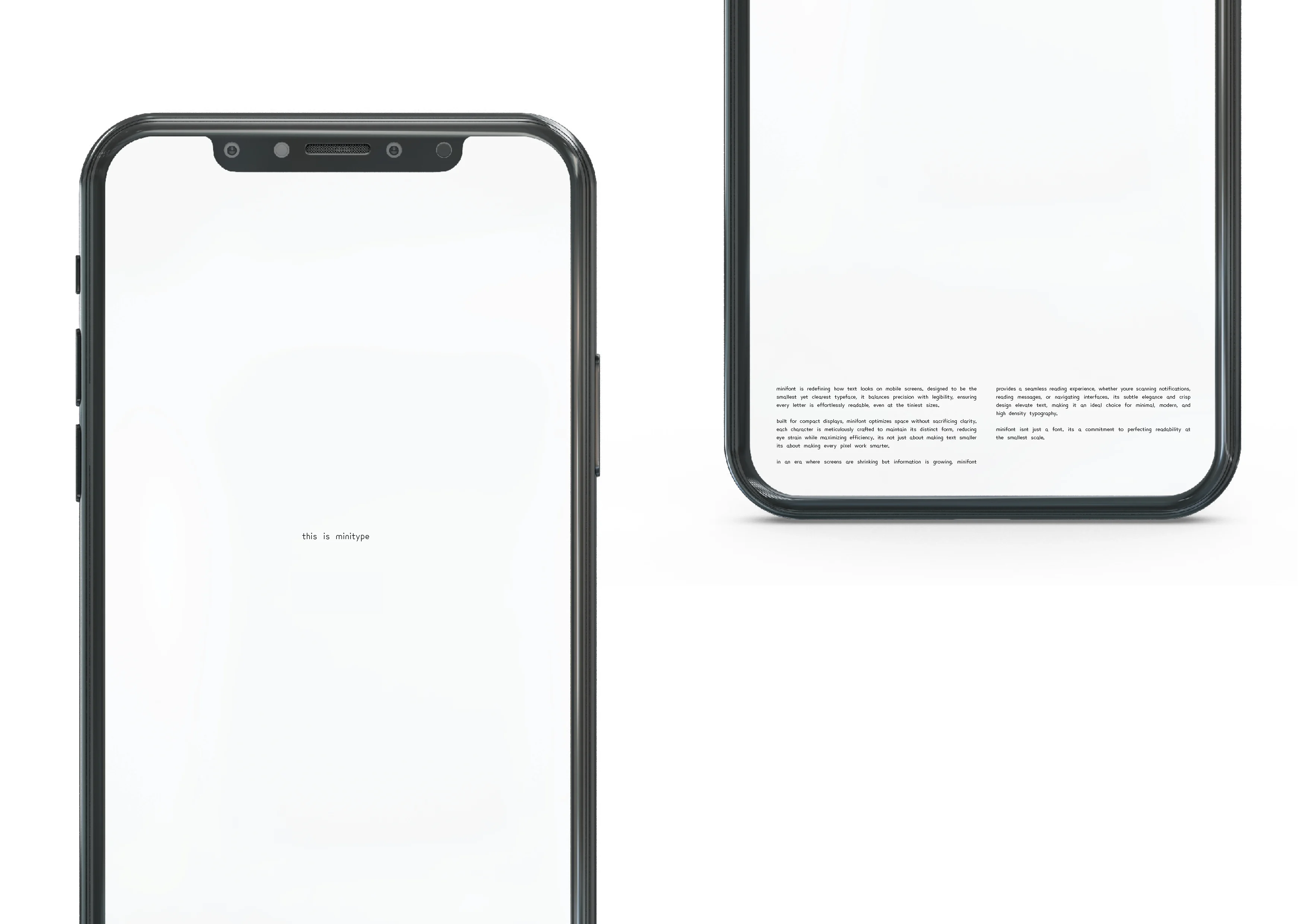
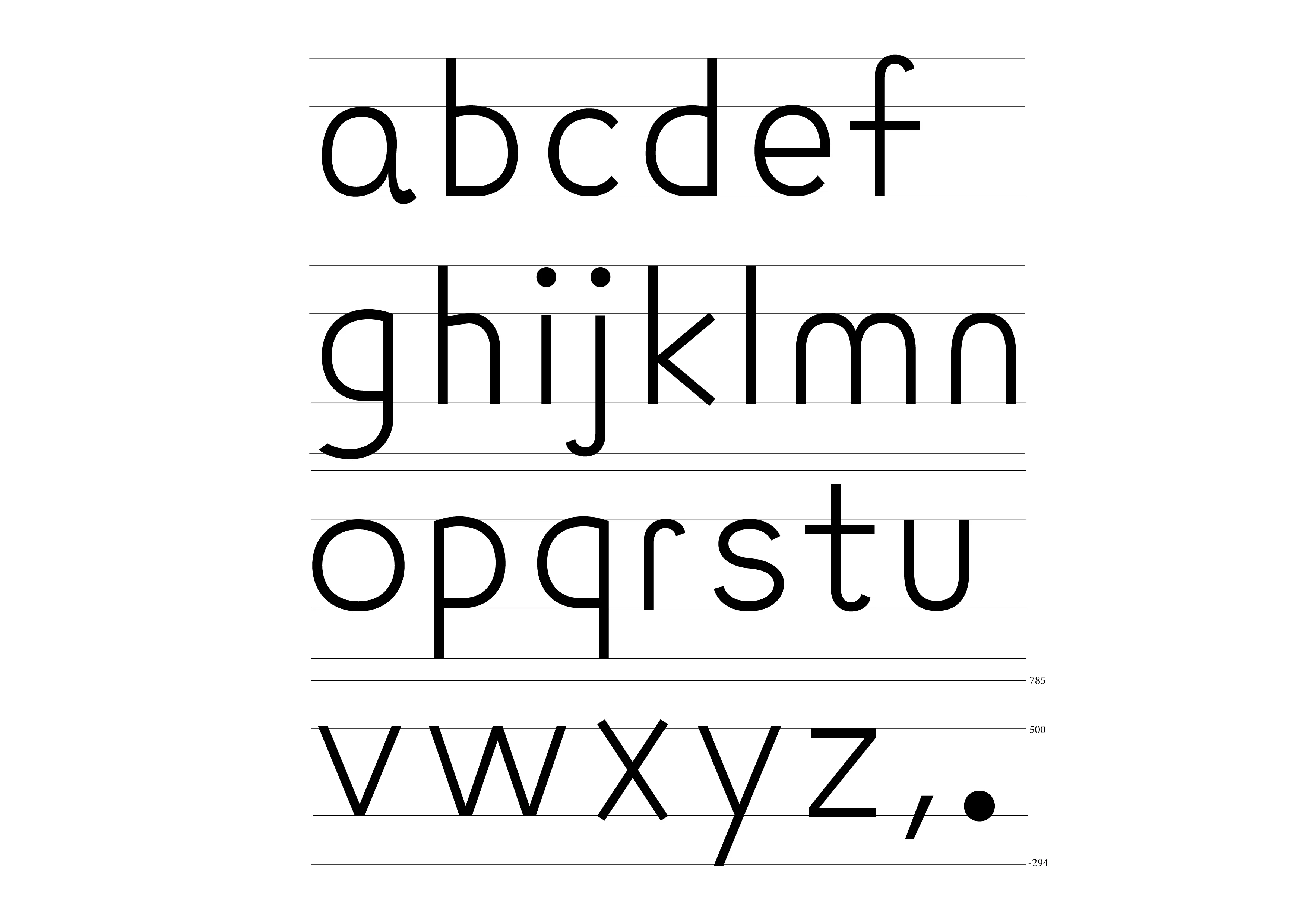
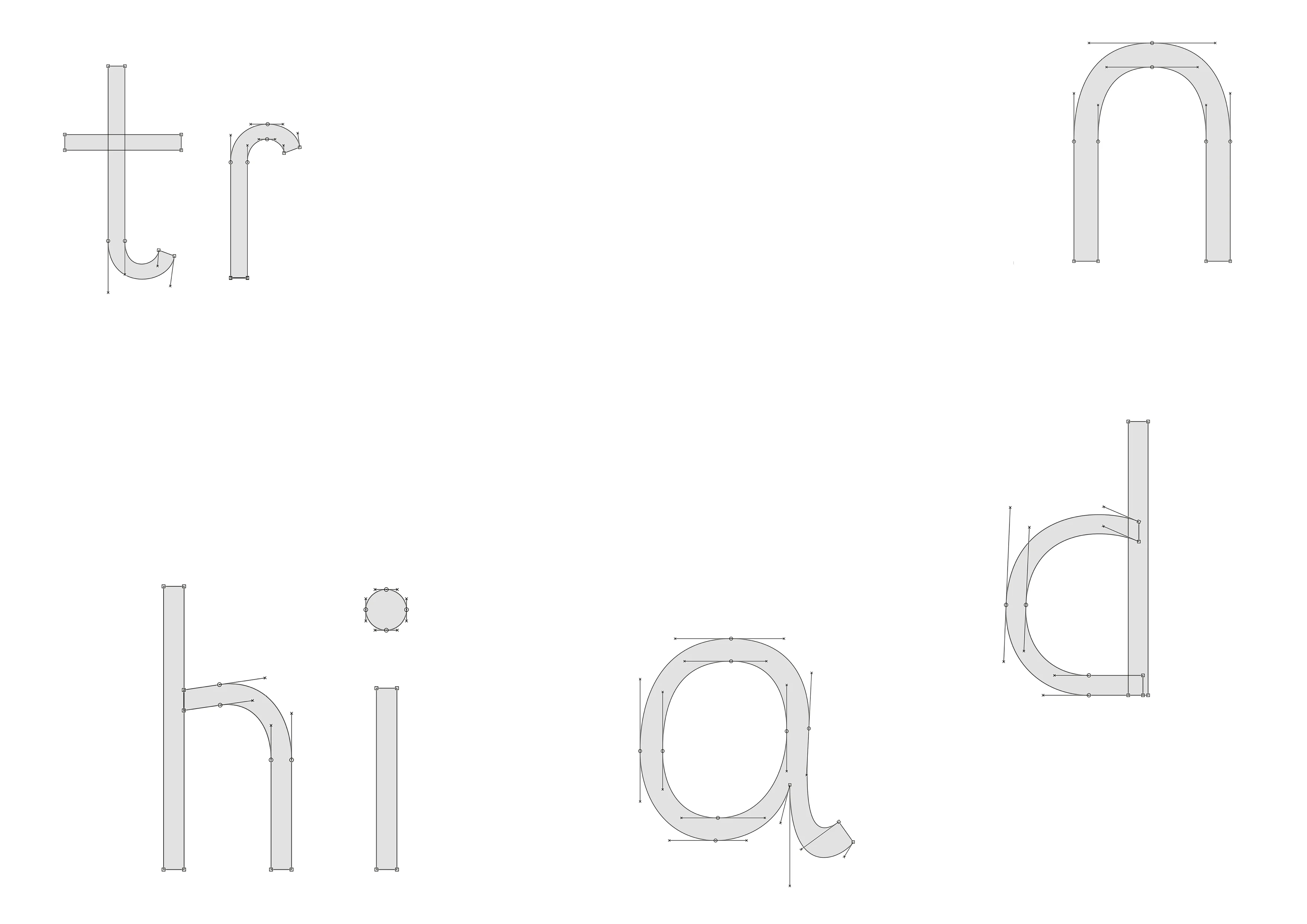
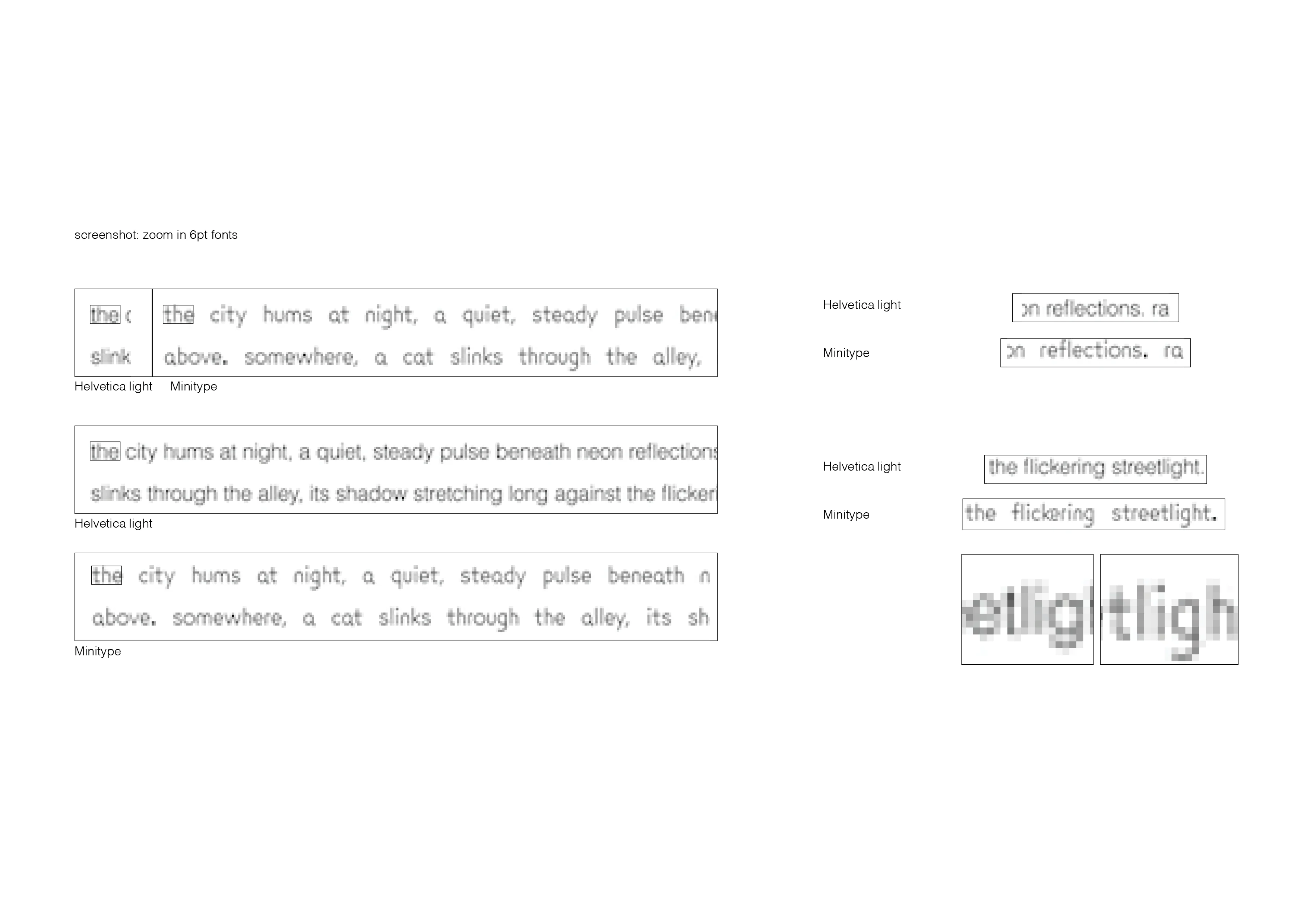
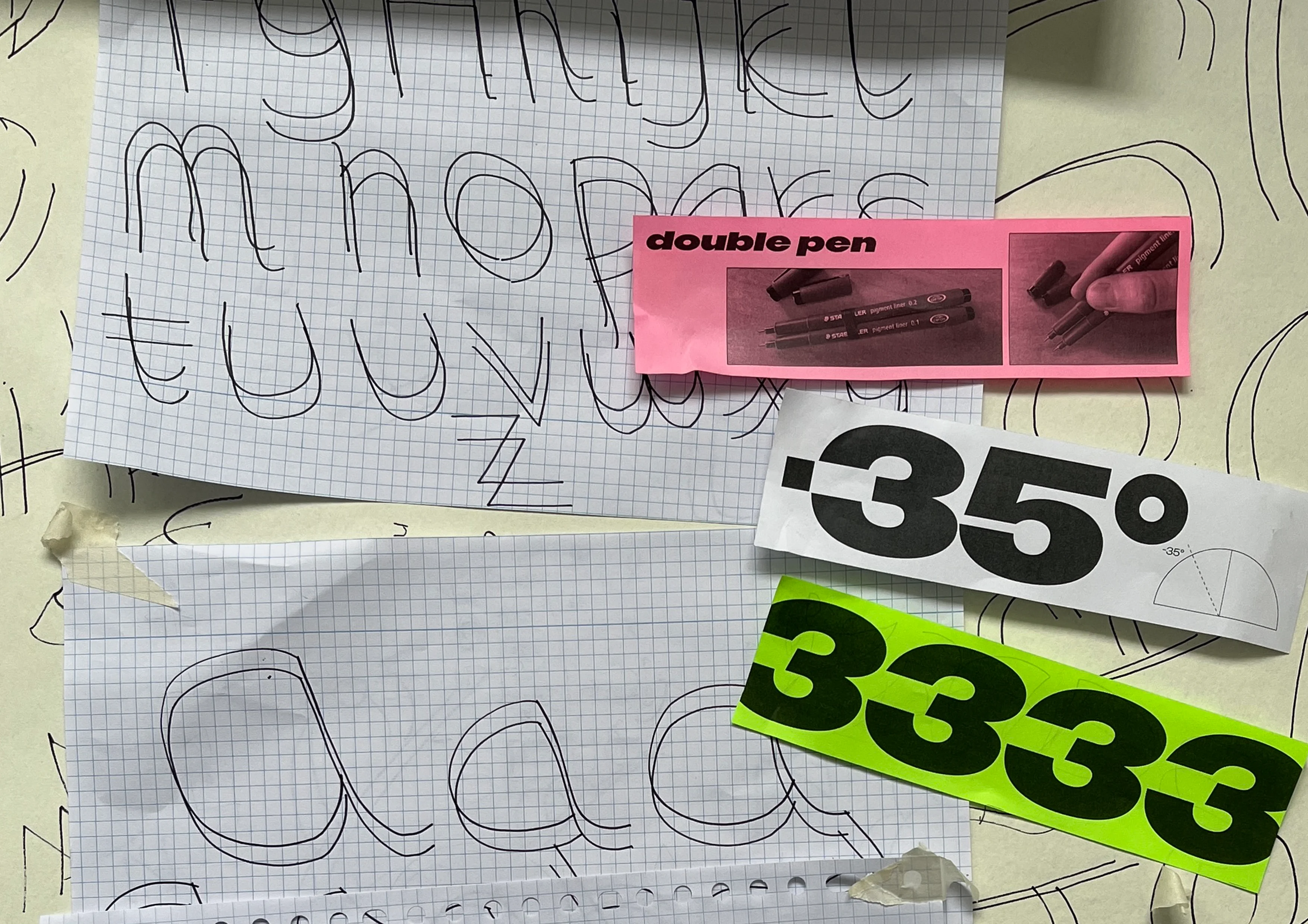
A typeface designed exclusively for mobile users. Optimized for small text, it delivers exceptional readability—compact, yet remarkably clear.
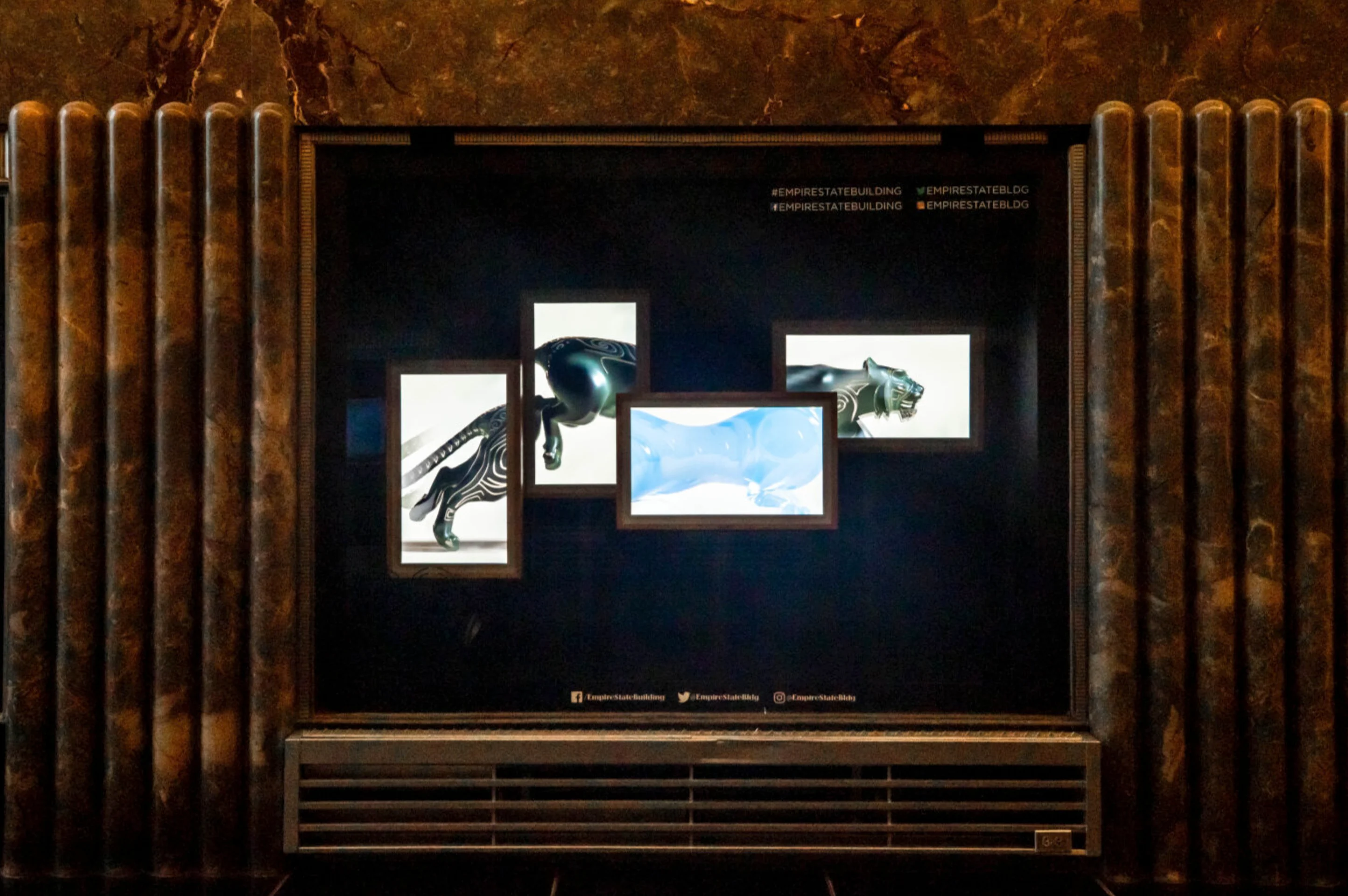
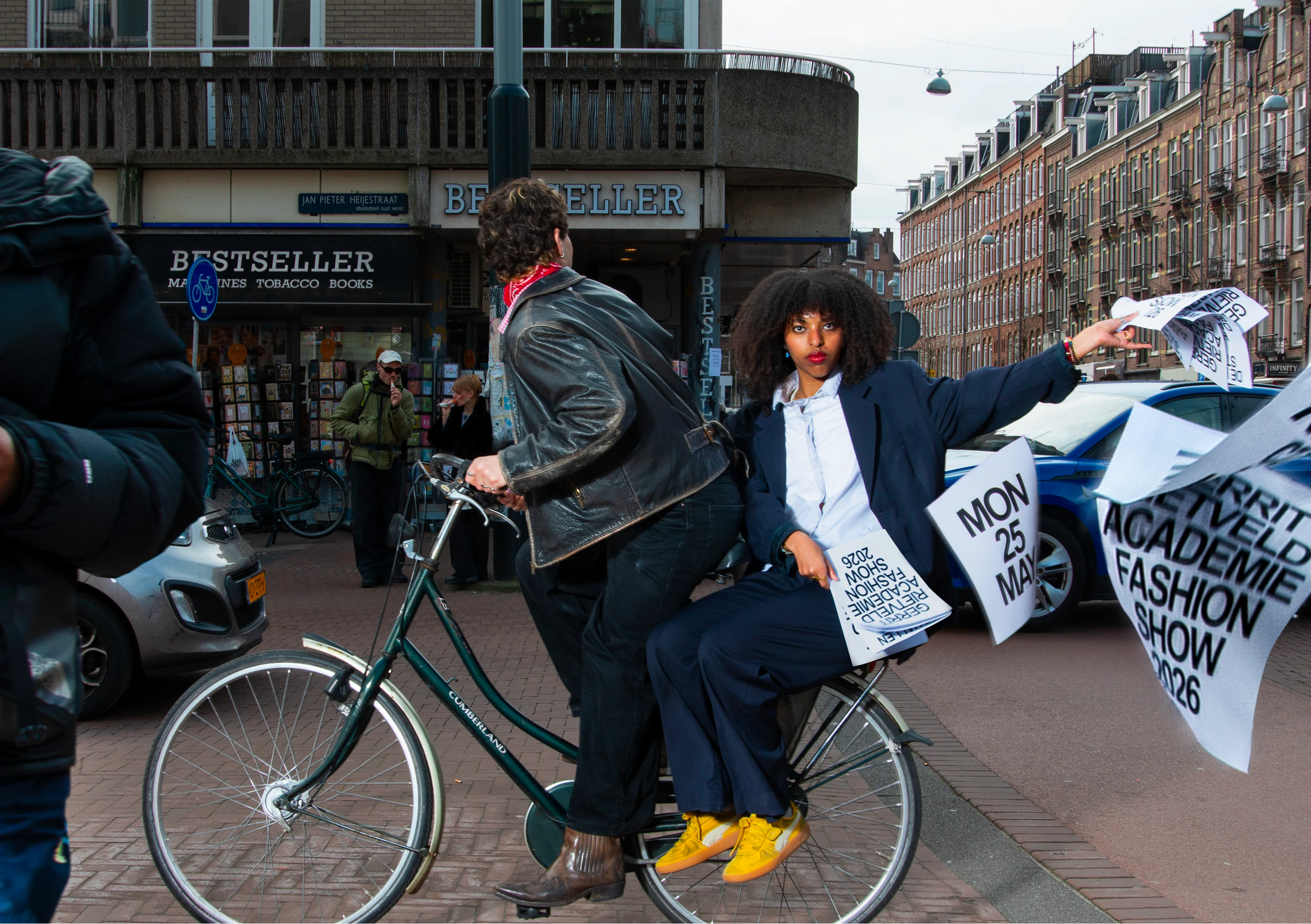
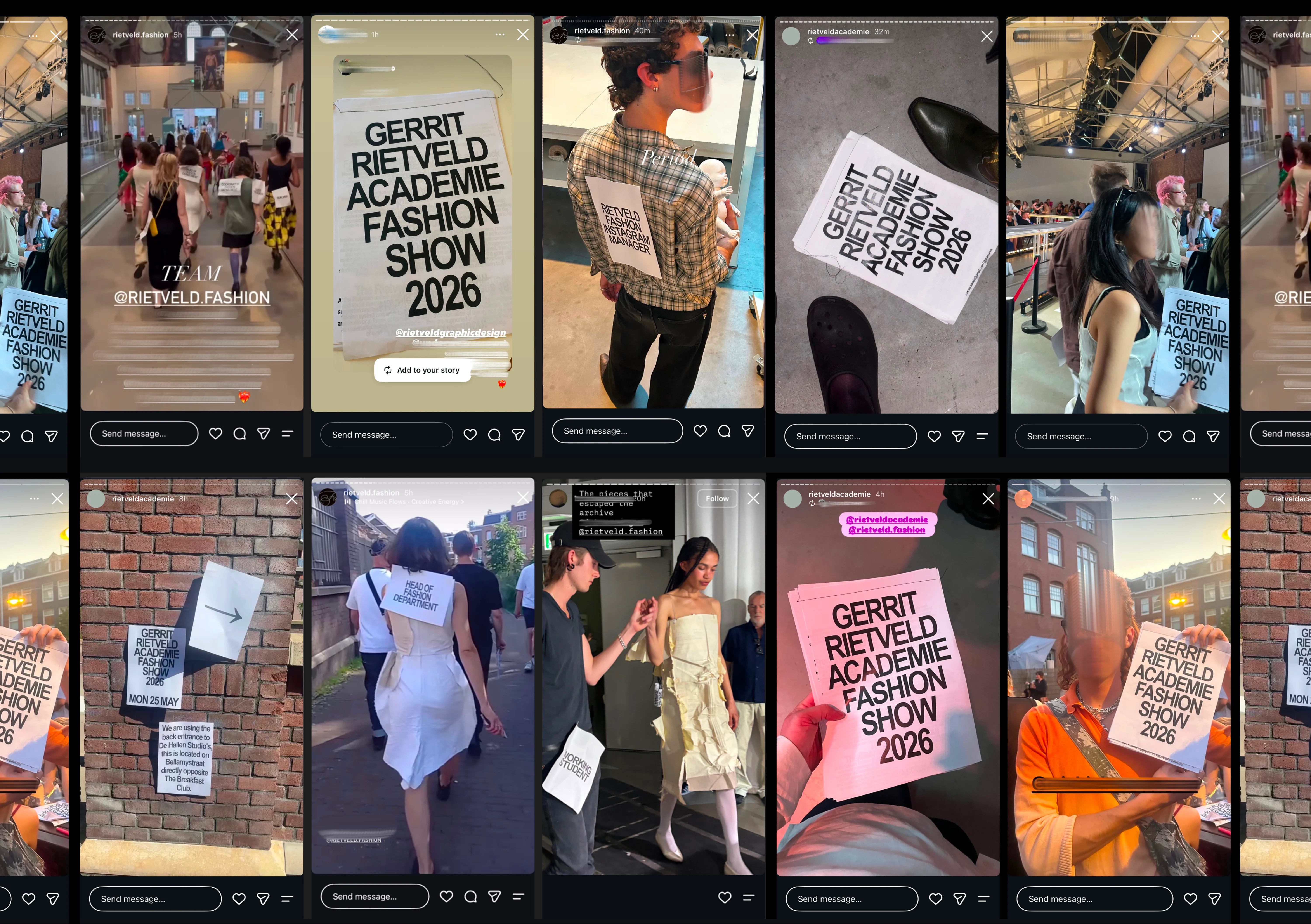
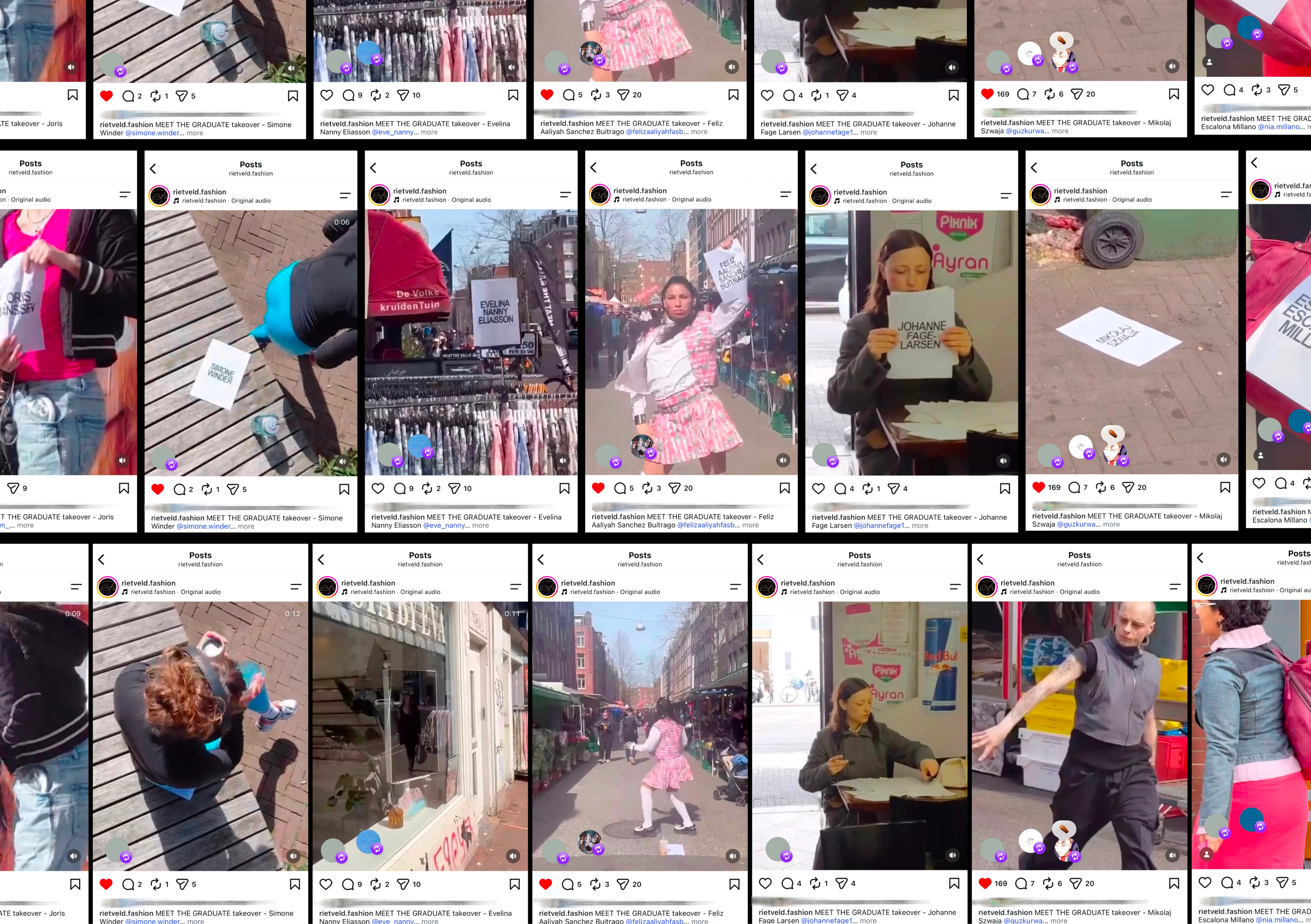
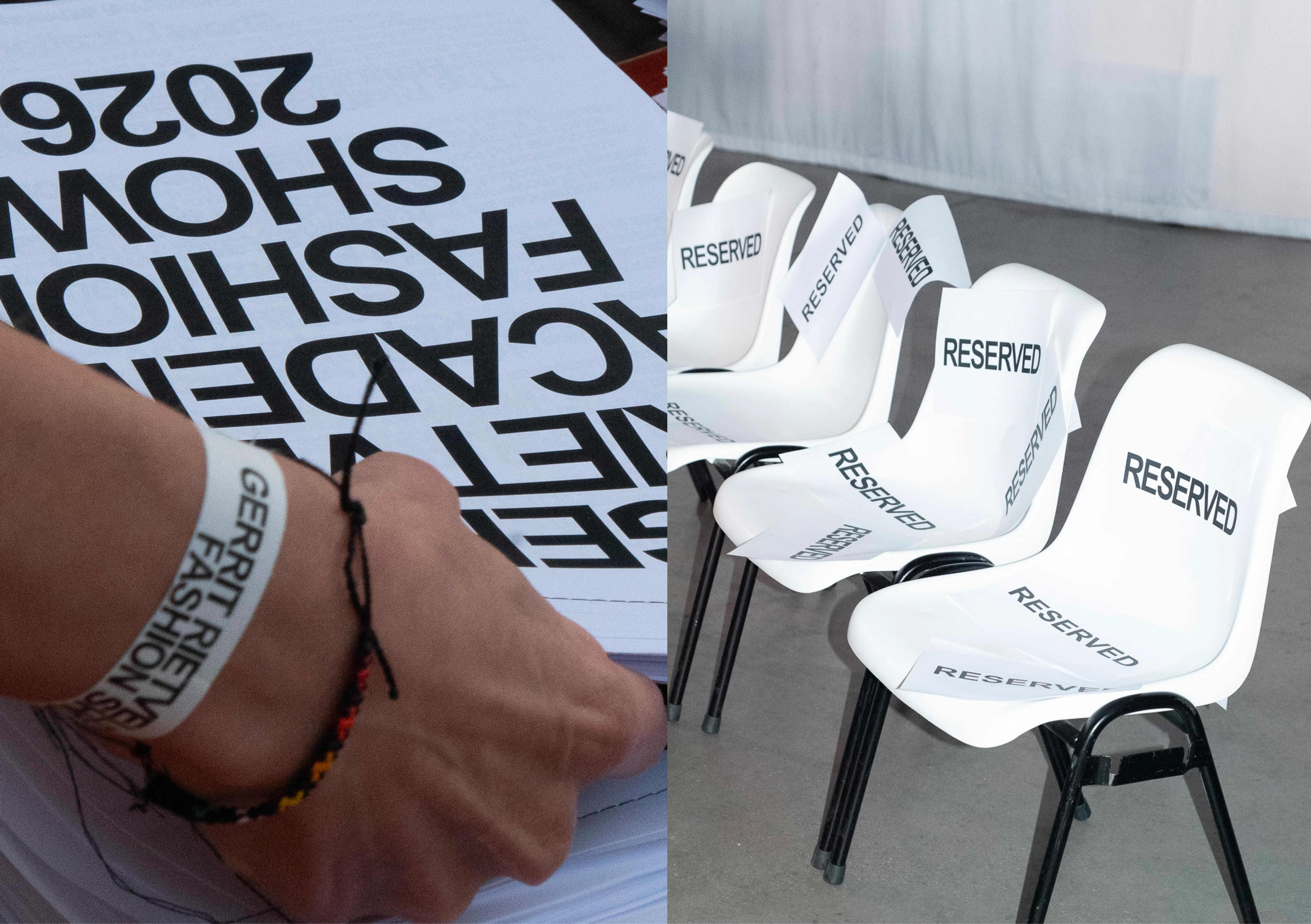
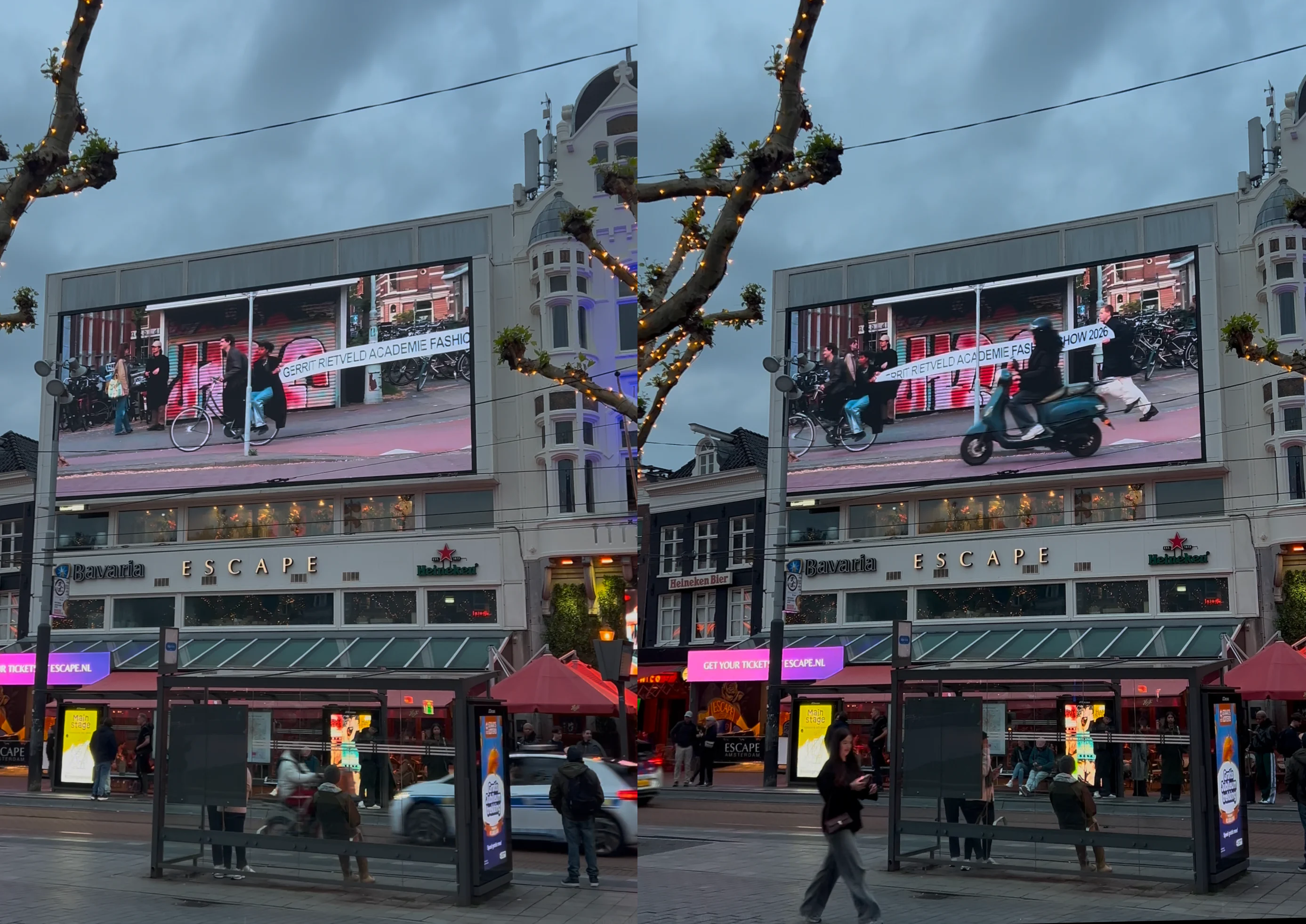
Rietveld Fashion Show Campaign 2026
Digital Print
i.c.w. Matija Stojanovic, Miro Jakob and Juliette Collins
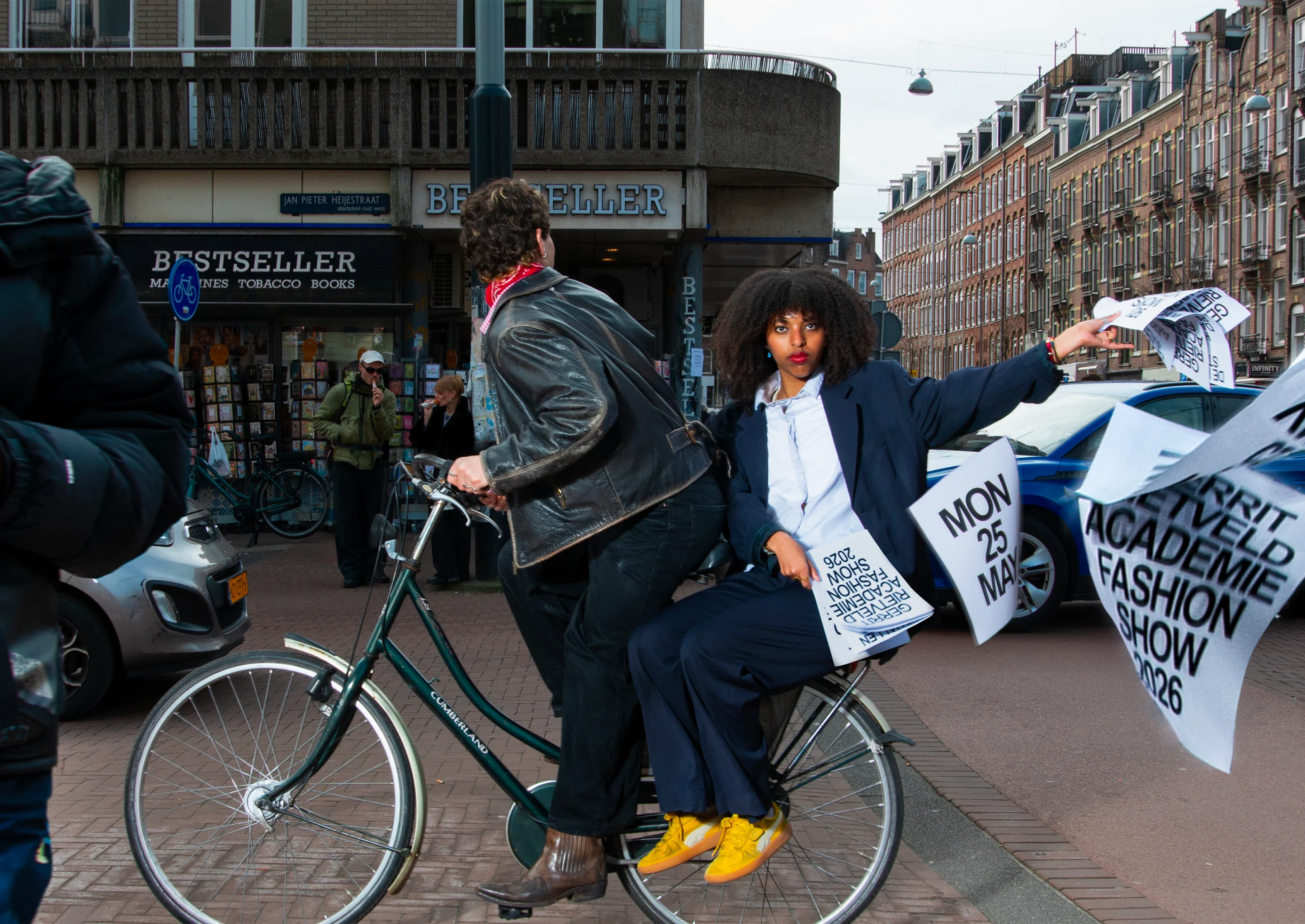
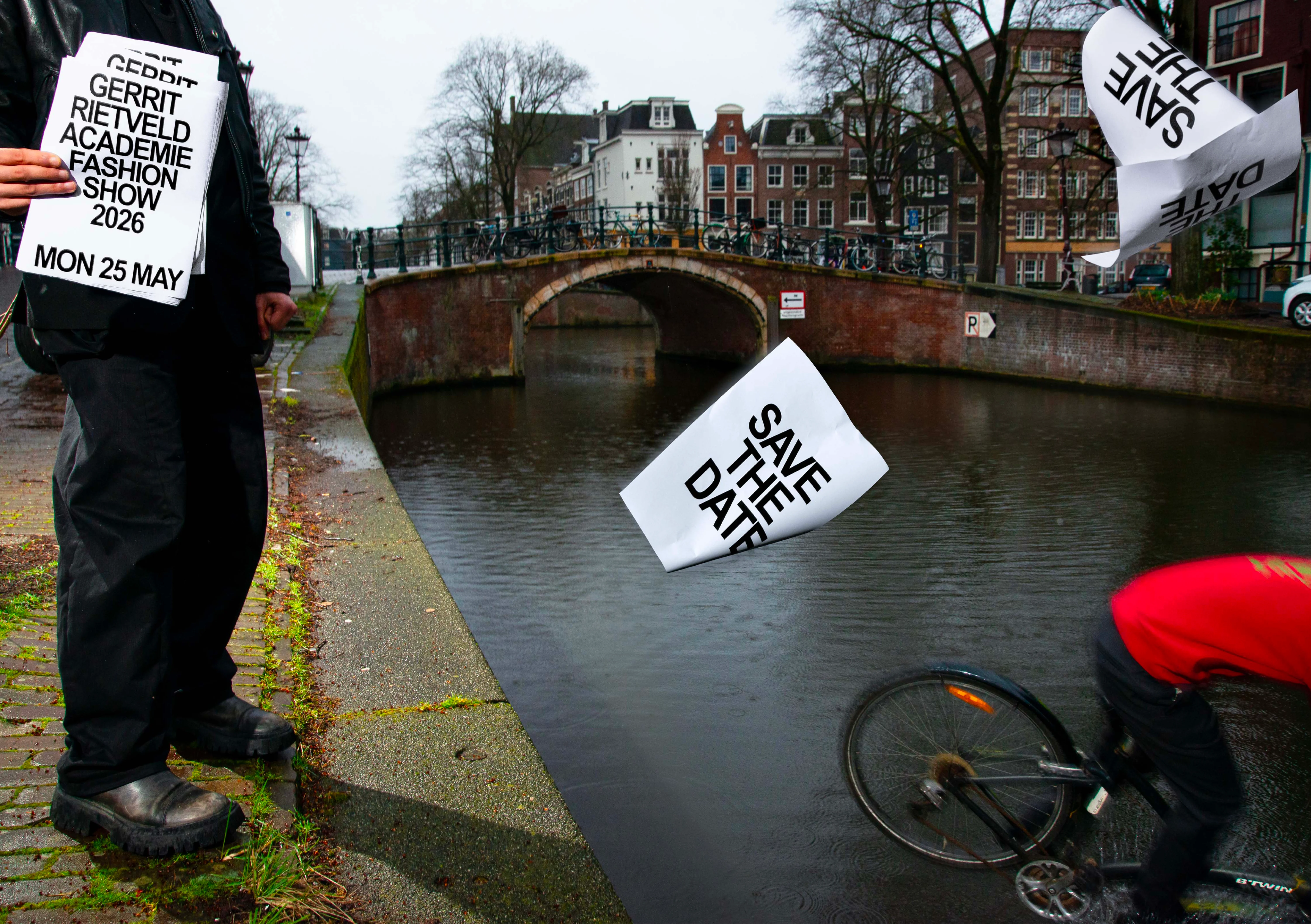
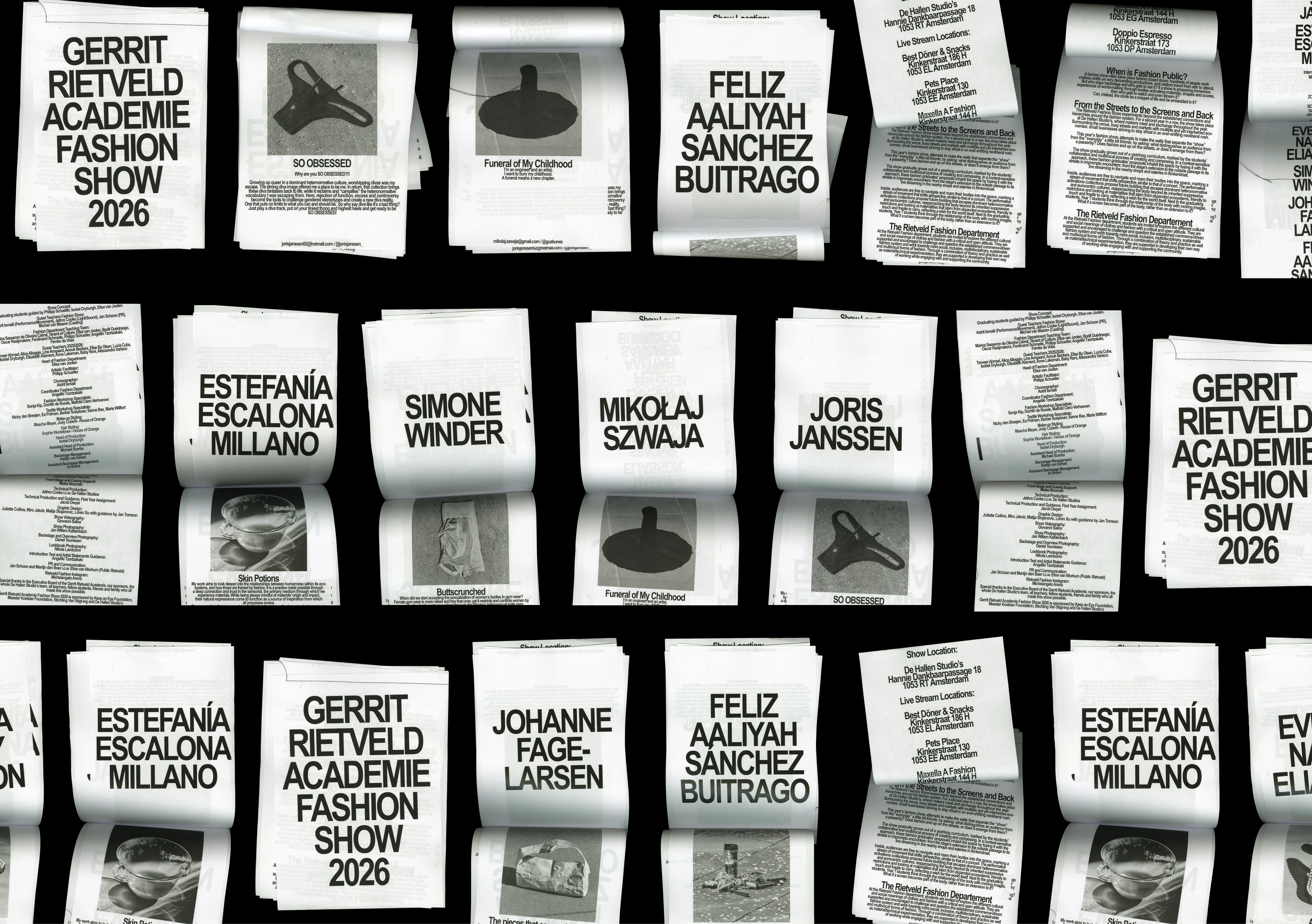
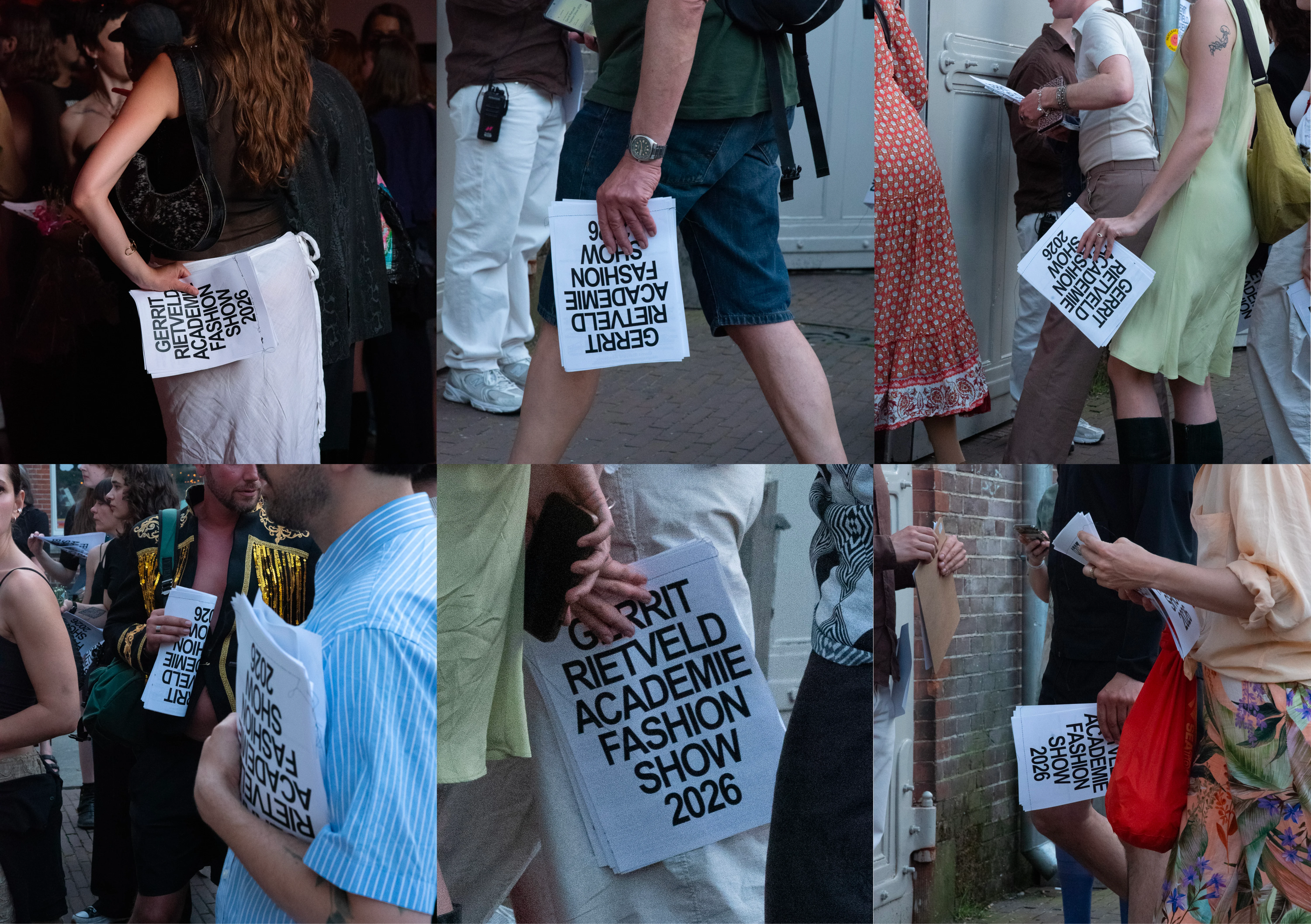
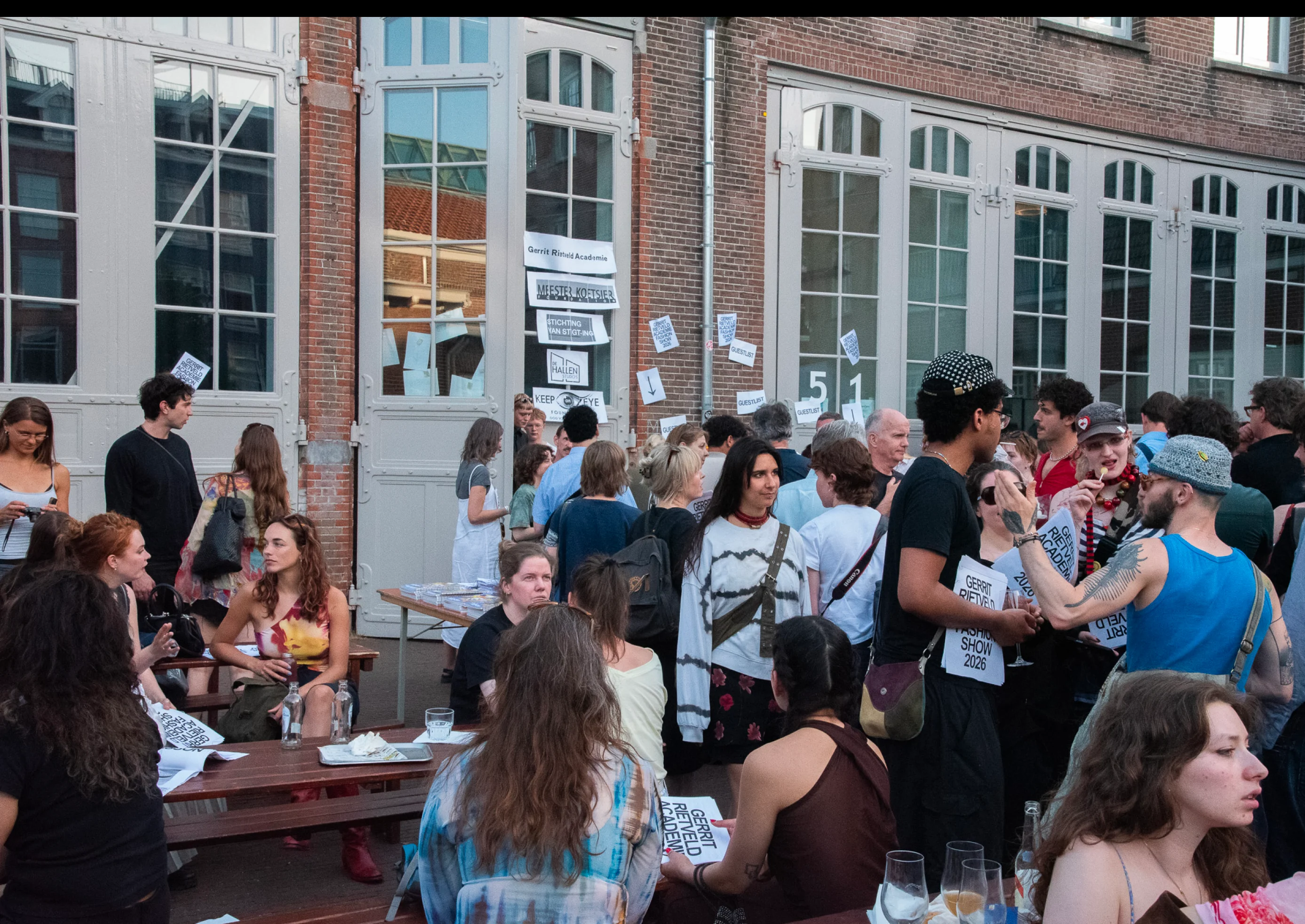
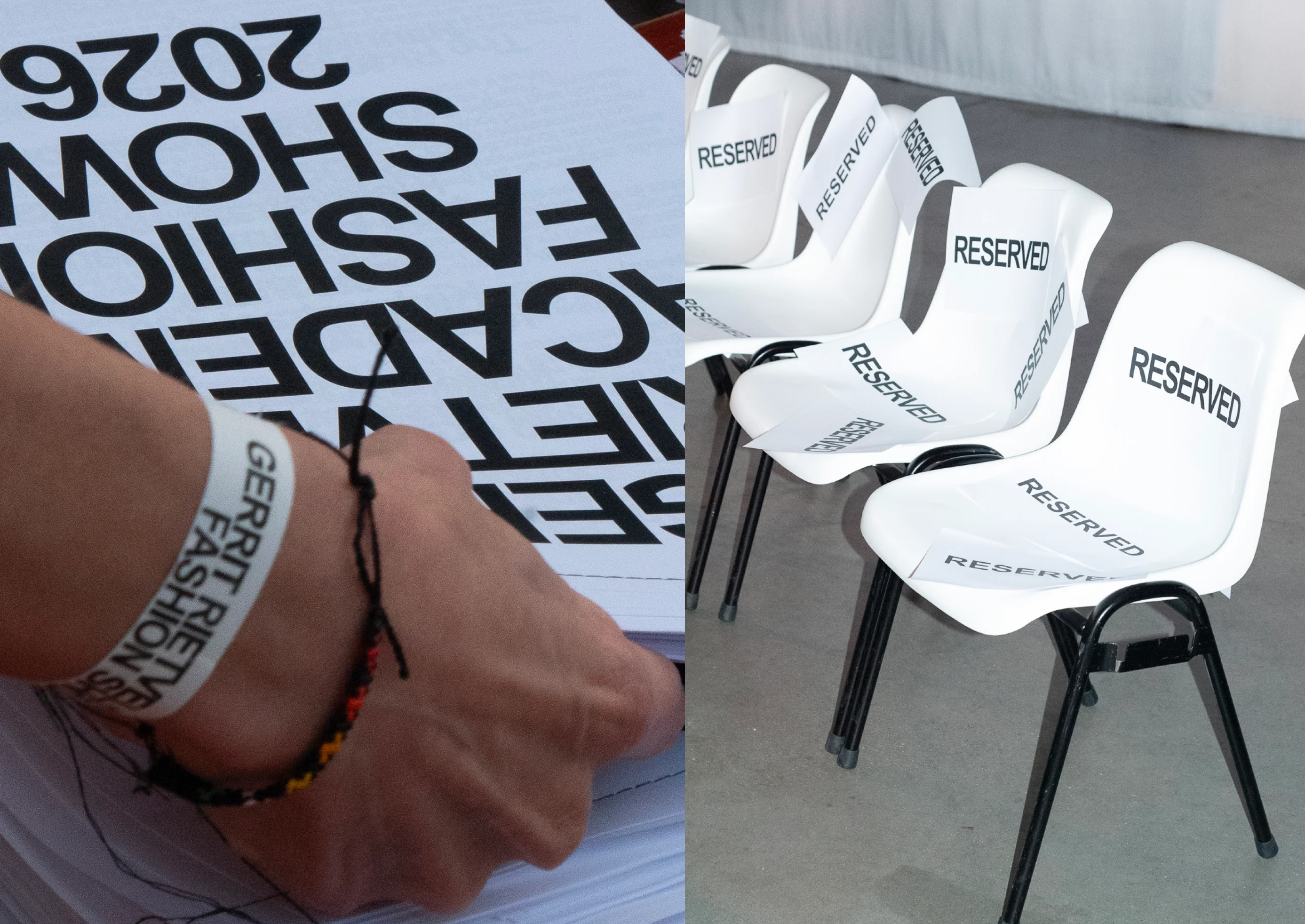
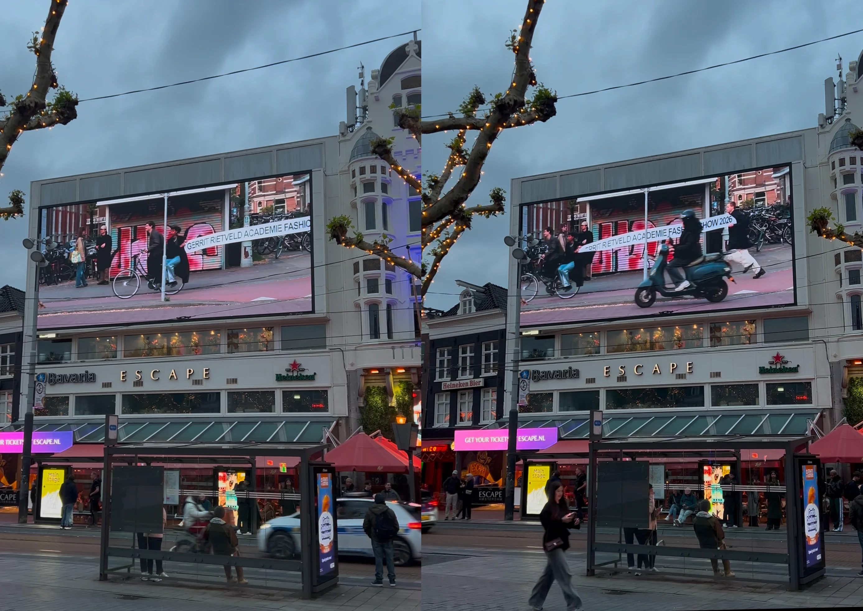
We made the campaign for the Fashion Show of the Gerrit Rietveld Academie by constructing images which blur the boundary between Oud-West—the neighbourhood surrounding the fashion show’s venue—and the fashion show itself. All the logistical information for the show is contained within these images and was arranged in-camera. During the show itself, we live-streamed the show in businesses around the neighbourhood, opening up the show to audiences in döner shops and pet stores on Kinkerstraat.
We made the campaign for the Fashion Show of the Gerrit Rietveld Academie by constructing images which blur the boundary between Oud-West—the neighbourhood surrounding the fashion show’s venue—and the fashion show itself. All the logistical information for the show is contained within these images and was arranged in-camera. During the show itself, we live-streamed the show in businesses around the neighbourhood, opening up the show to audiences in döner shops and pet stores on Kinkerstraat.
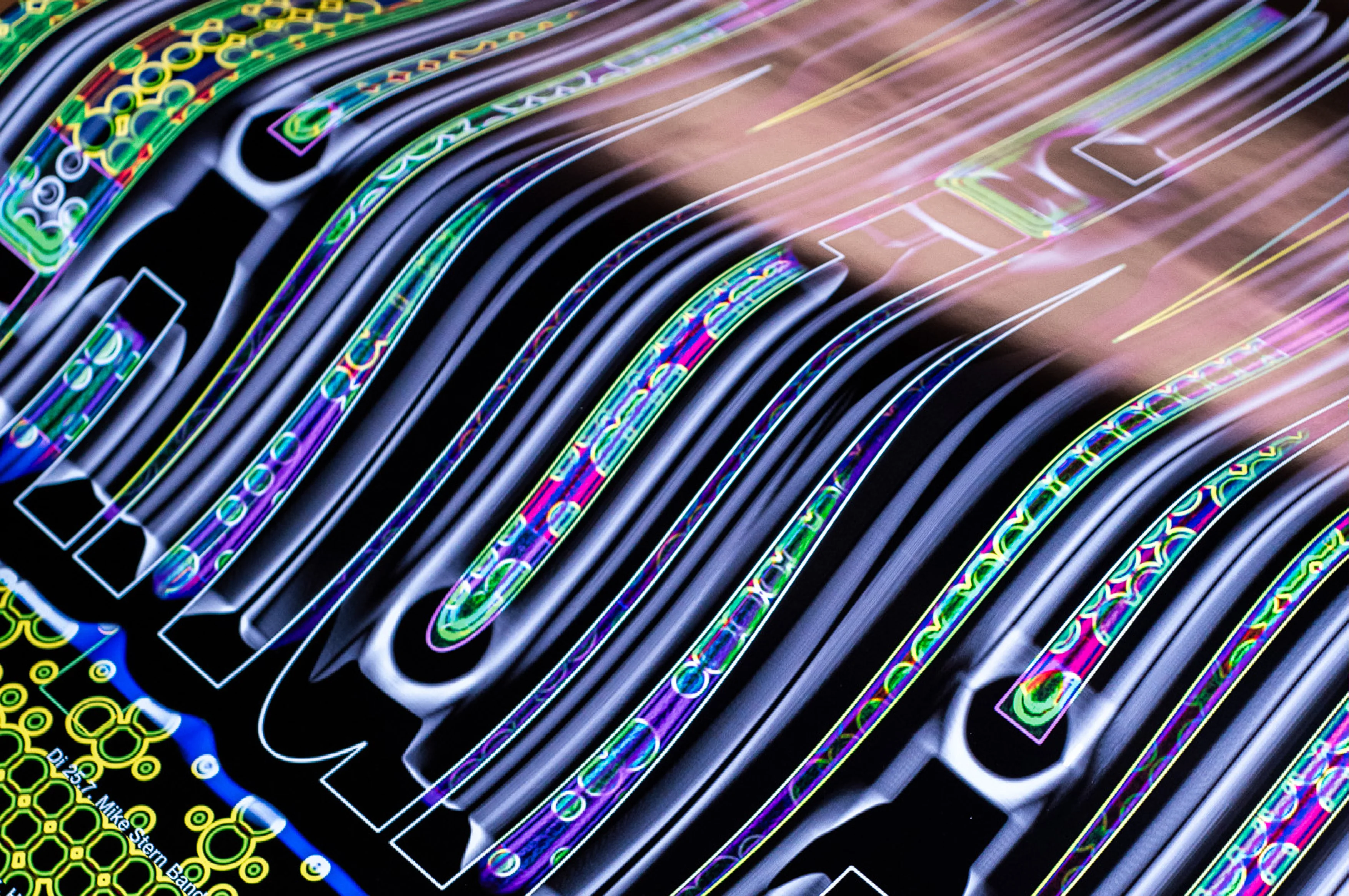
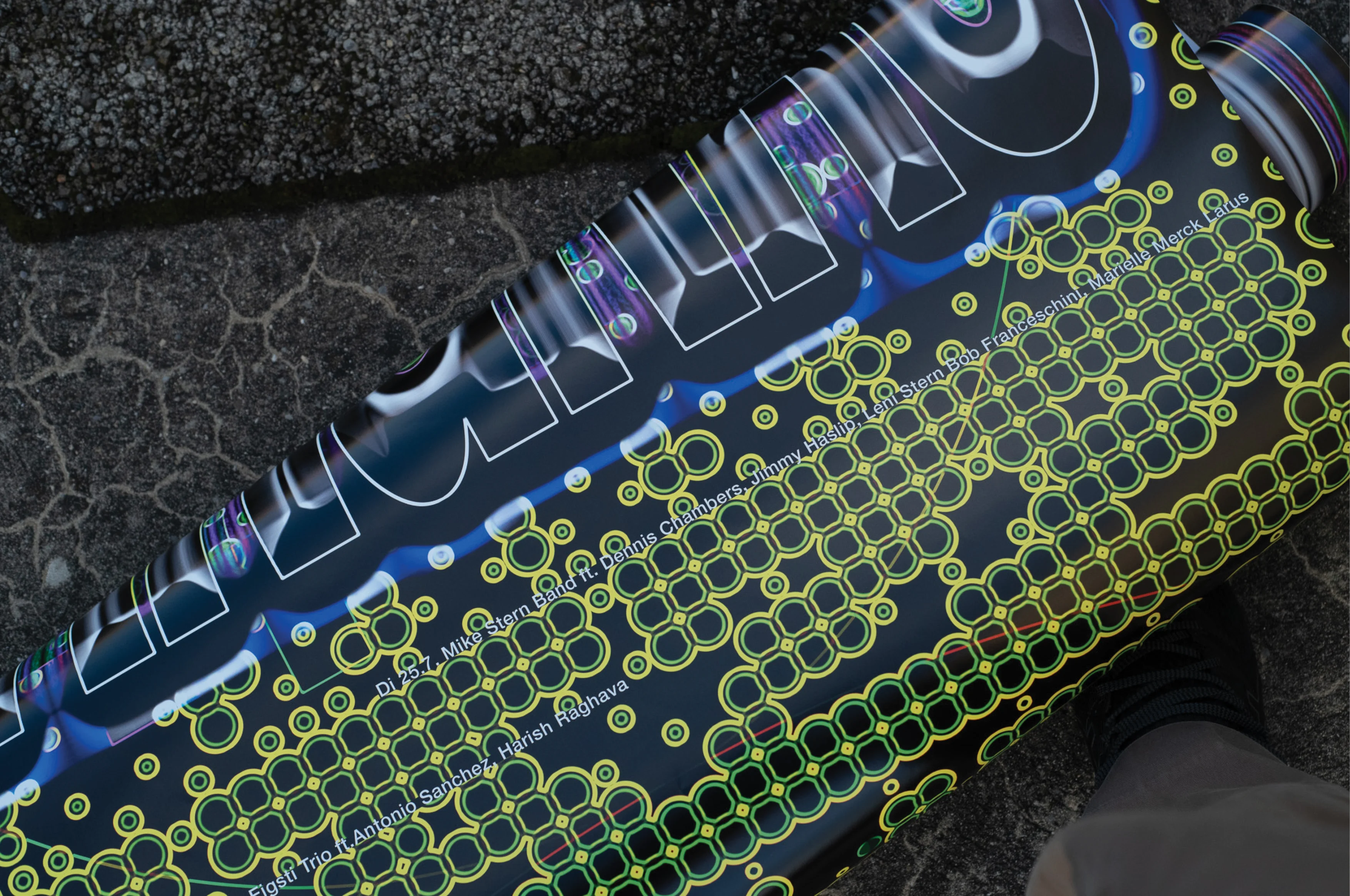
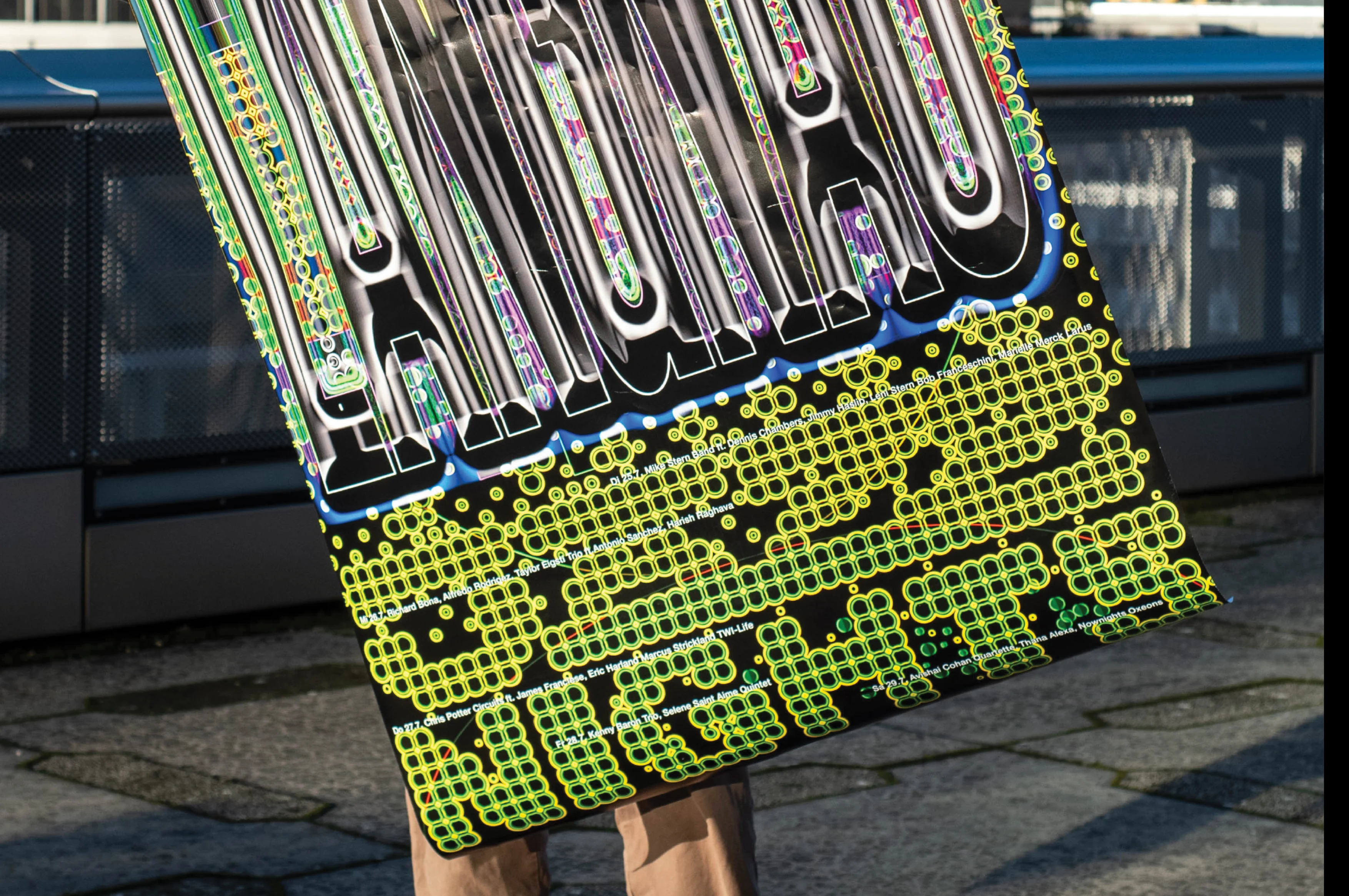
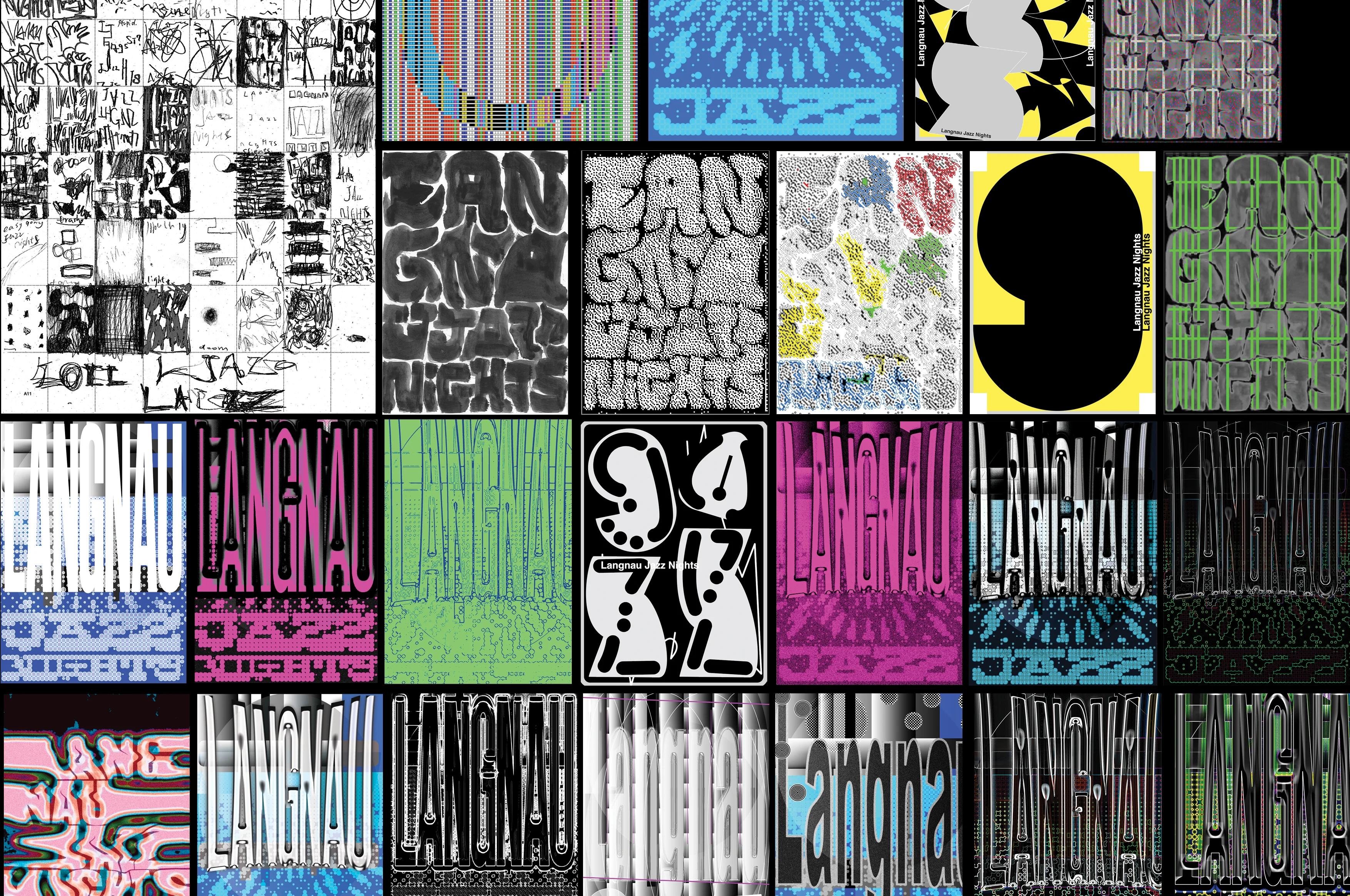
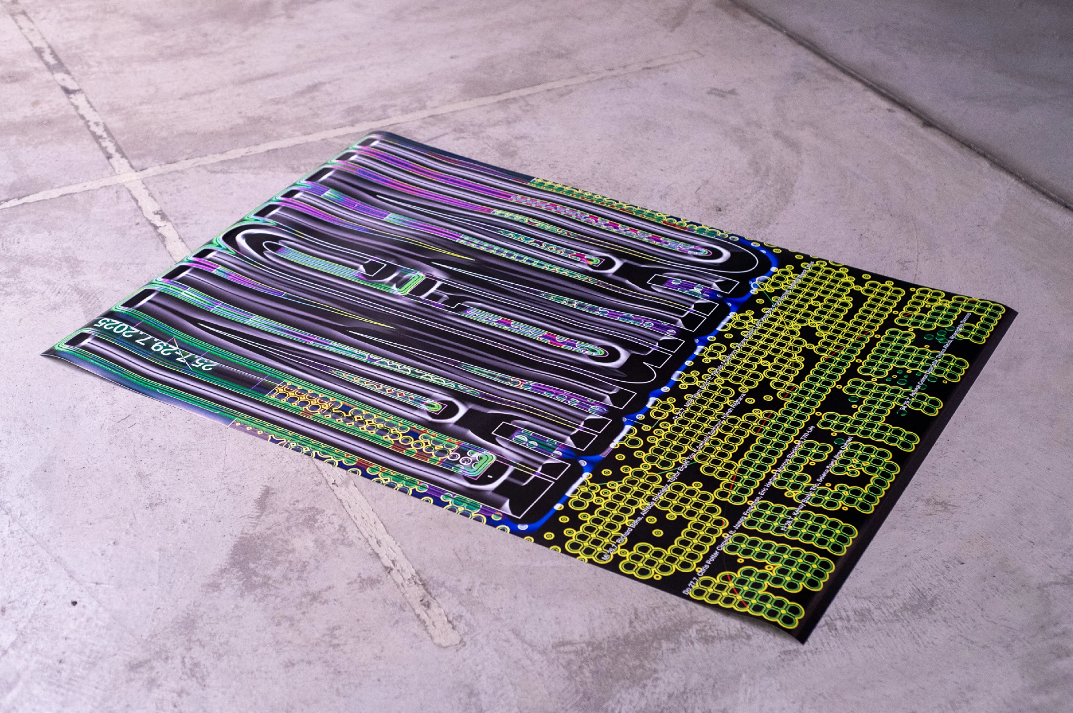
Langnau Jazz Nights Poster Design
Poster Design
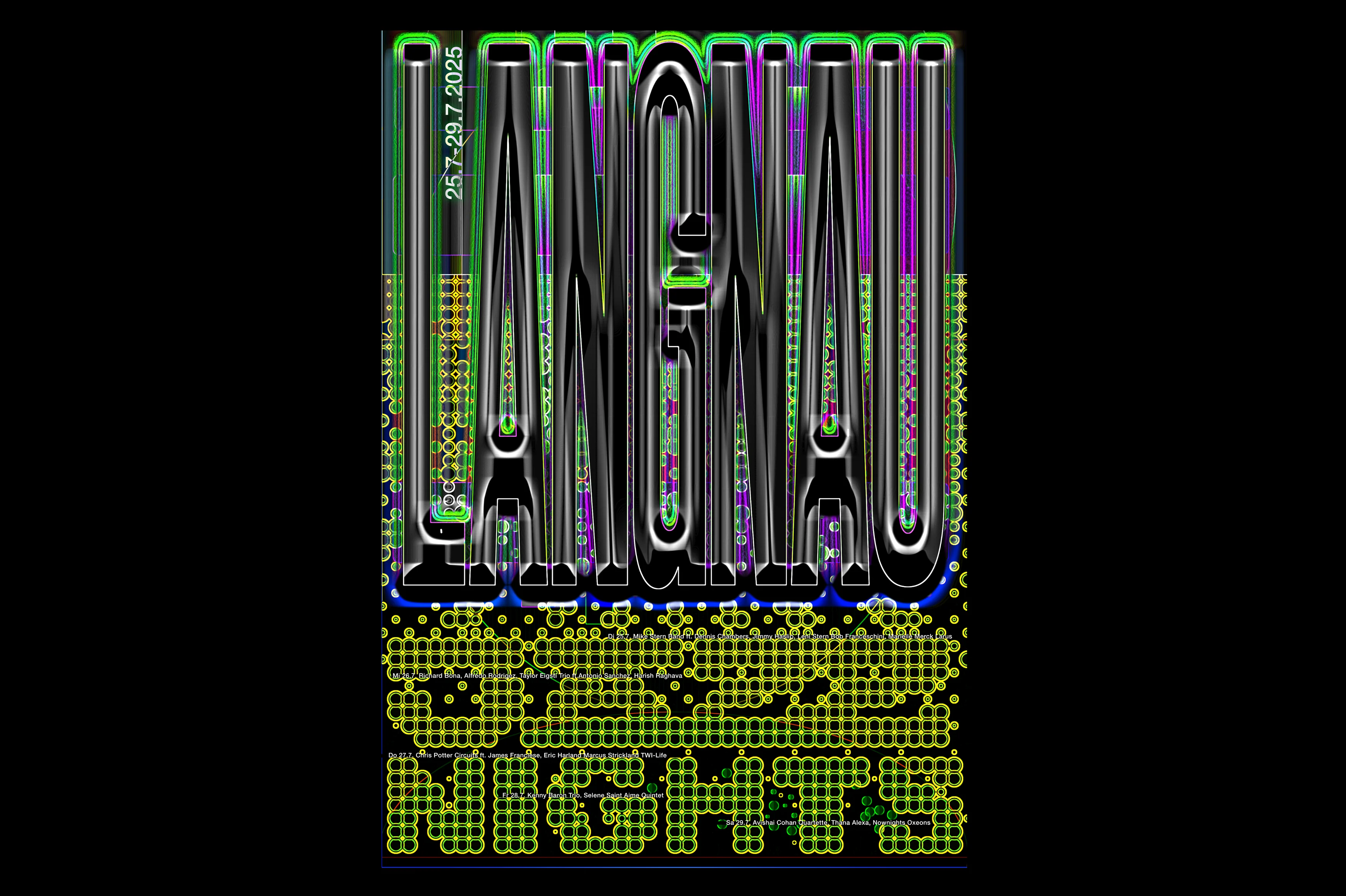
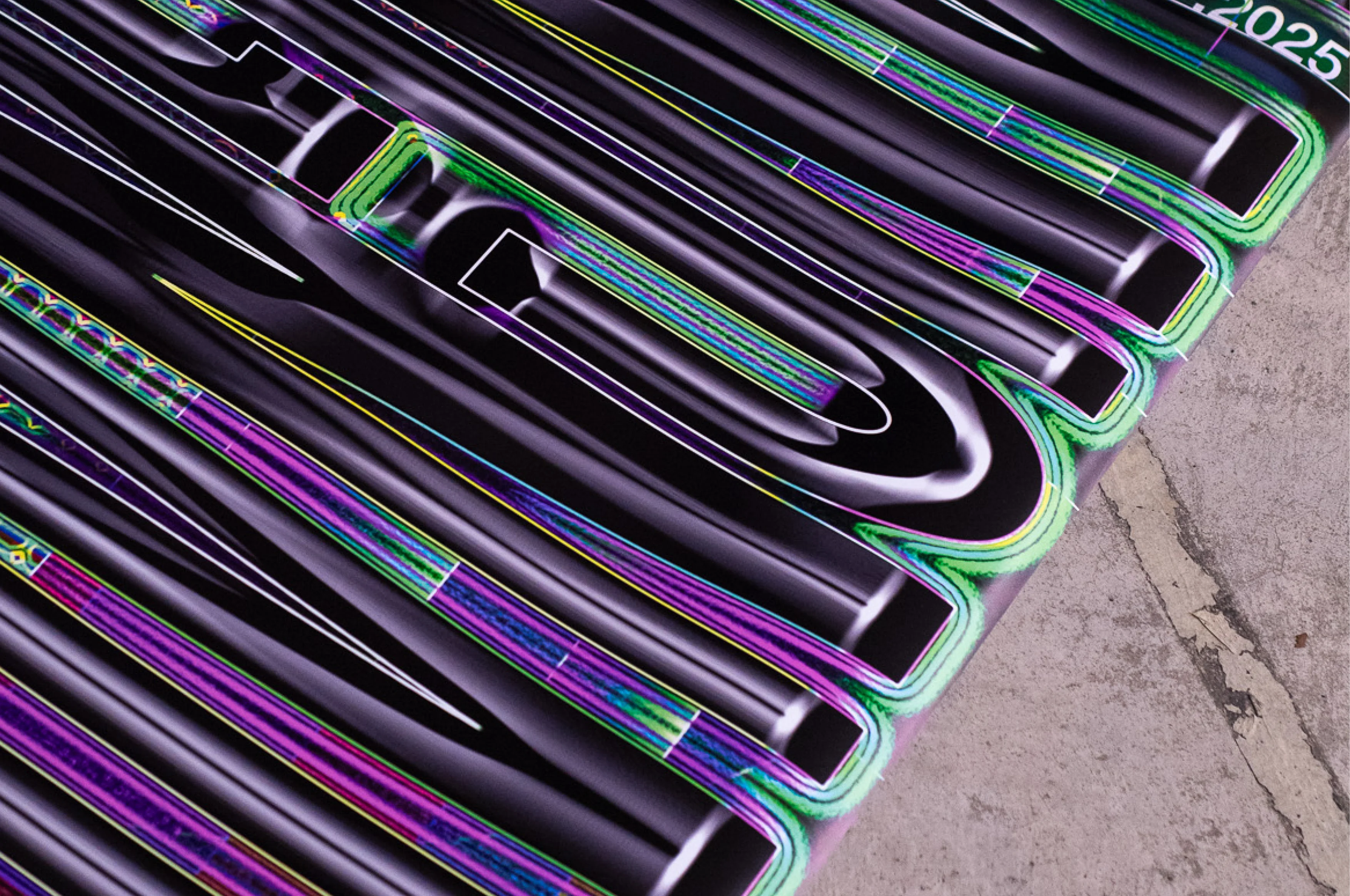
Poster proposal for this year's Langnau Jazz Nights.
Mentored by @rebeccamorgantipfaffhauser & @martin_woodtli.
Mentored by @rebeccamorgantipfaffhauser & @martin_woodtli.
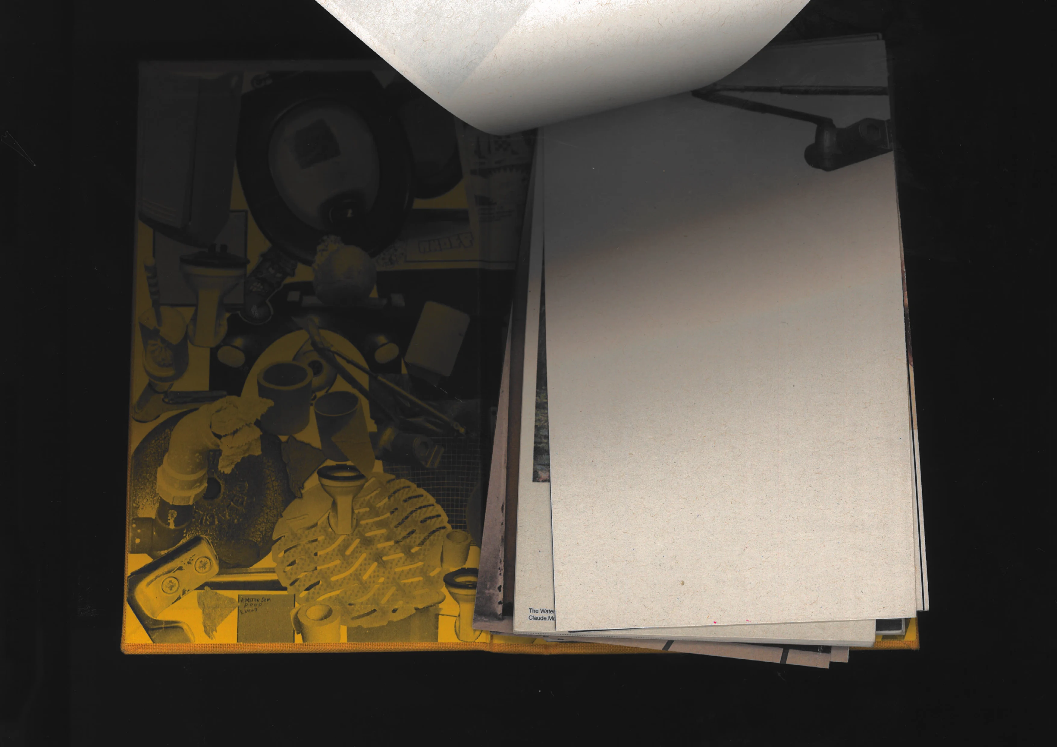
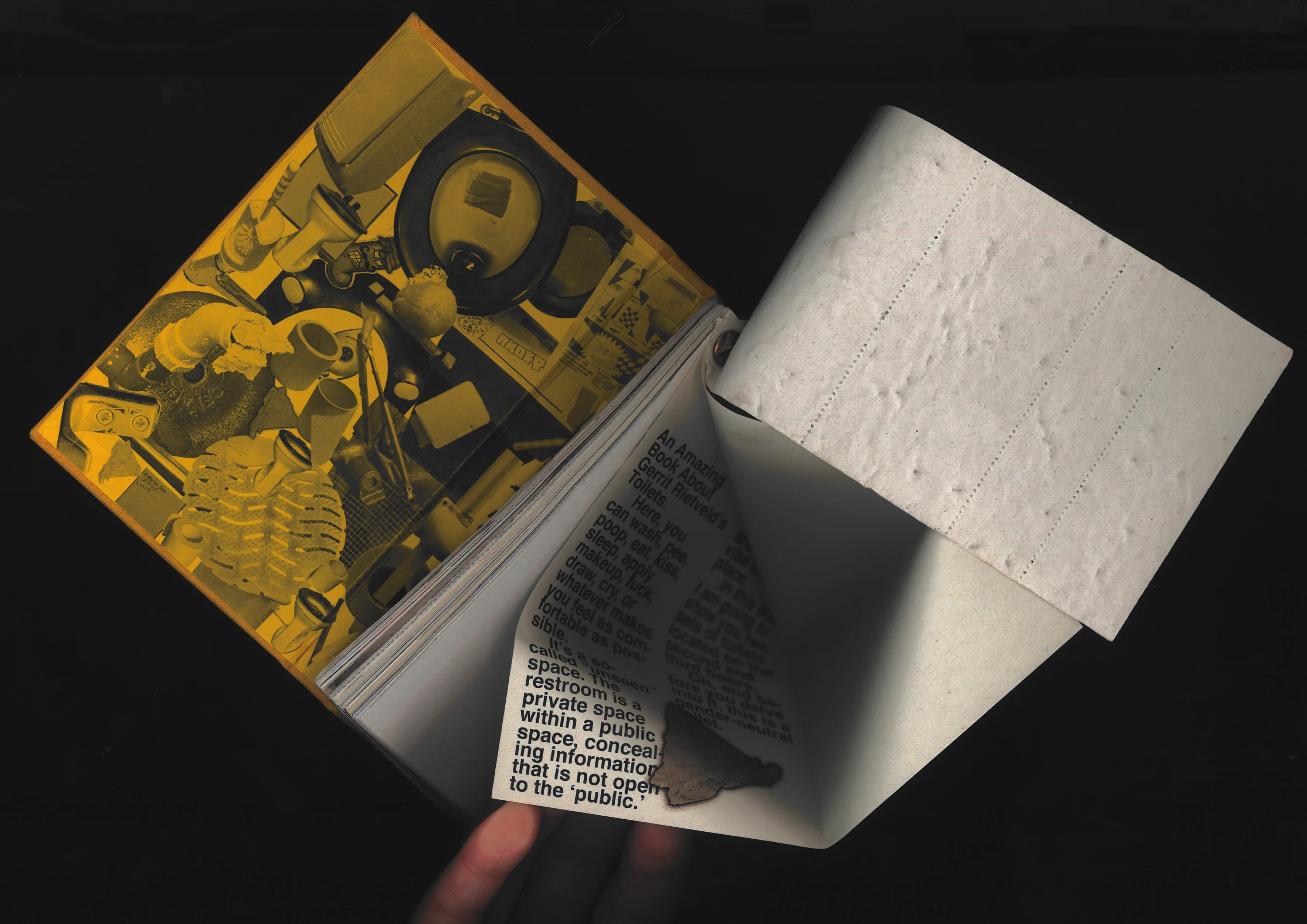
Toi-let Booky
Editorial design
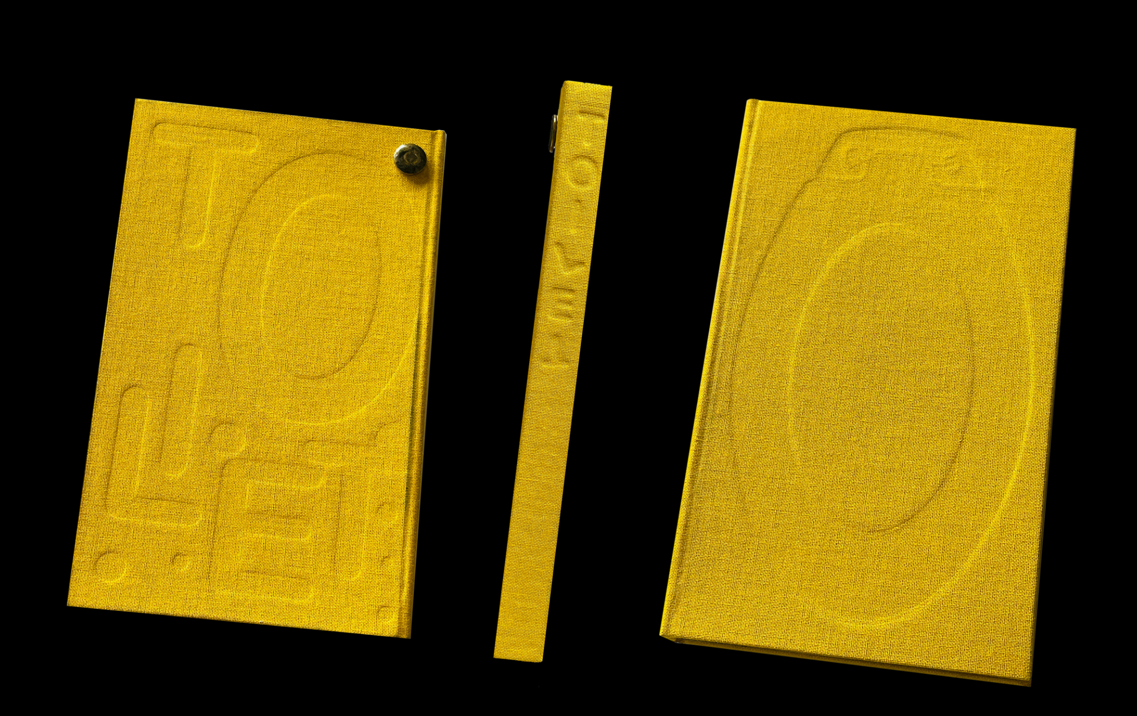
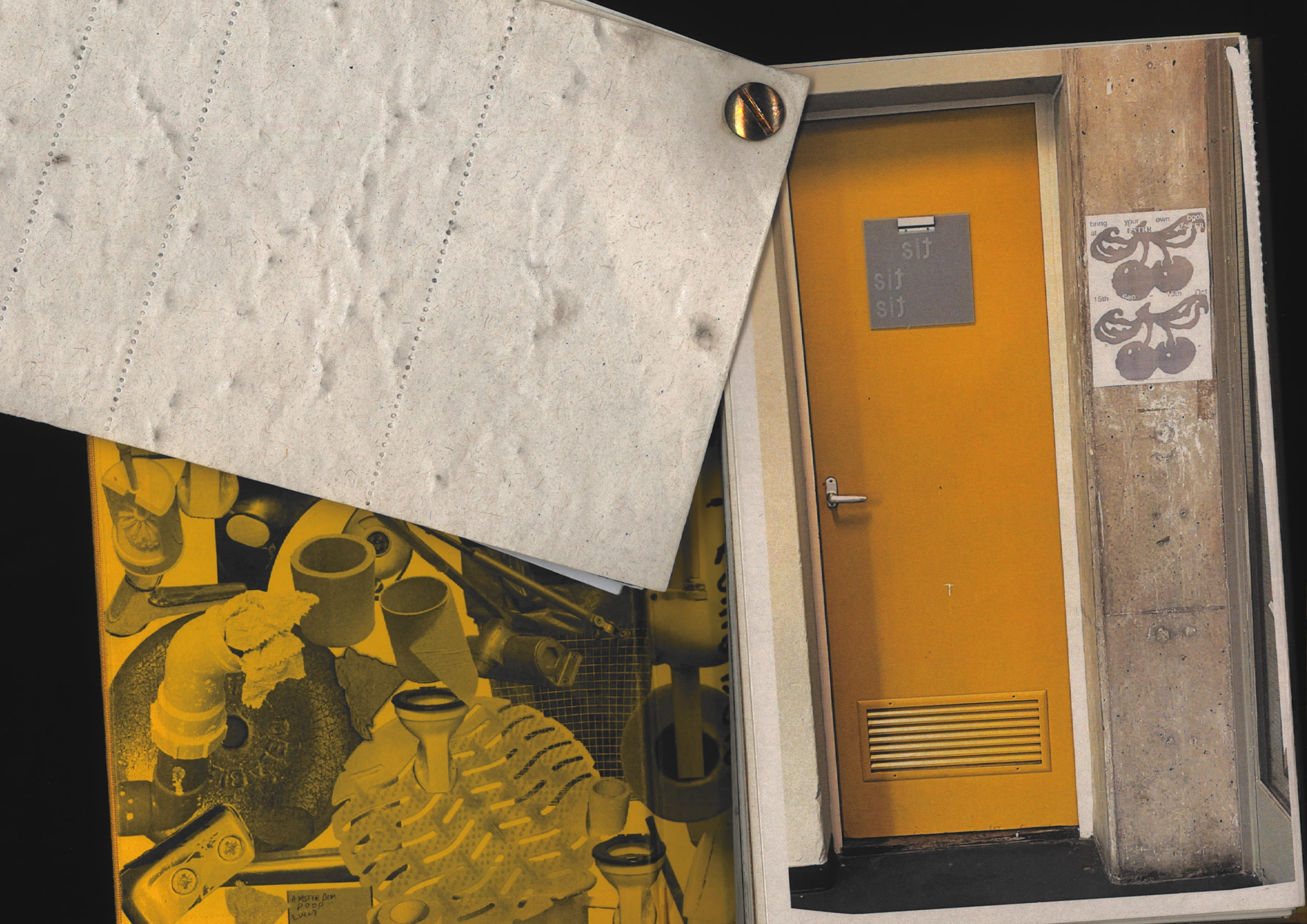
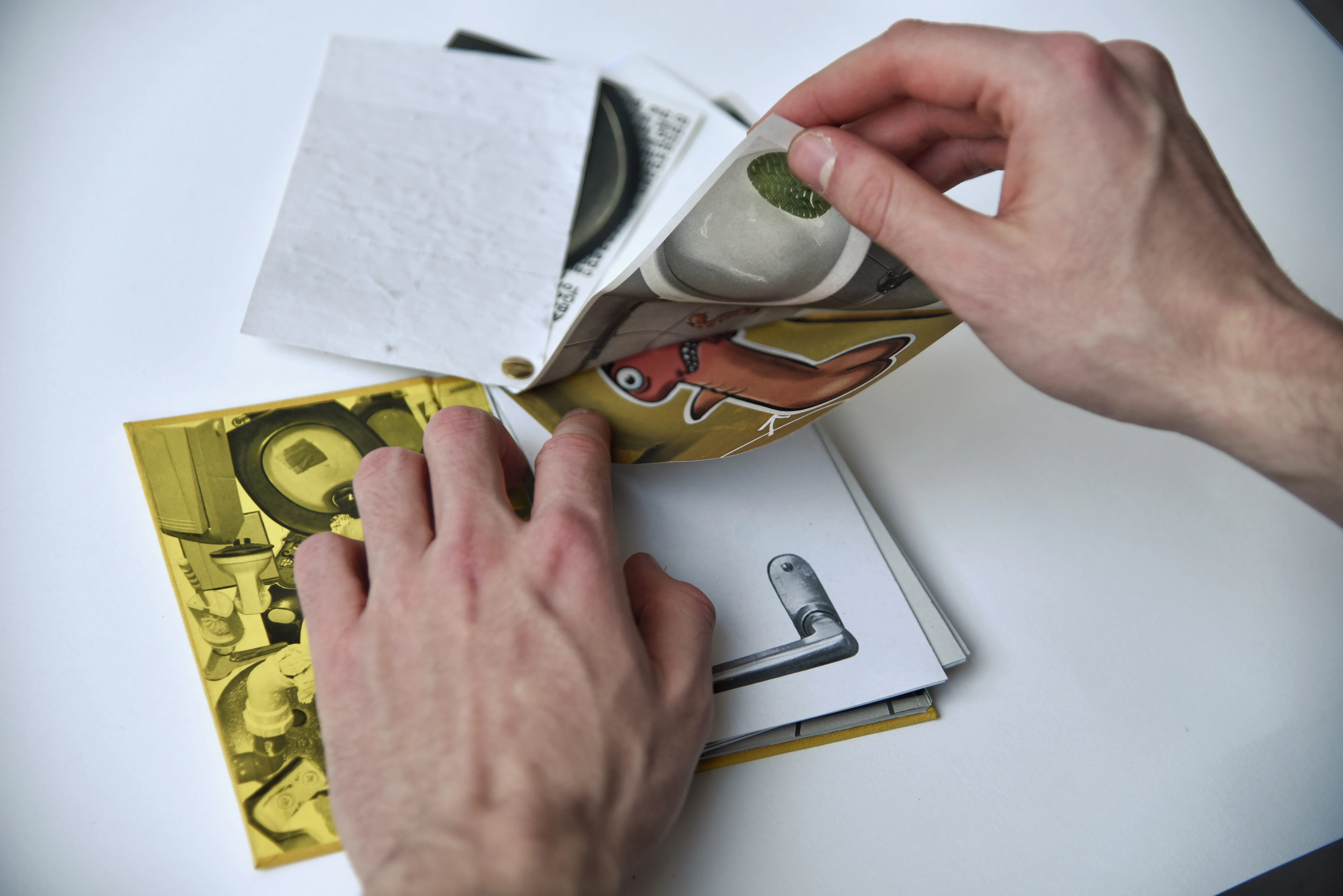
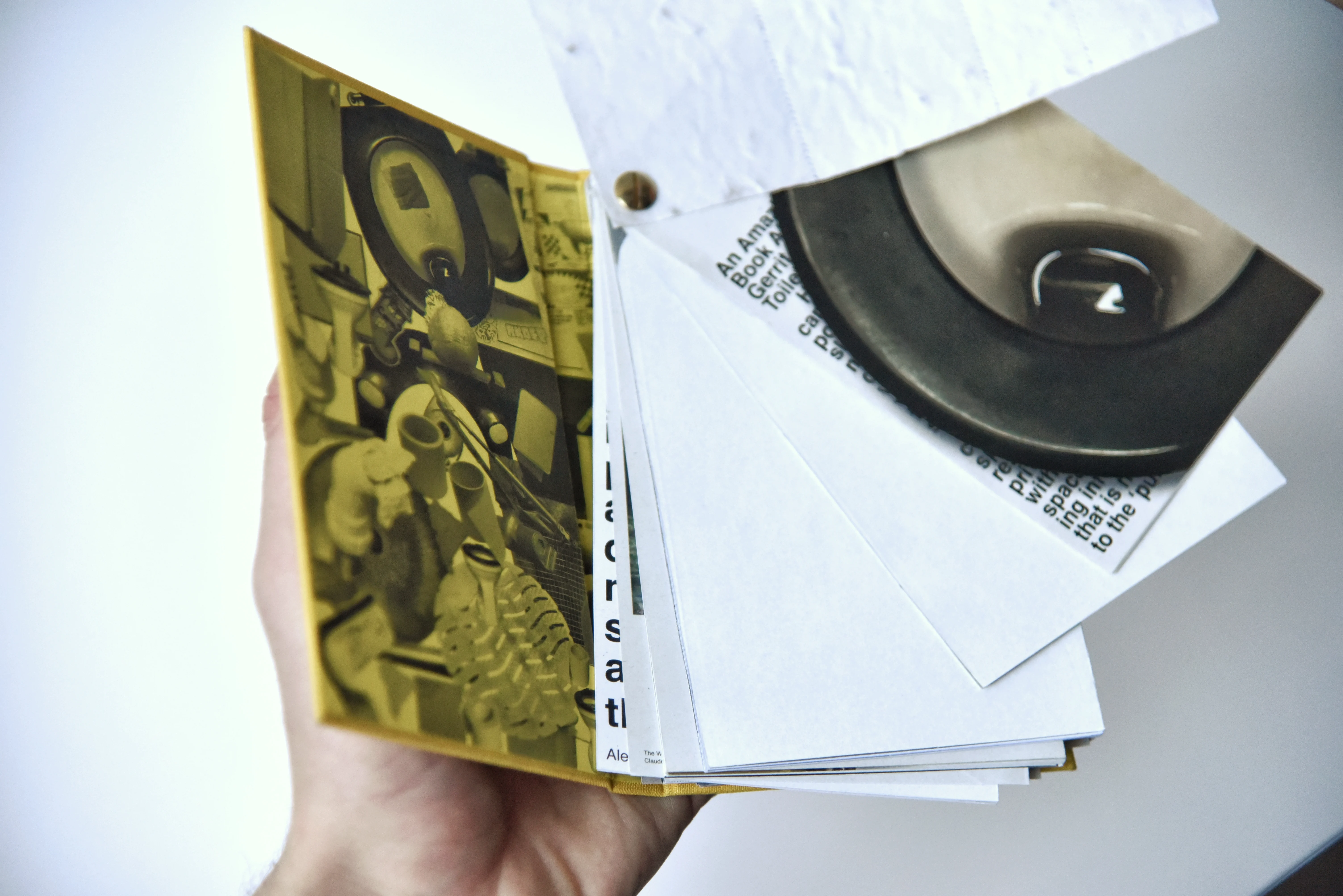
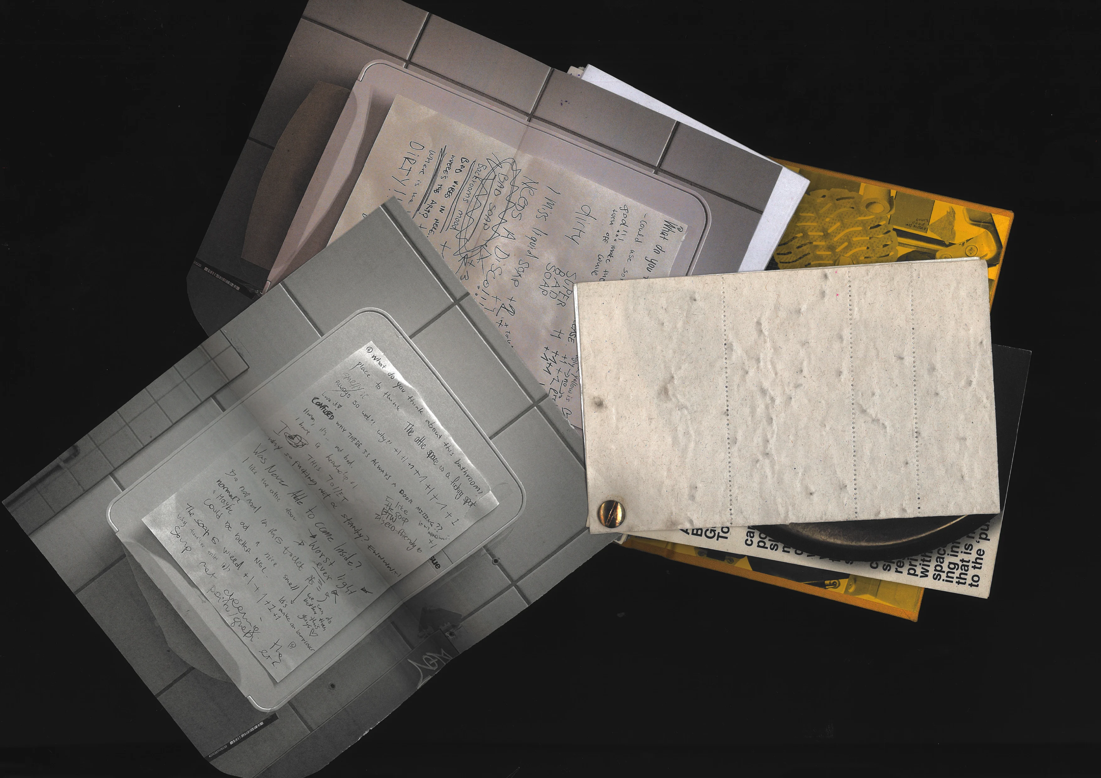
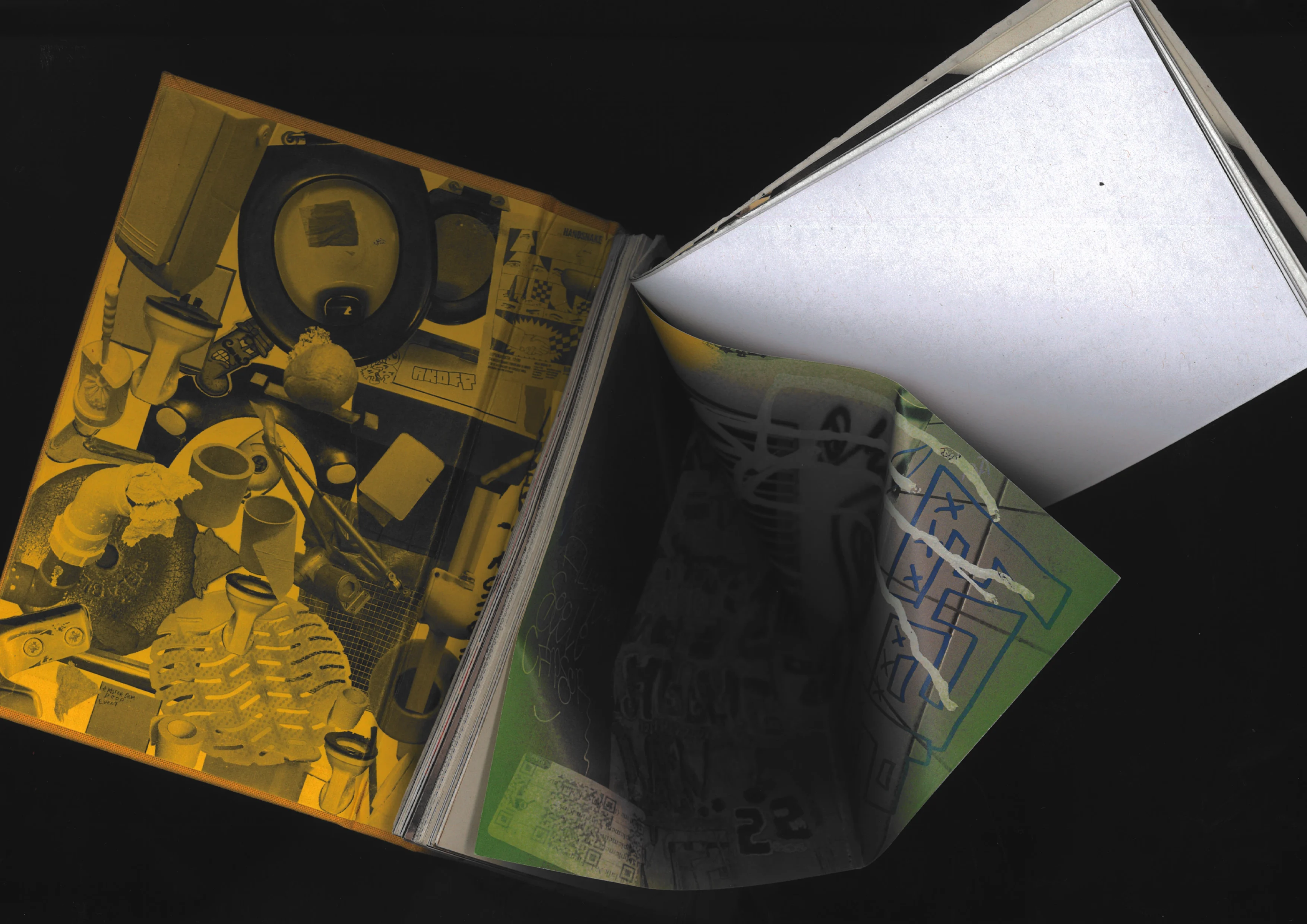
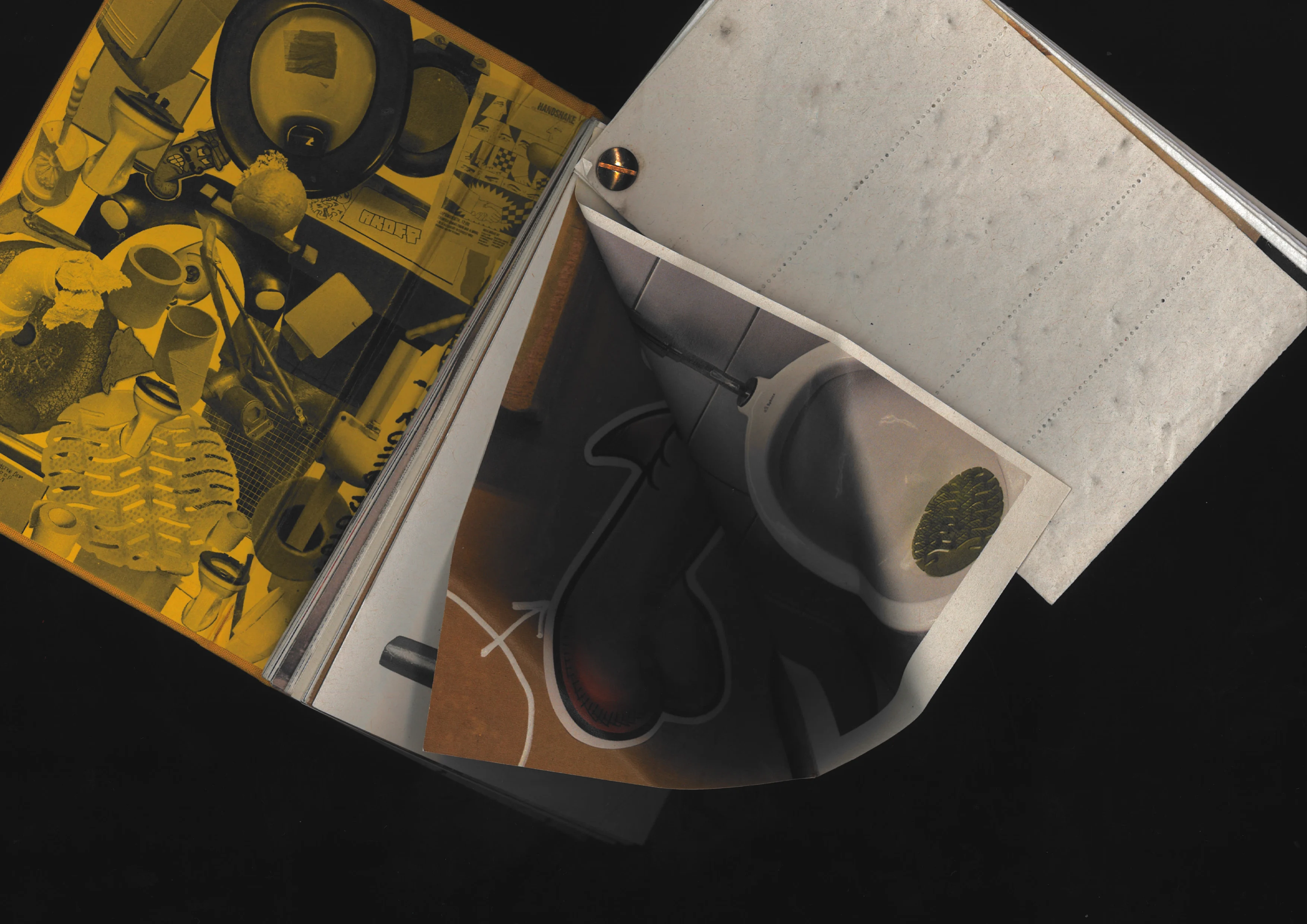
A documentary book about GRA’s public toilets. When you look at this toilet from the outside, it's all so normal. When you open the door, the dirtiest part and the funniest part are hidden in the deepest part of the toilet, and the room is so narrow and so small.
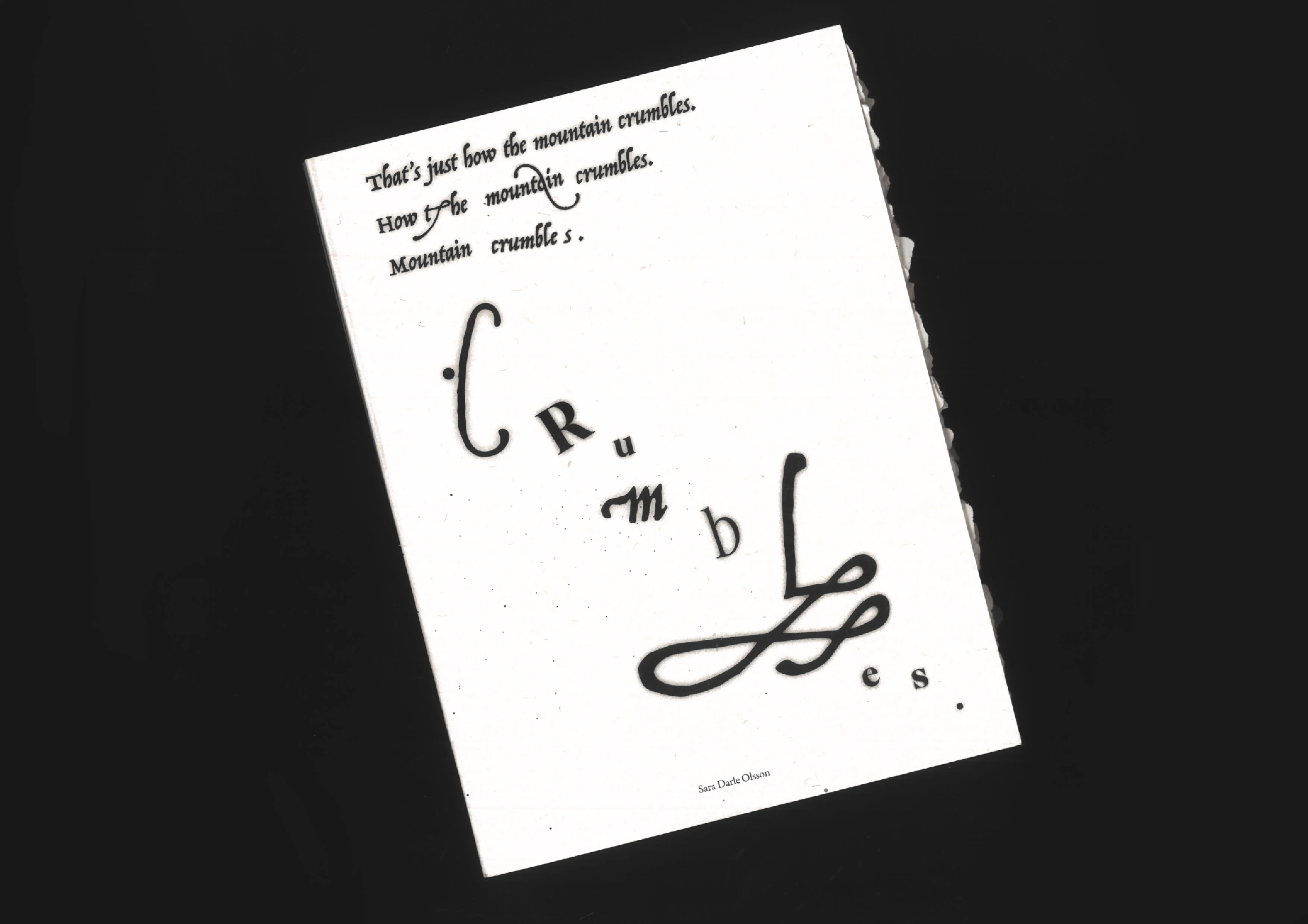
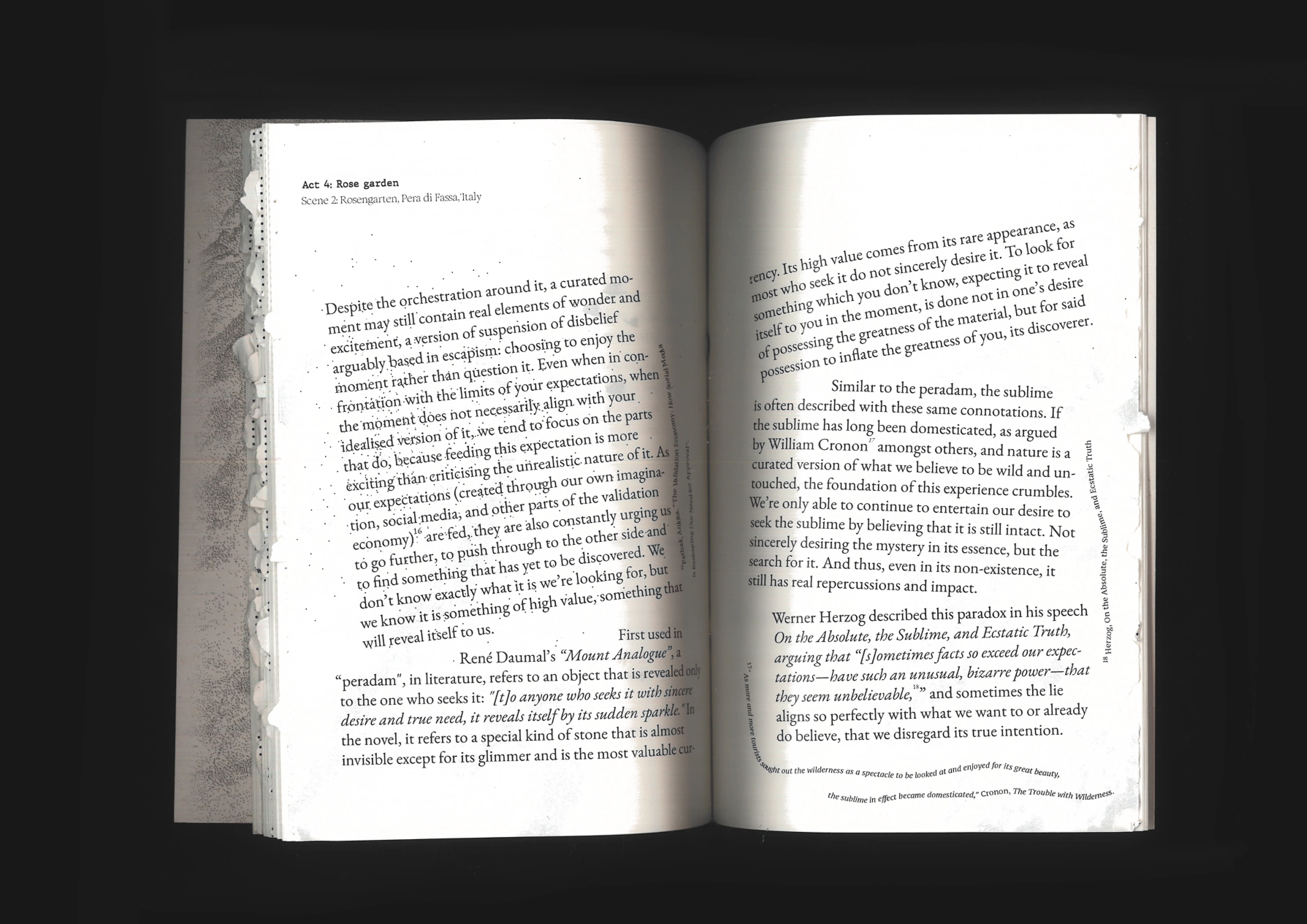
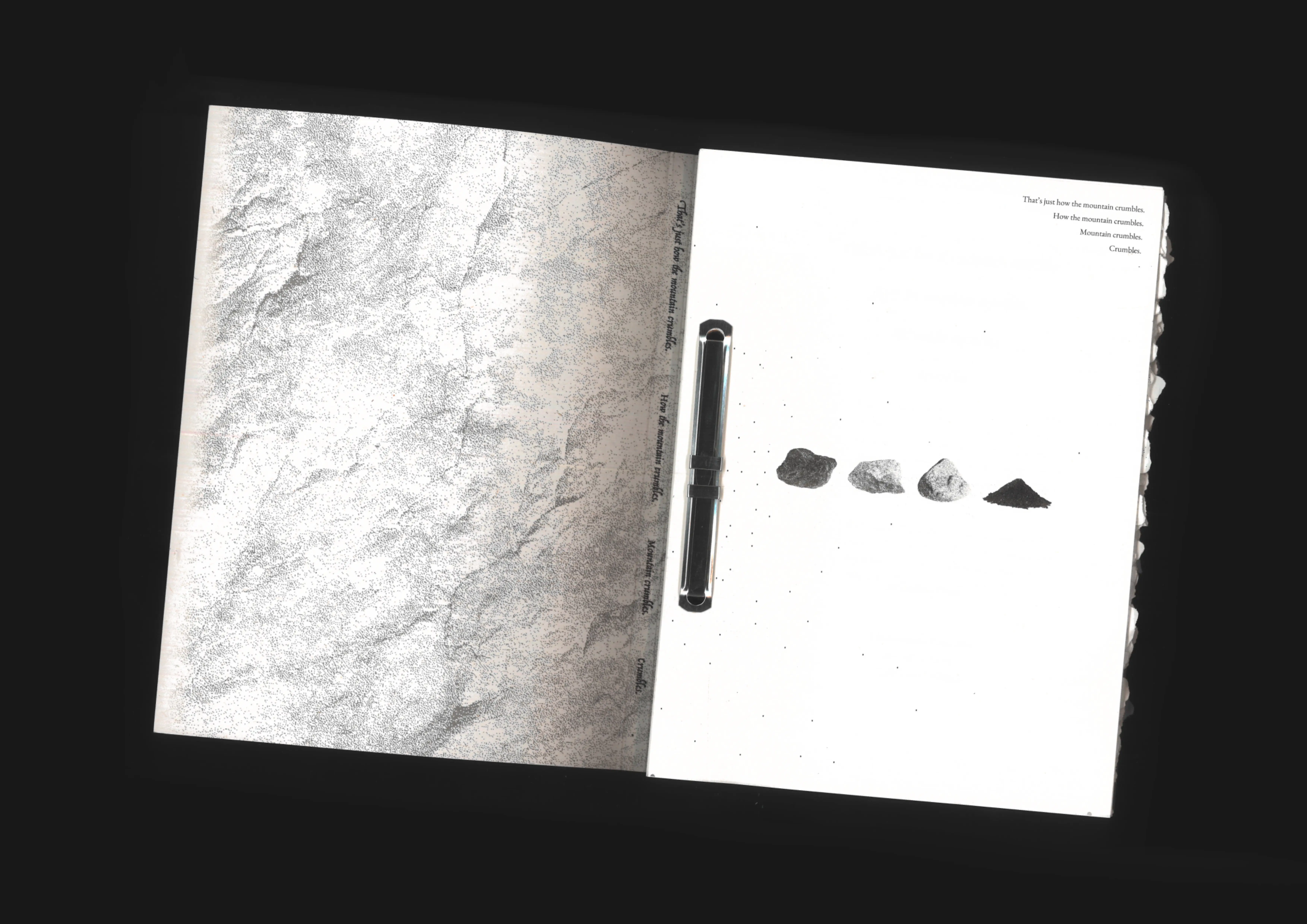

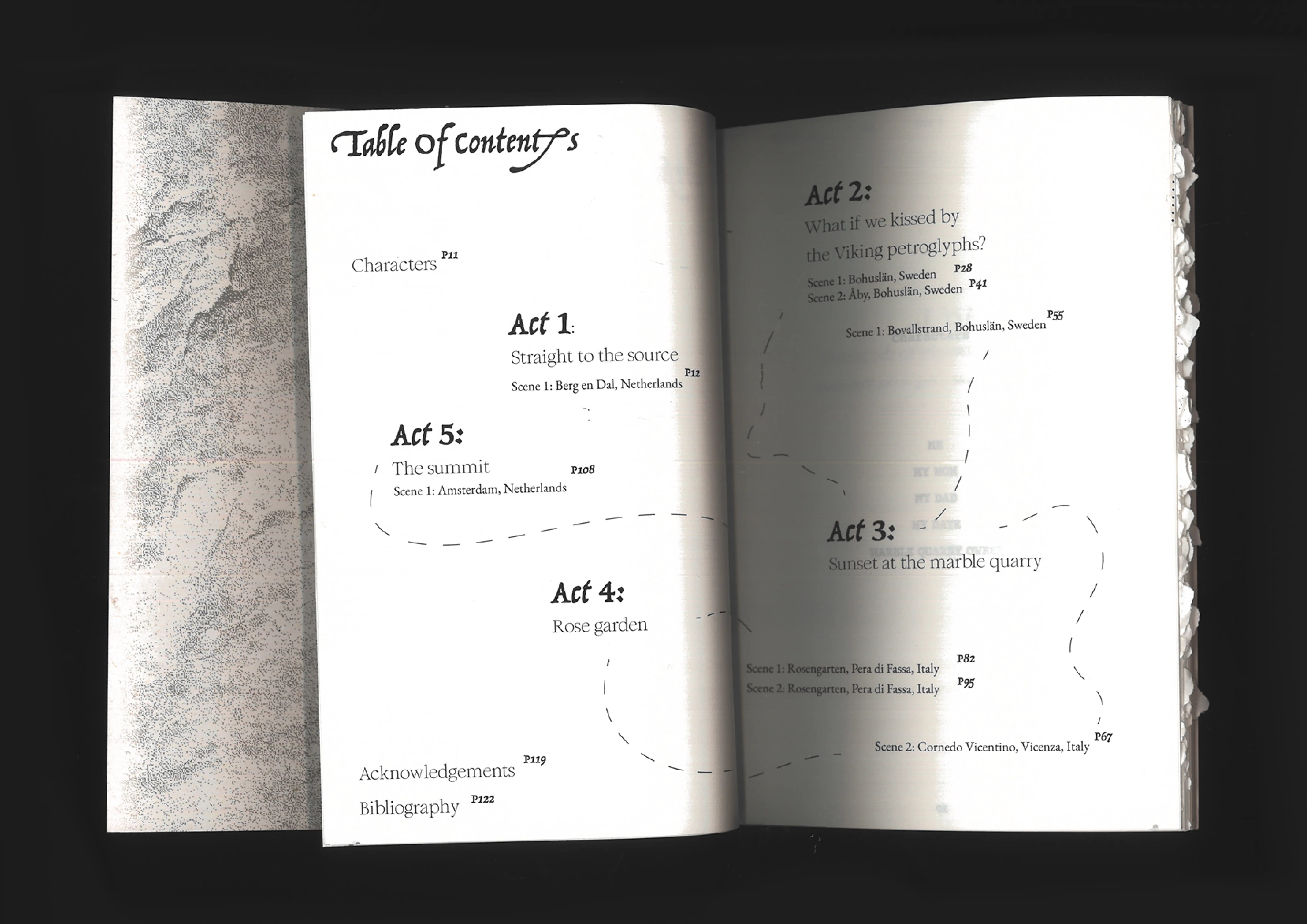
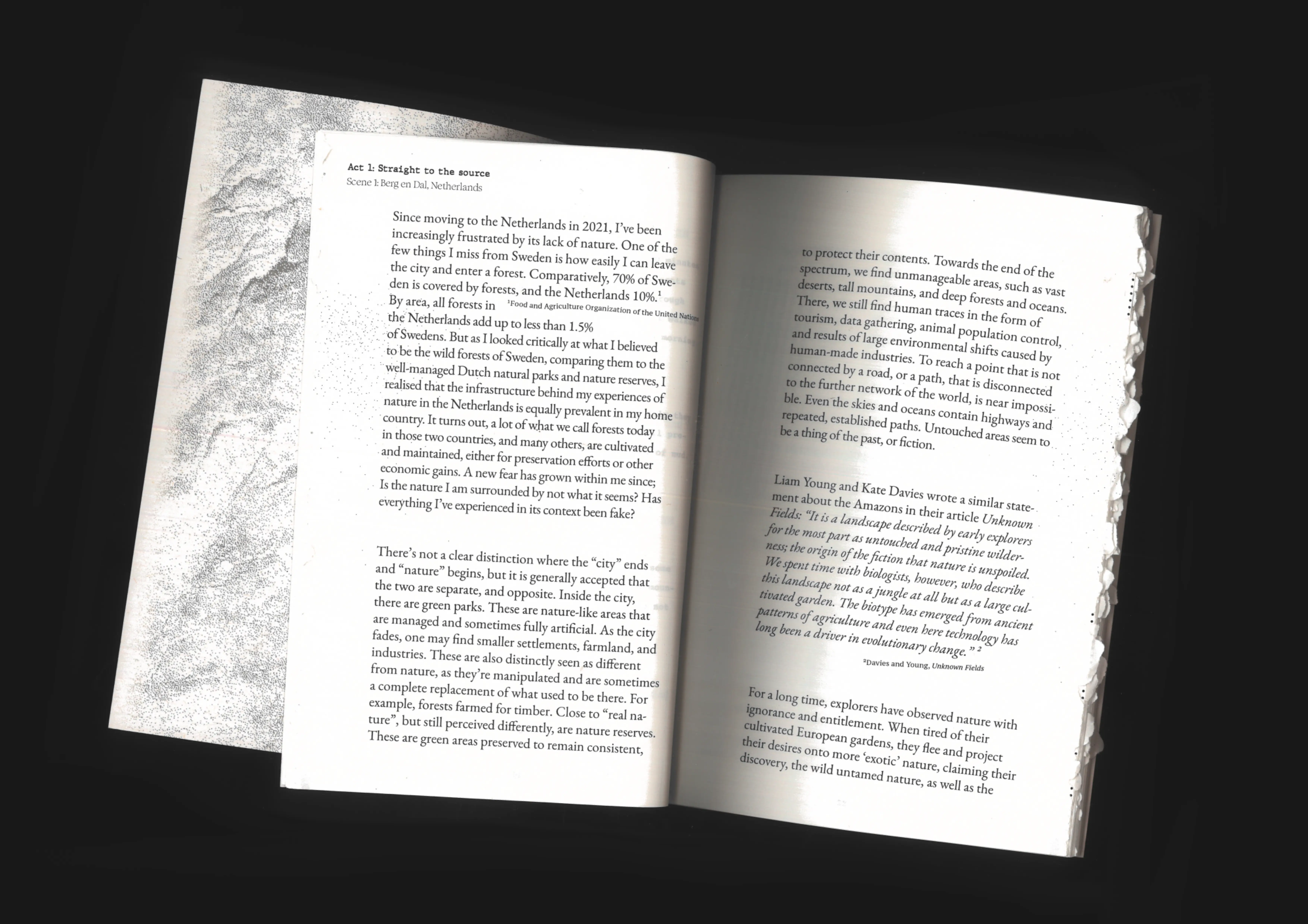

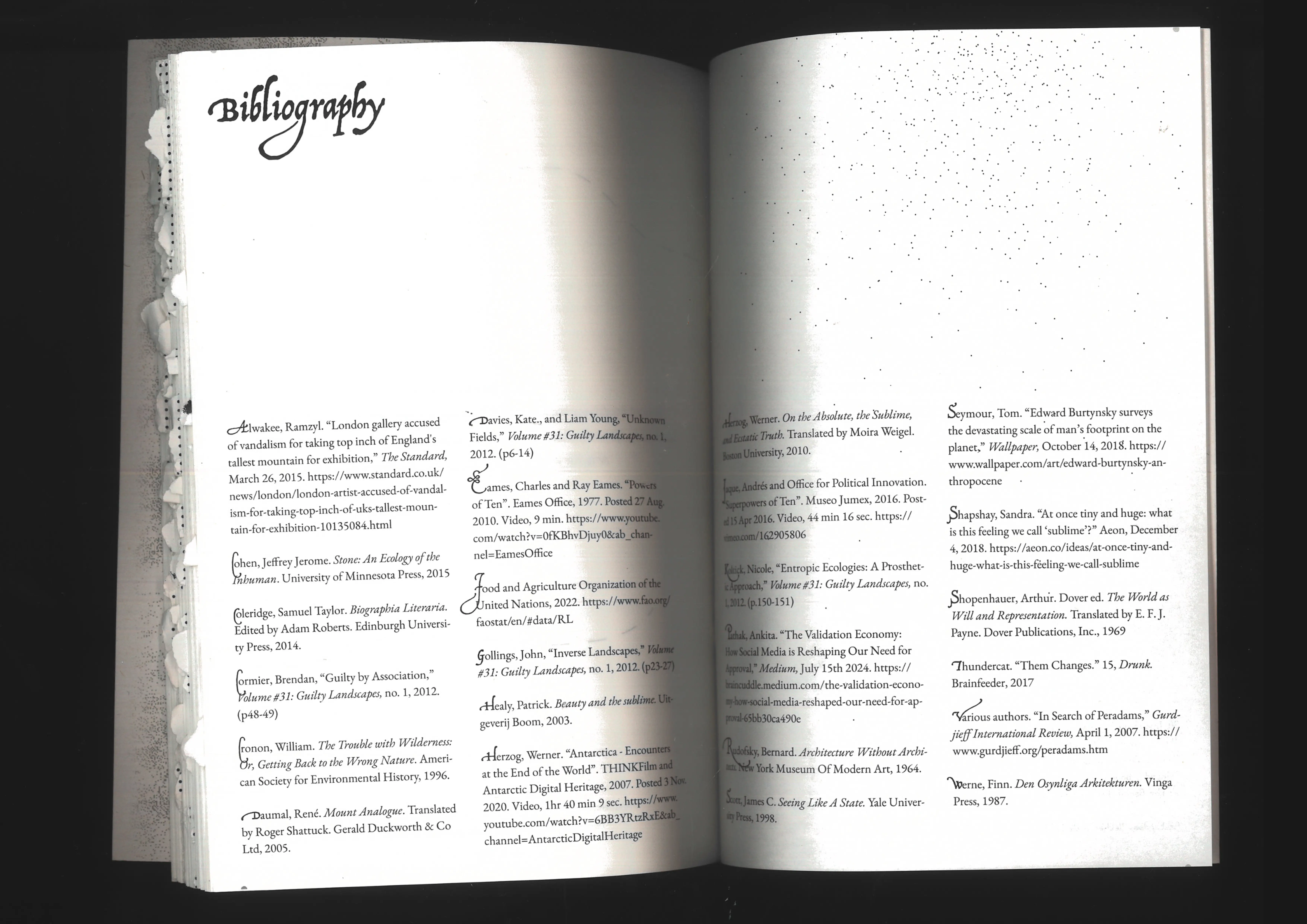
That's just how the mountain crumbles.
Editorial design
About Anthropocene, Human desire, and the Ecological Environment.
(graduation thesis design for Sara Darle Olsson)
(graduation thesis design for Sara Darle Olsson)
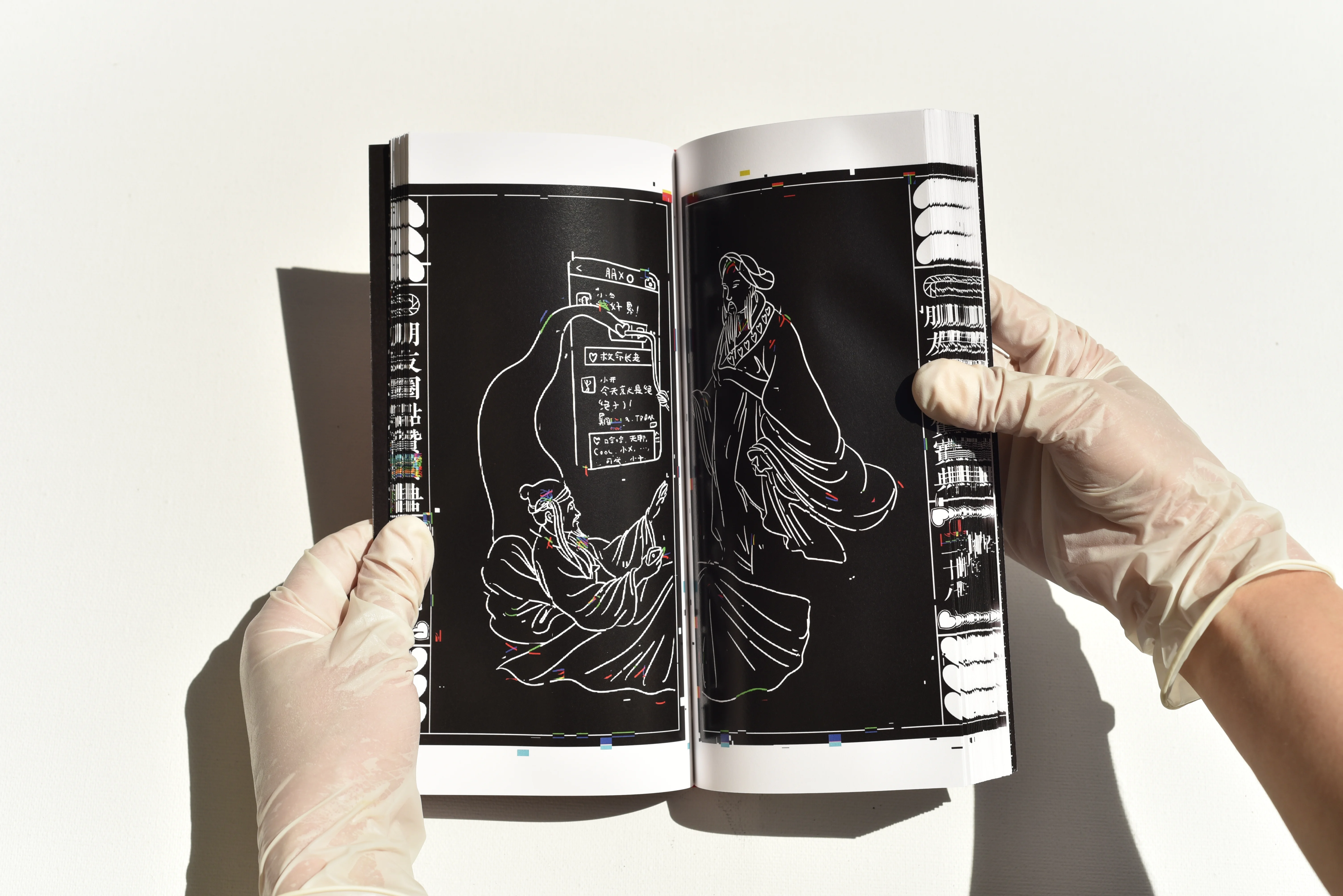
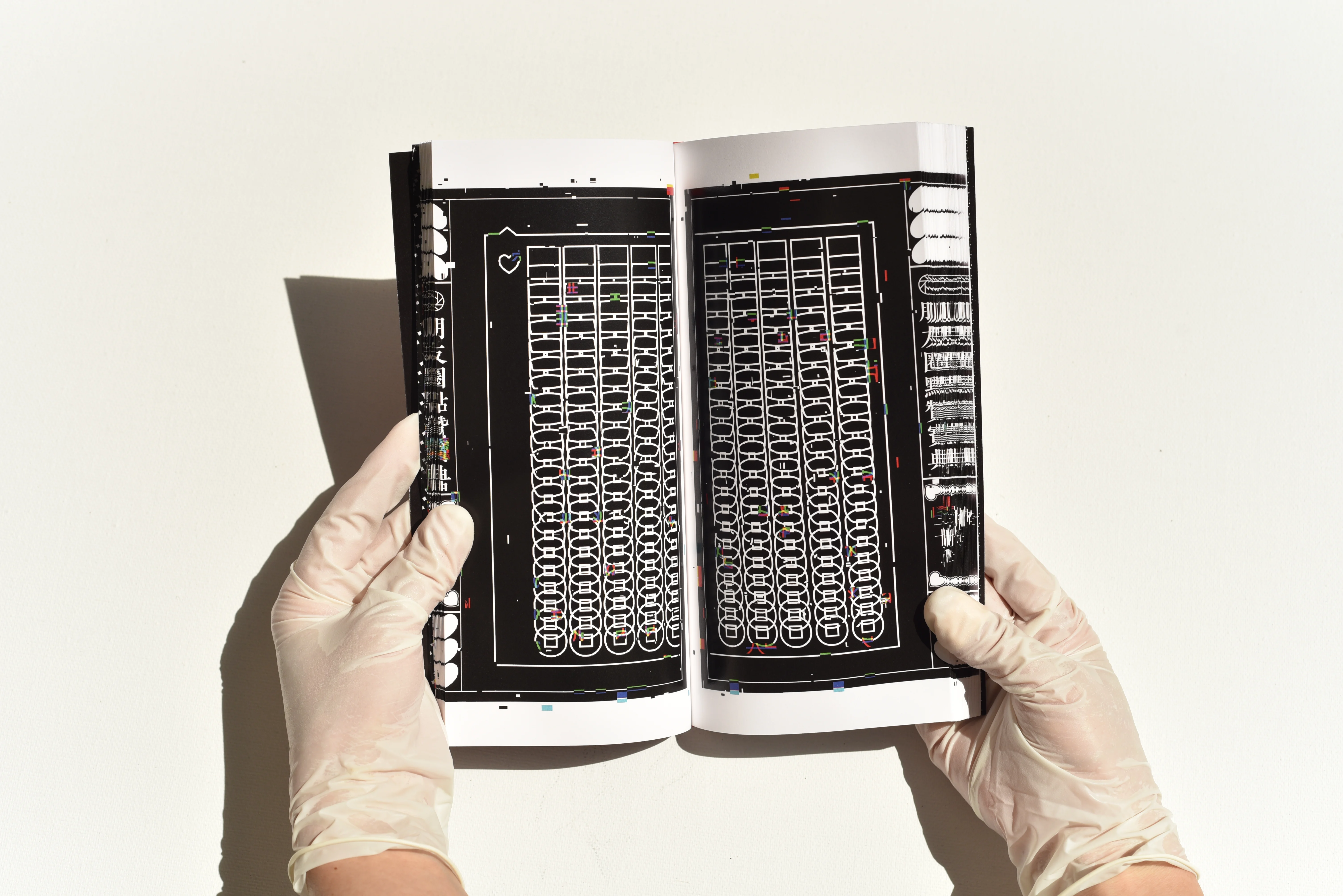
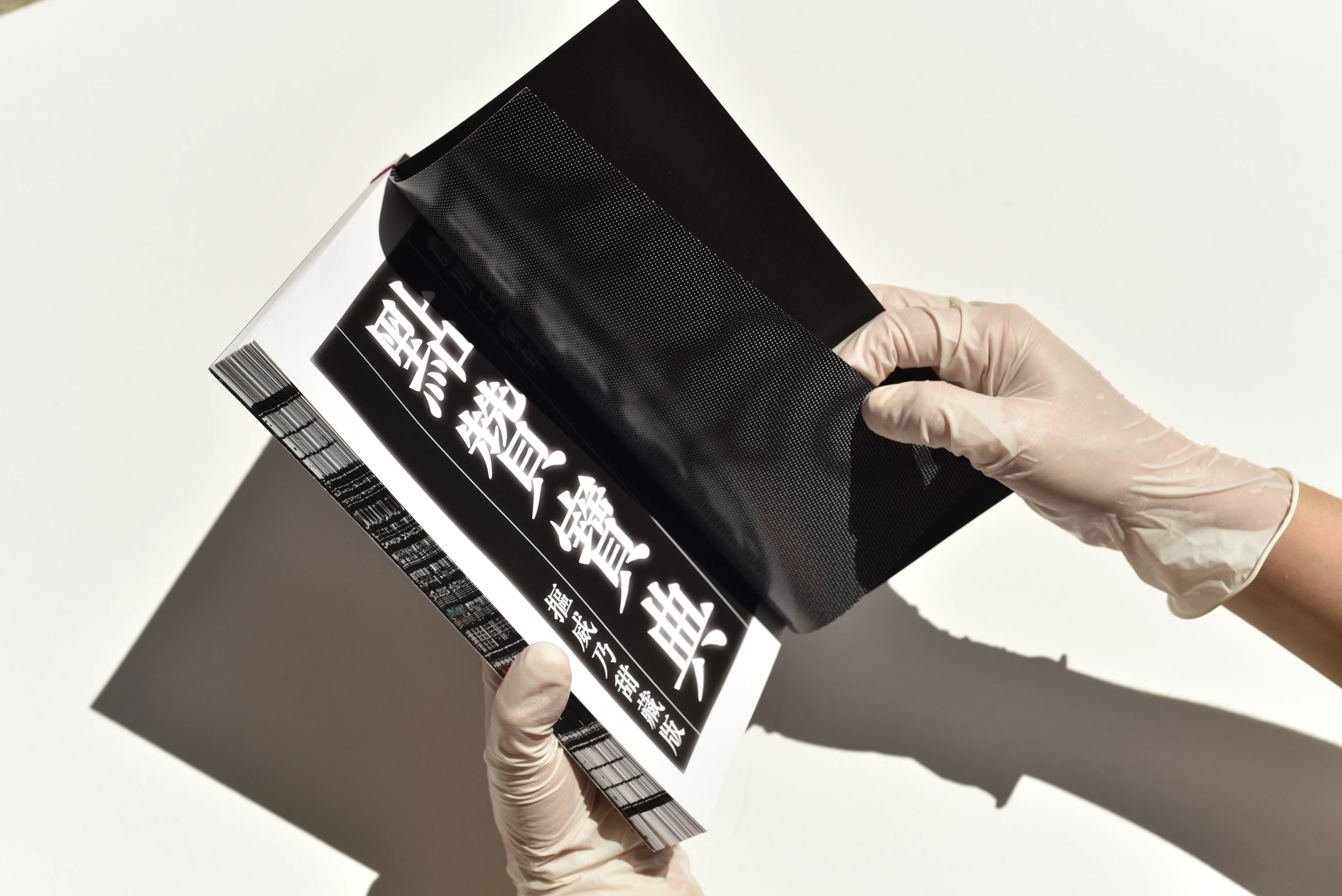
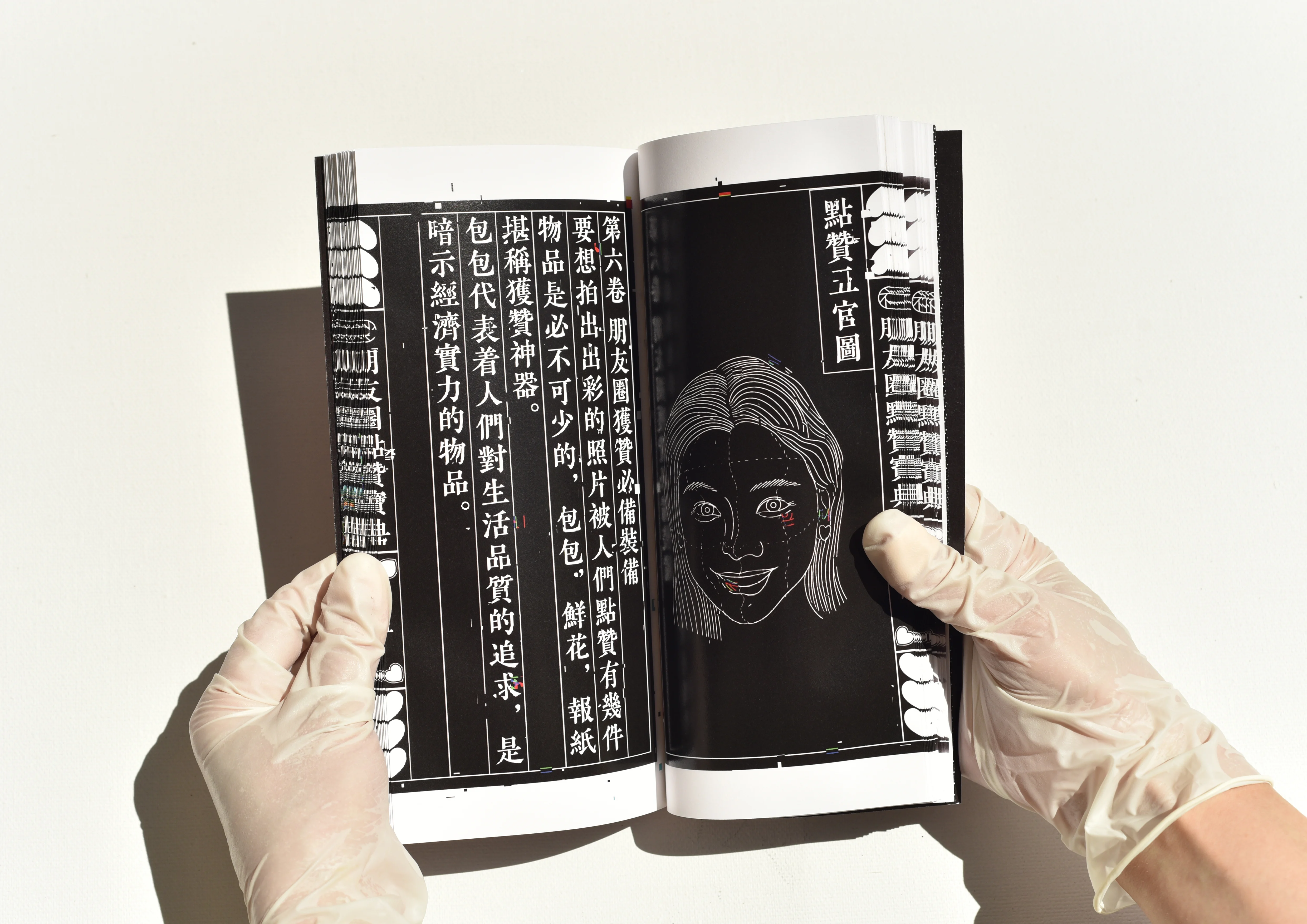
The Bible of Social Media
Digital Print
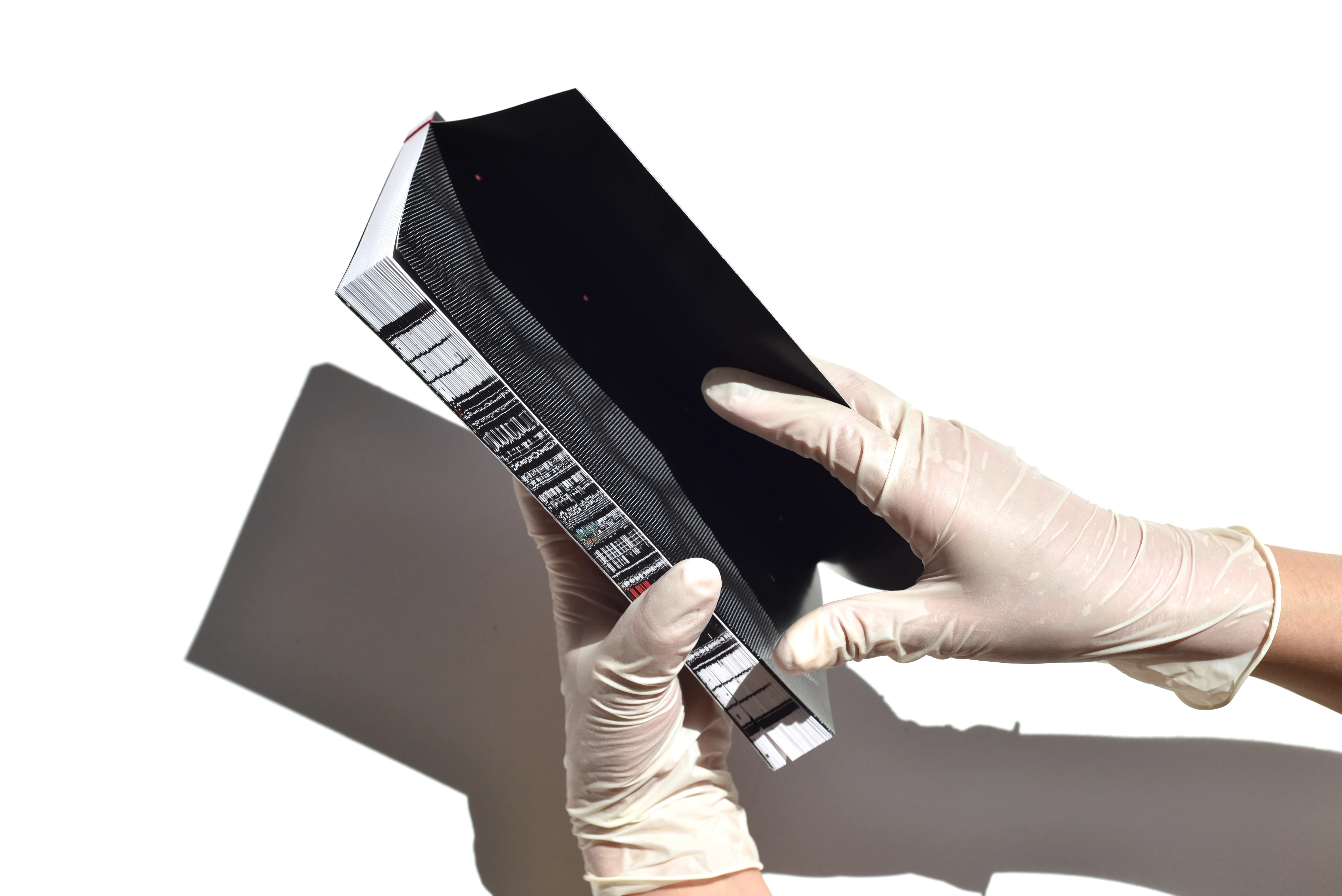
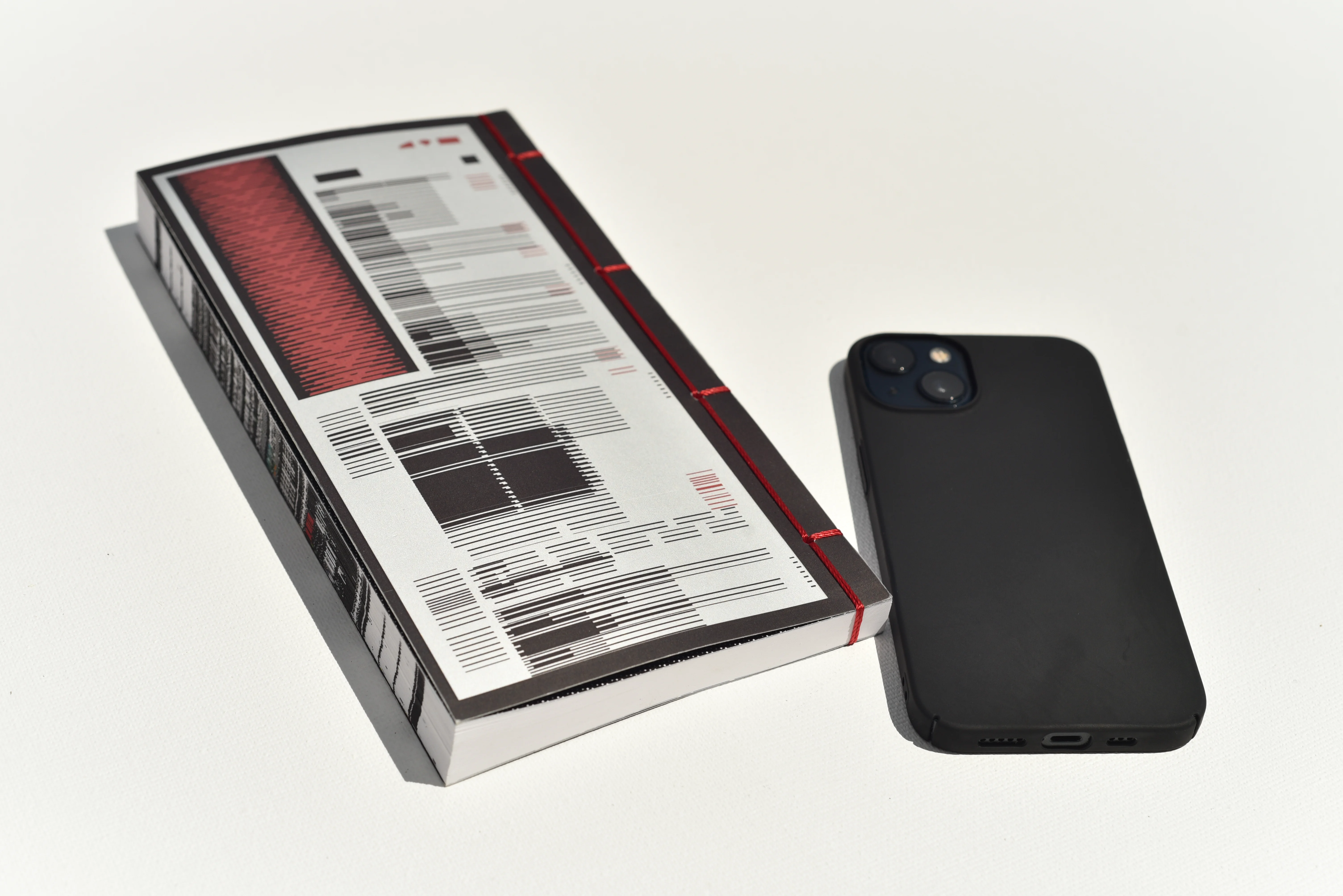
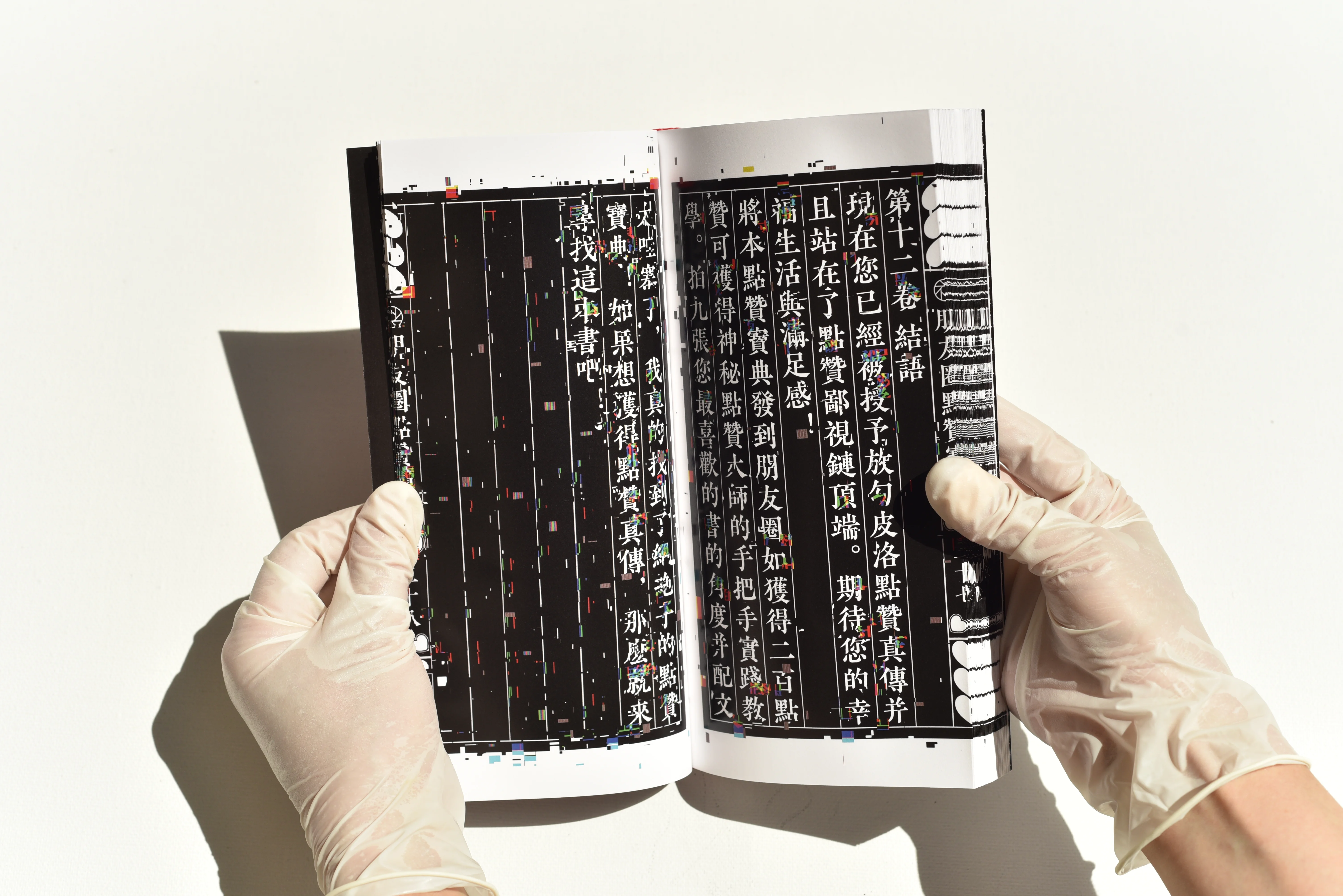
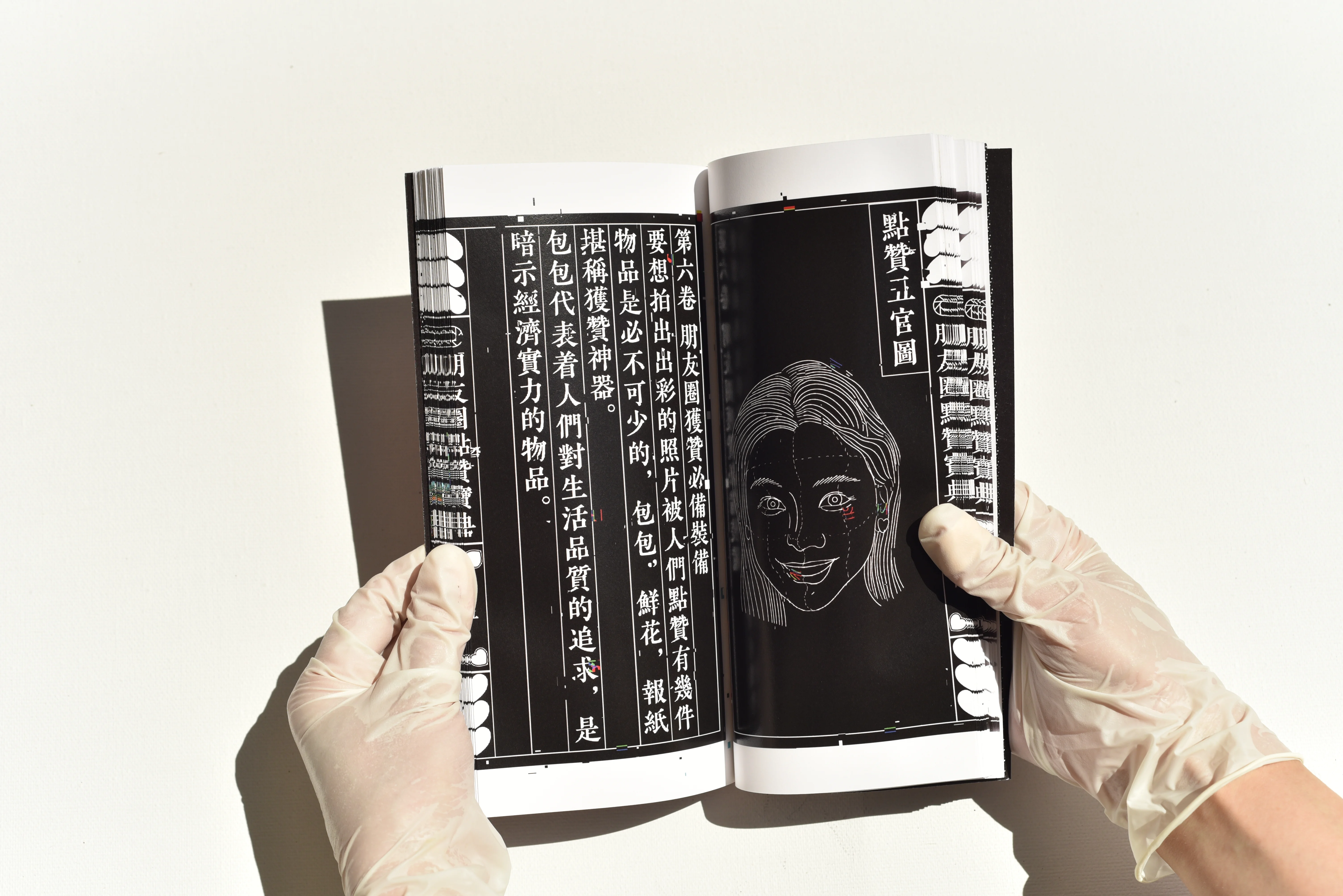
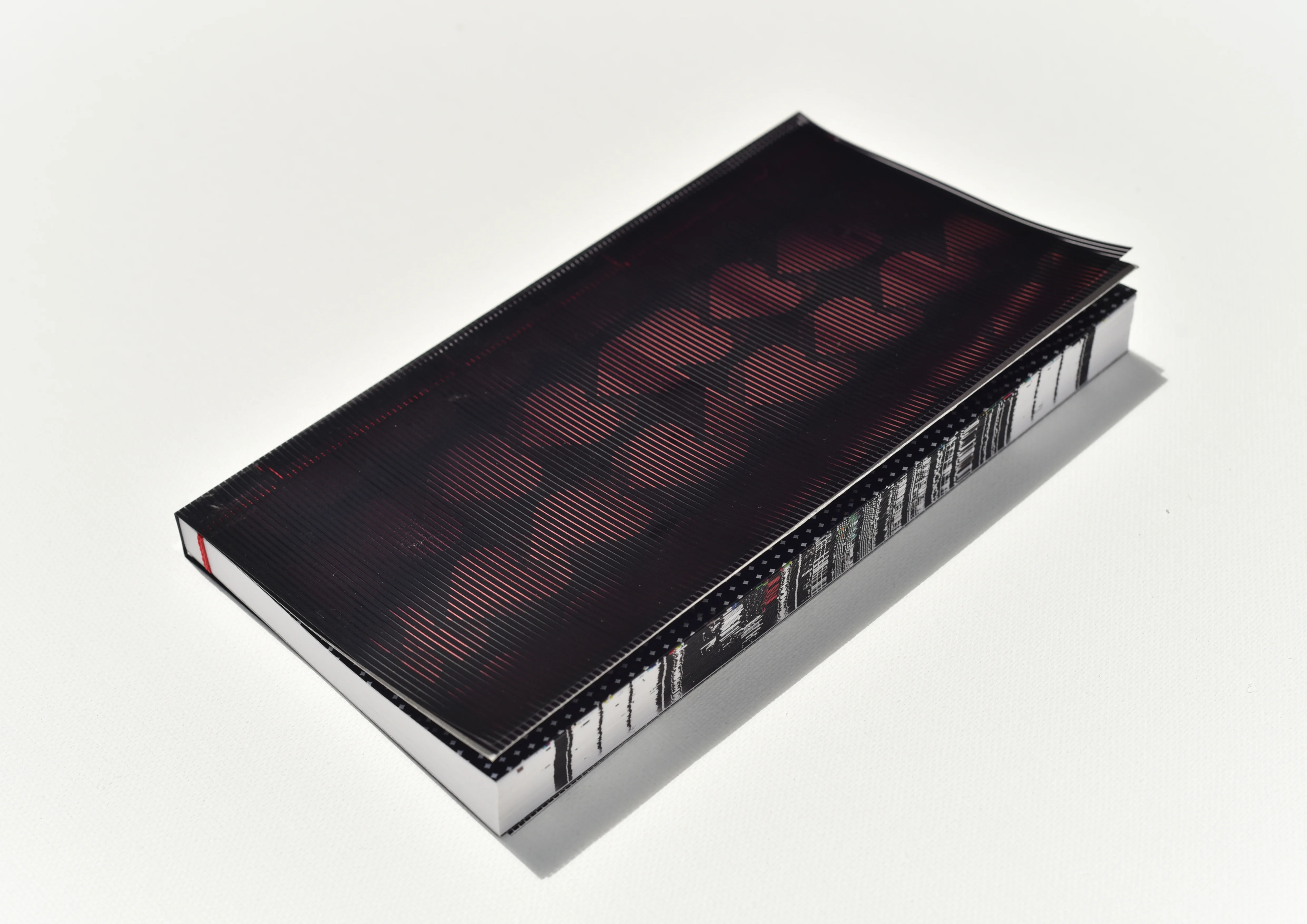
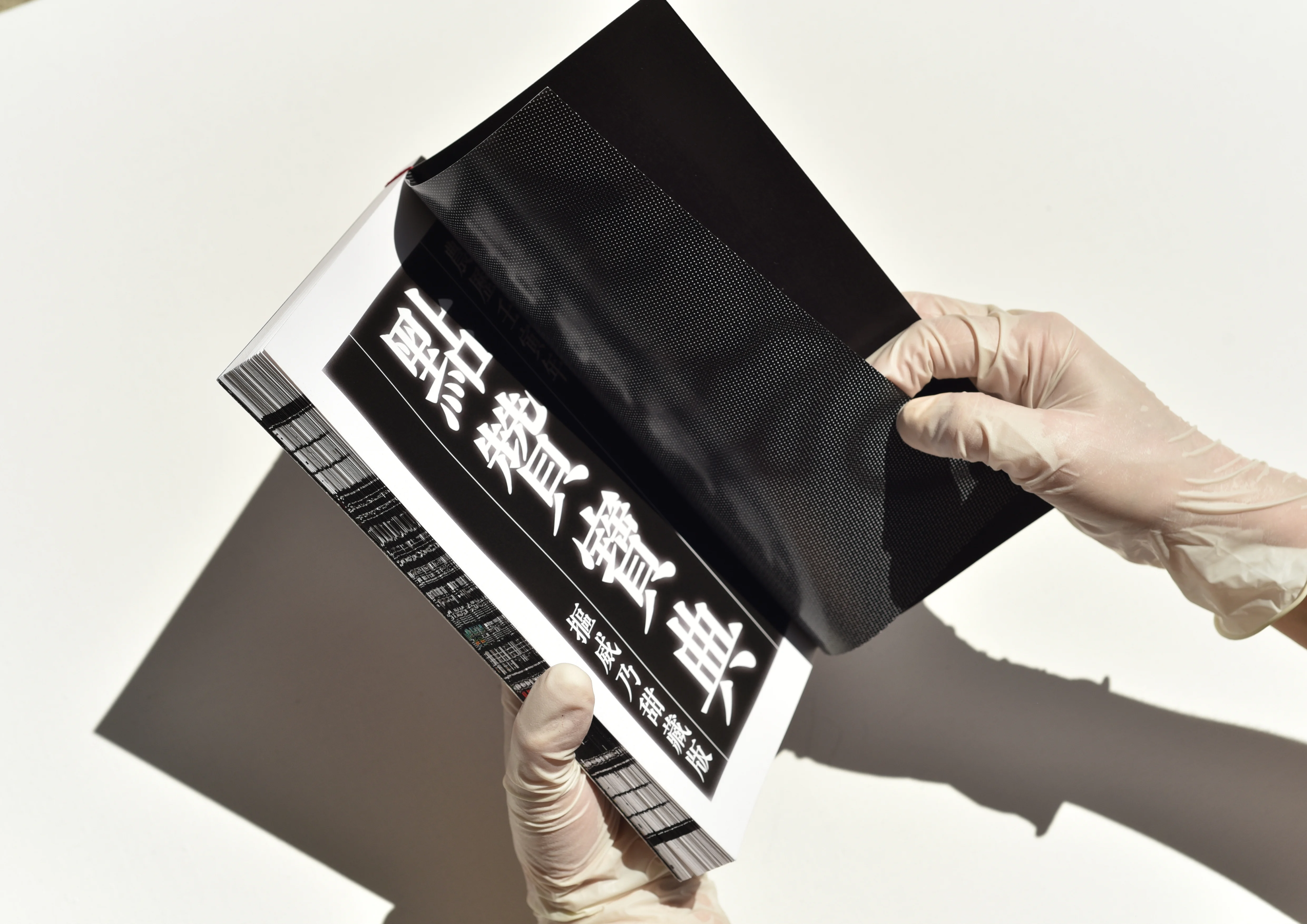
A Bible book that teaches you how to get more likes on Chinese social media. The work is intended to dramatize people’s need for likes.
I take ancient books that people used to rely on for survival as a form of metaphor and use satire to guide people to reflect on the chaos of social media nowadays.
GRA WORDS
Editorial design
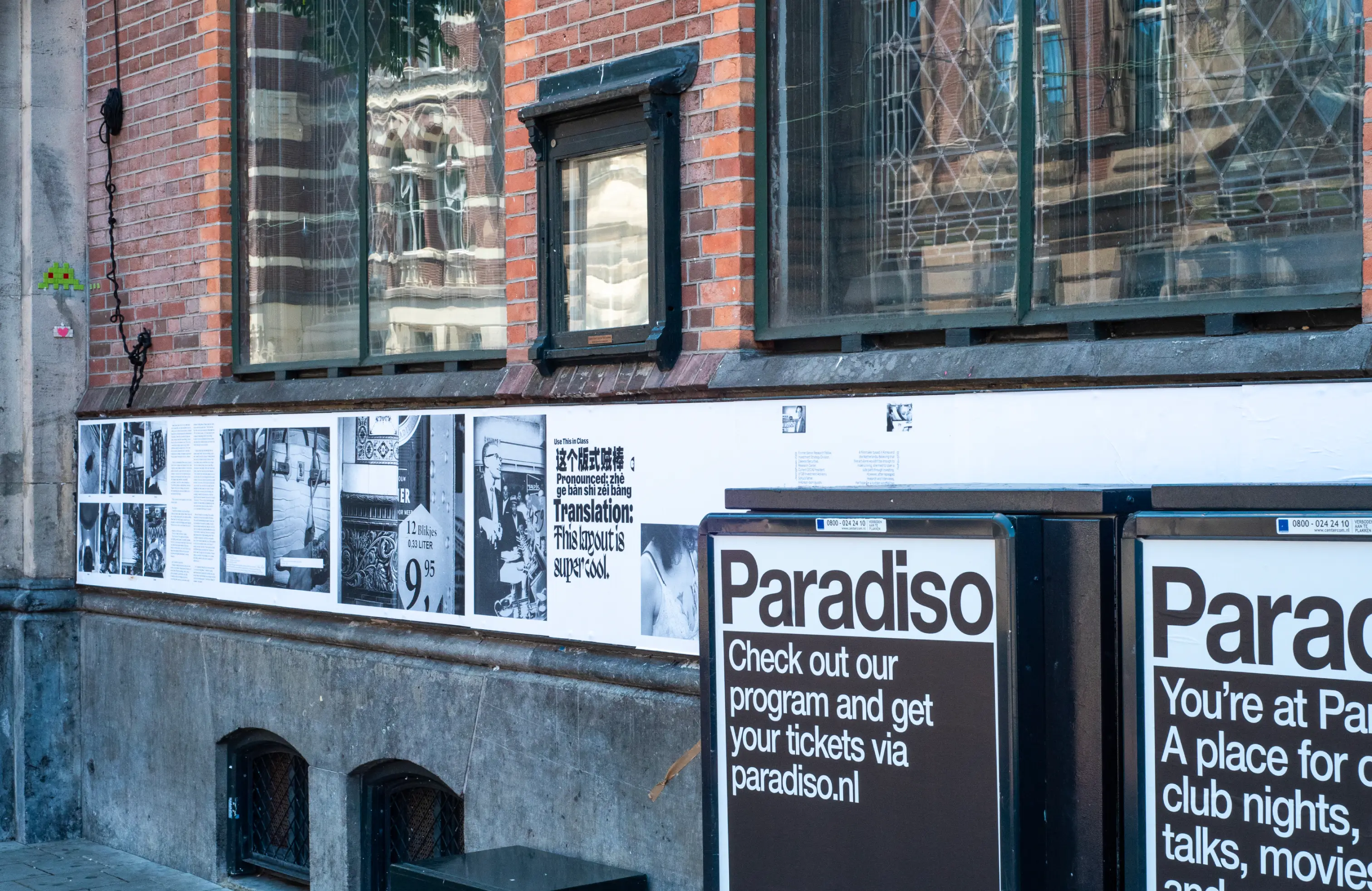
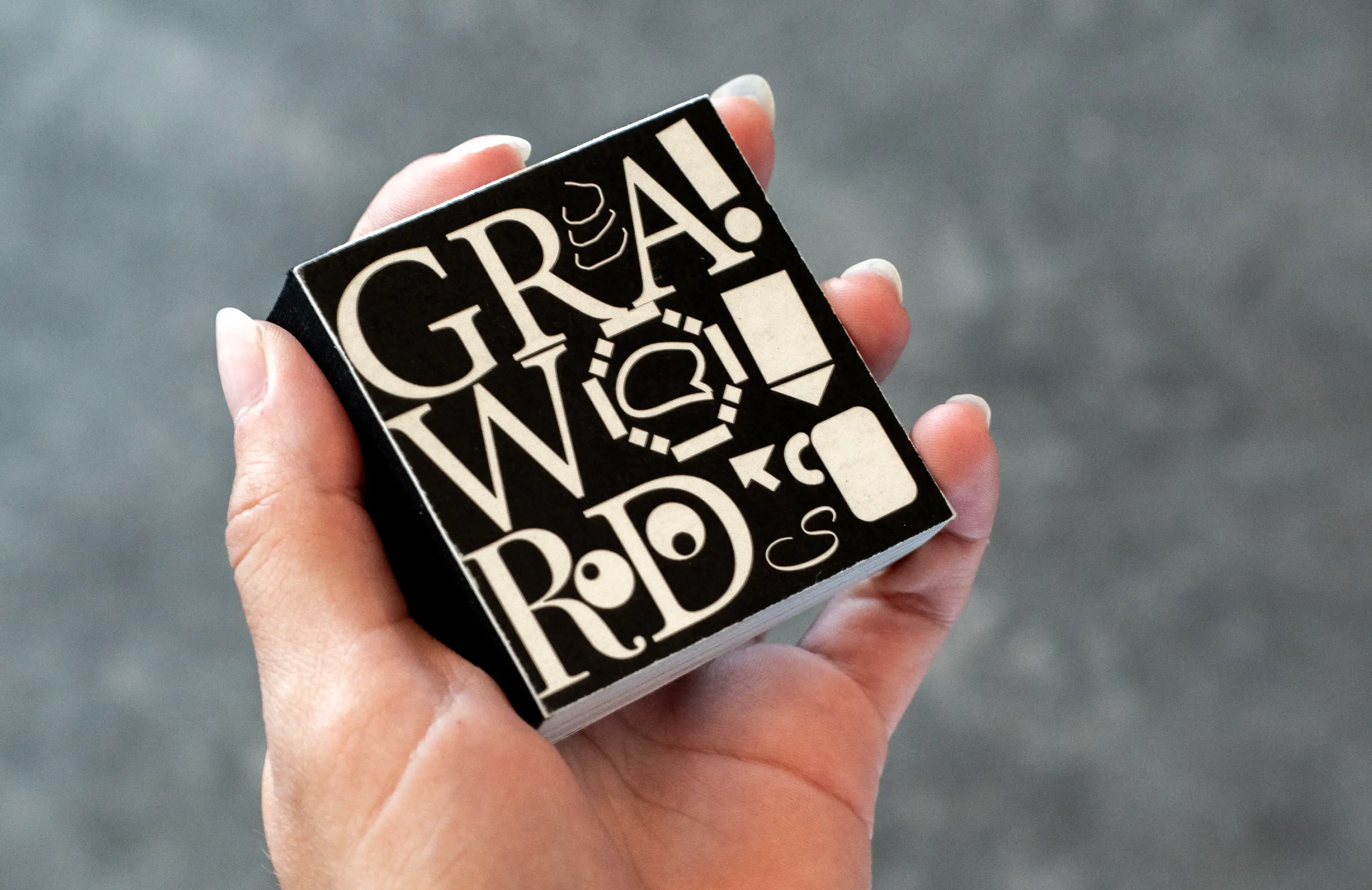
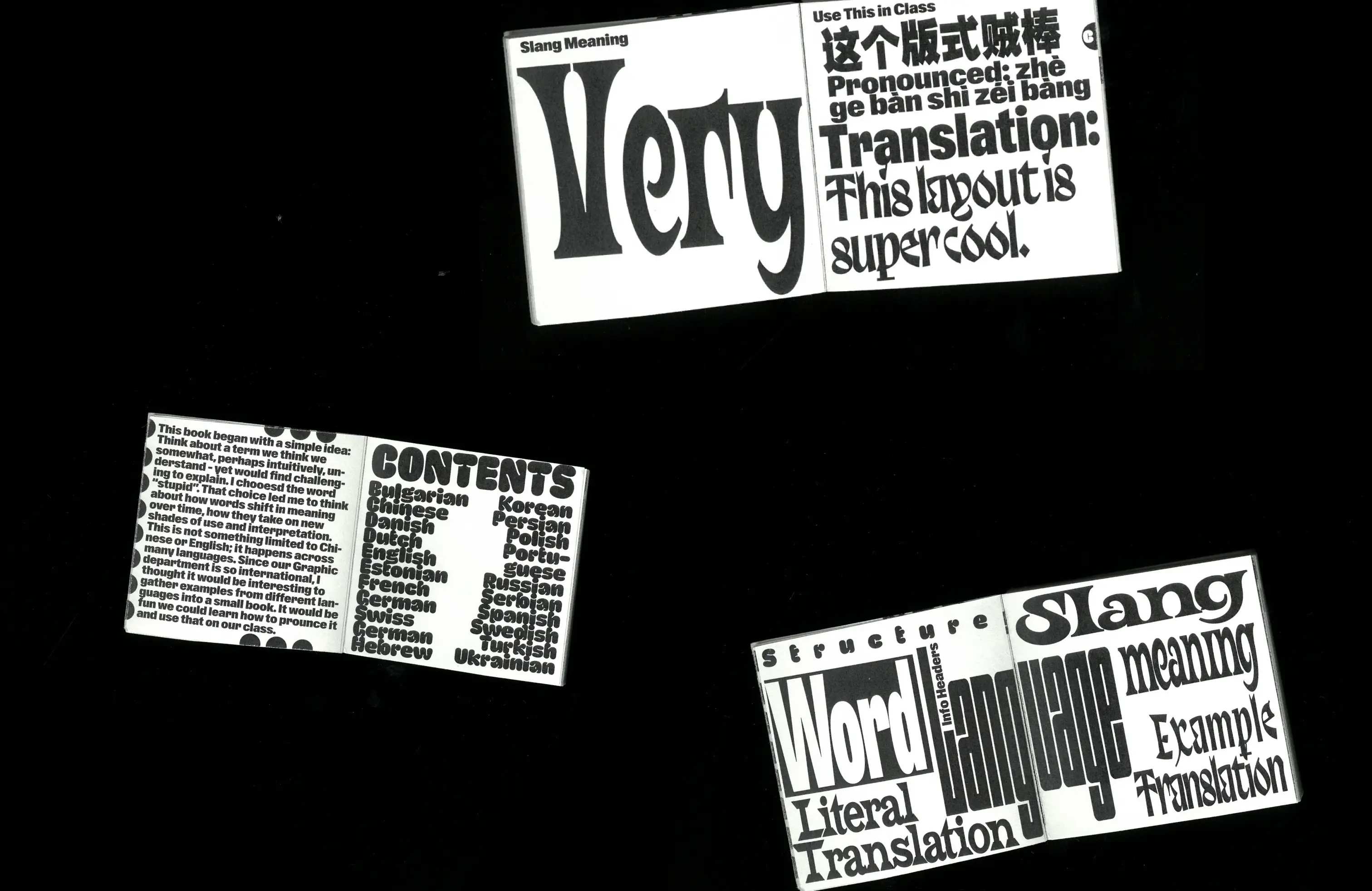
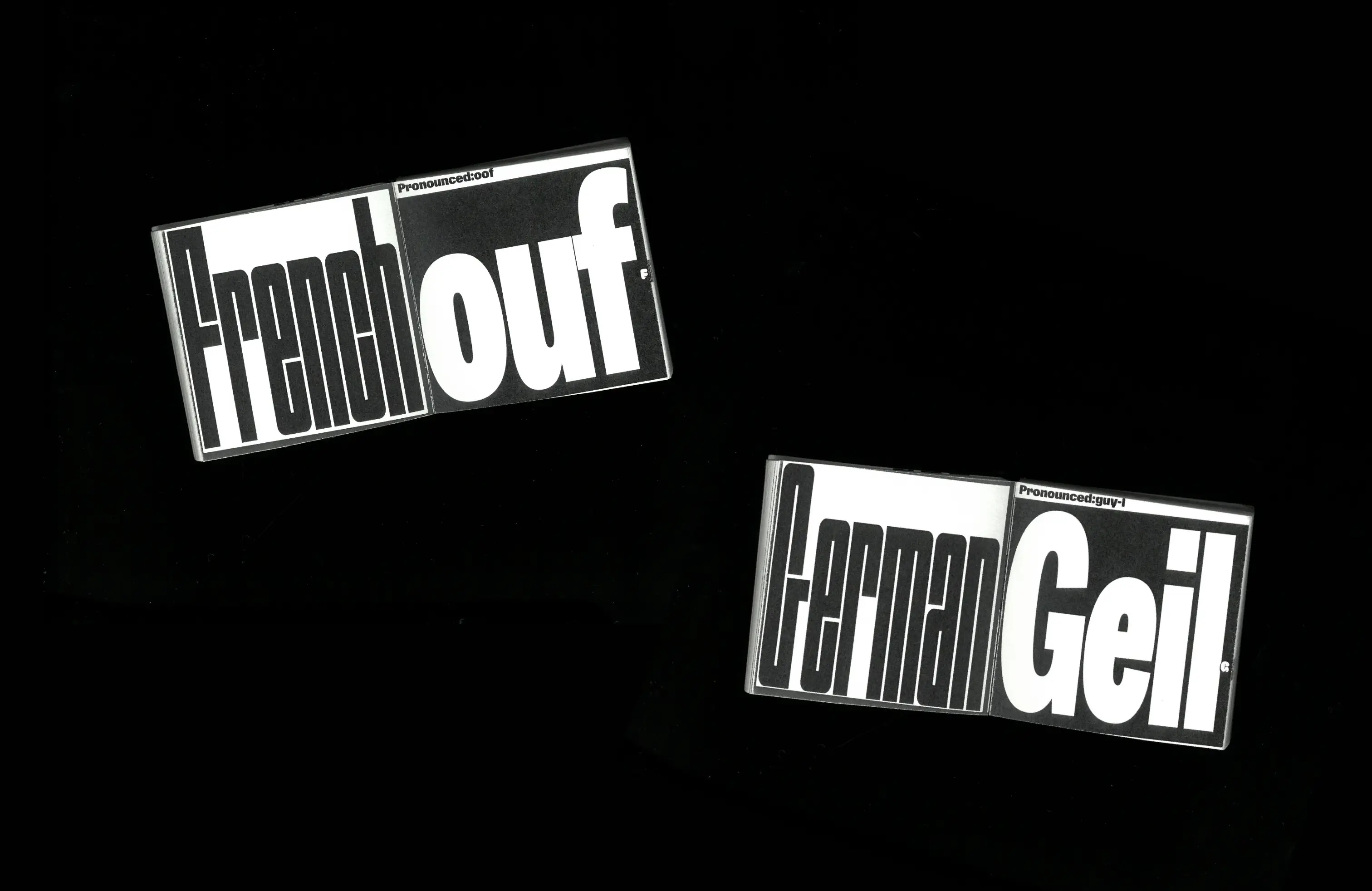
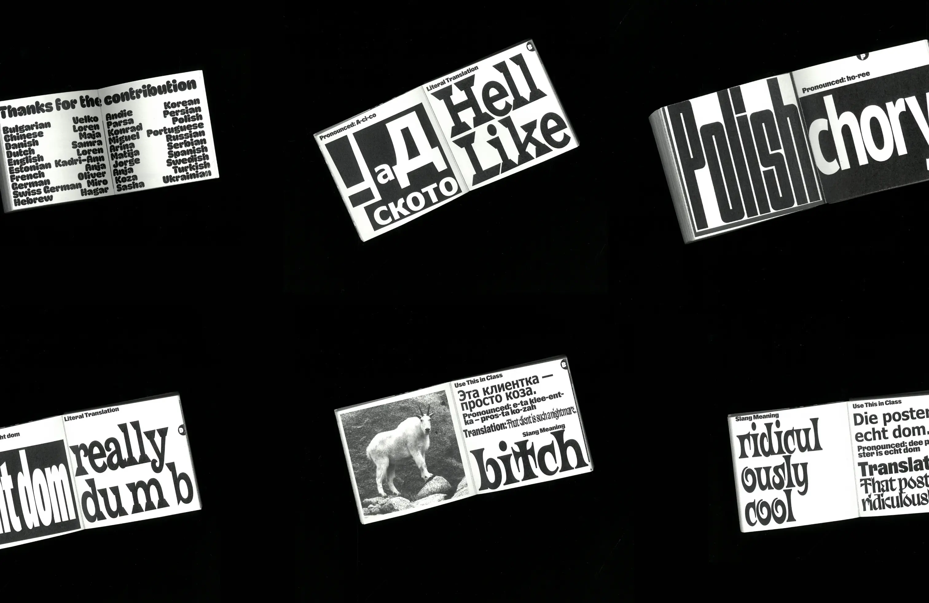
This book began with a simple idea: Think about a term we think we somewhat, perhaps intuitively, understand – yet would find challenging to explain.
I chooesd the word “stupid”. That choice led me to think about how words shift in meaning over time, how they take on new shades of use and interpretation. This is not something limited to Chinese or English; it happens across many languages.
I chooesd the word “stupid”. That choice led me to think about how words shift in meaning over time, how they take on new shades of use and interpretation. This is not something limited to Chinese or English; it happens across many languages.
“Here and There” issue 1
Editorial design
(Coming soon...)
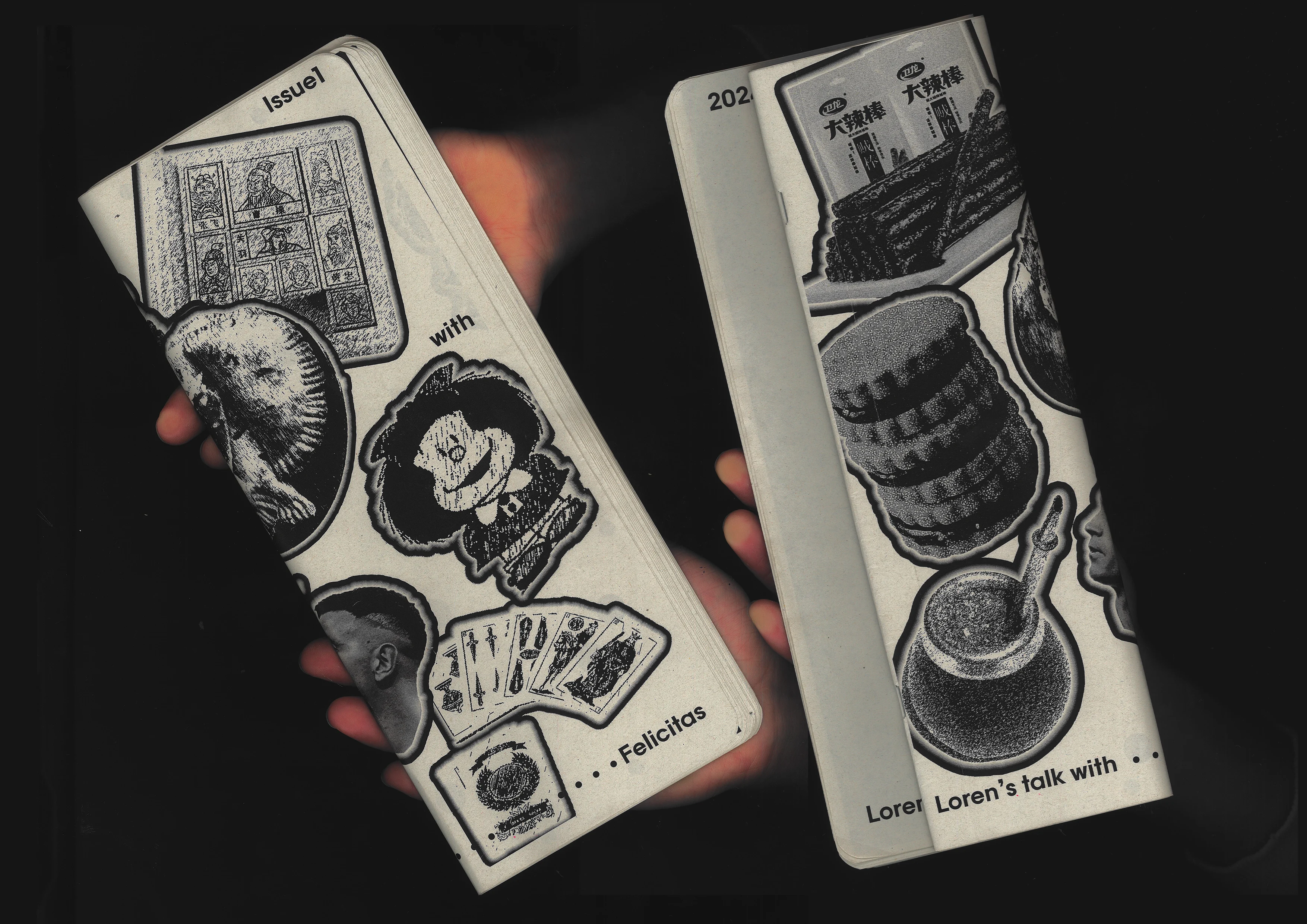
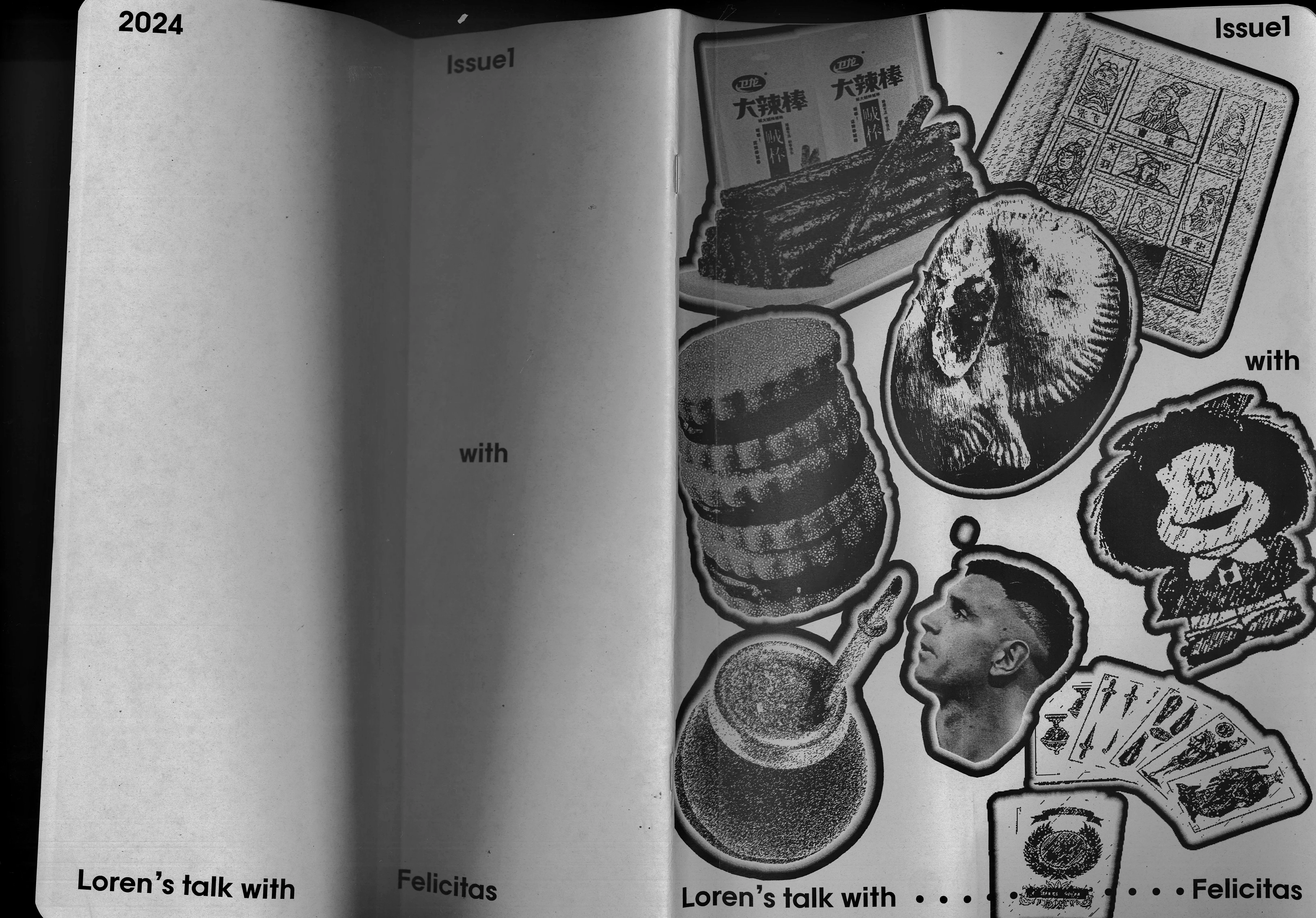
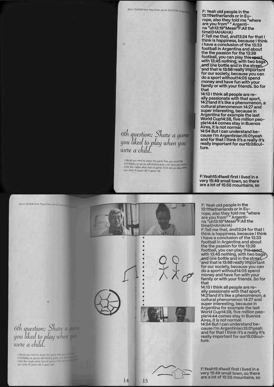
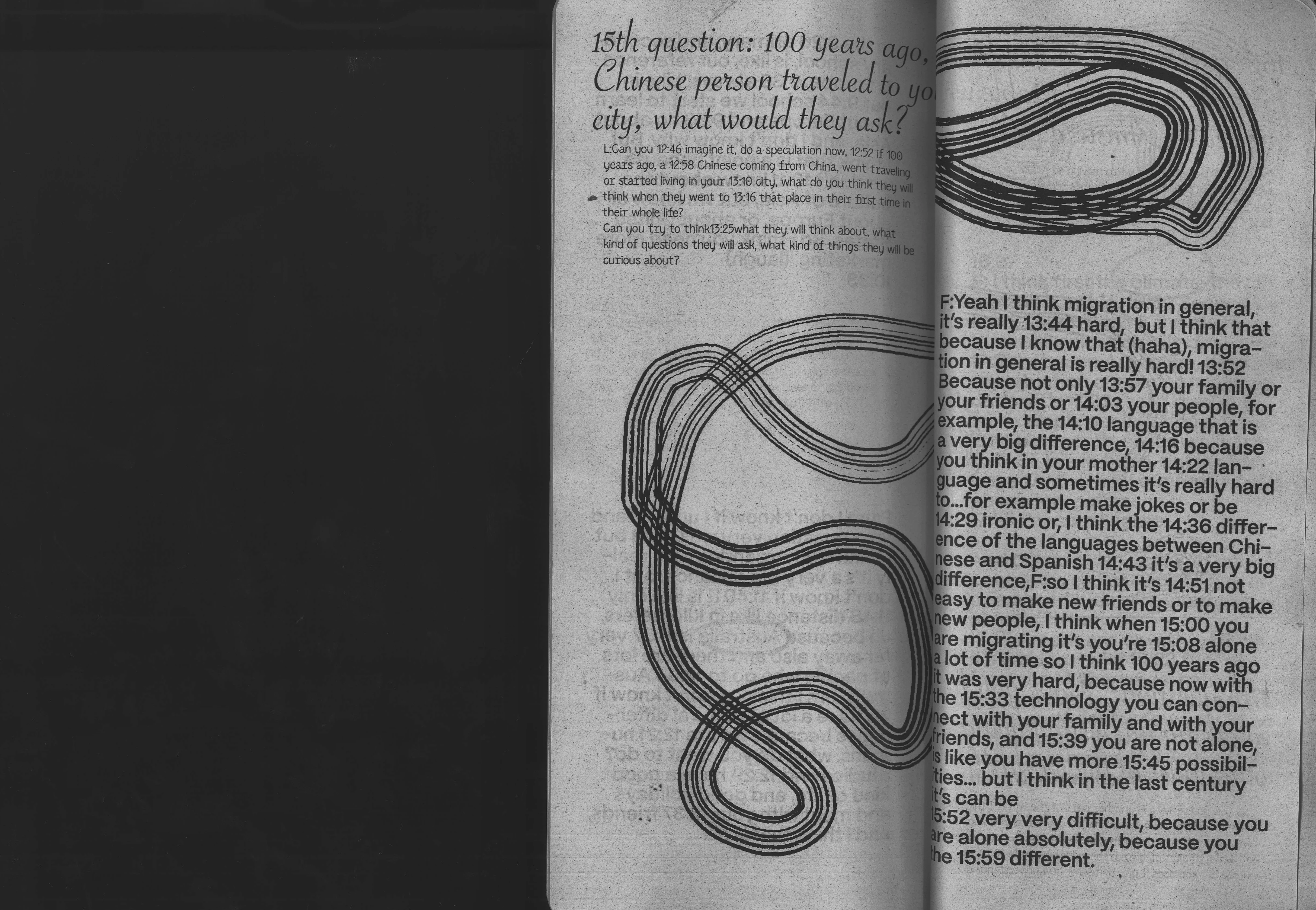
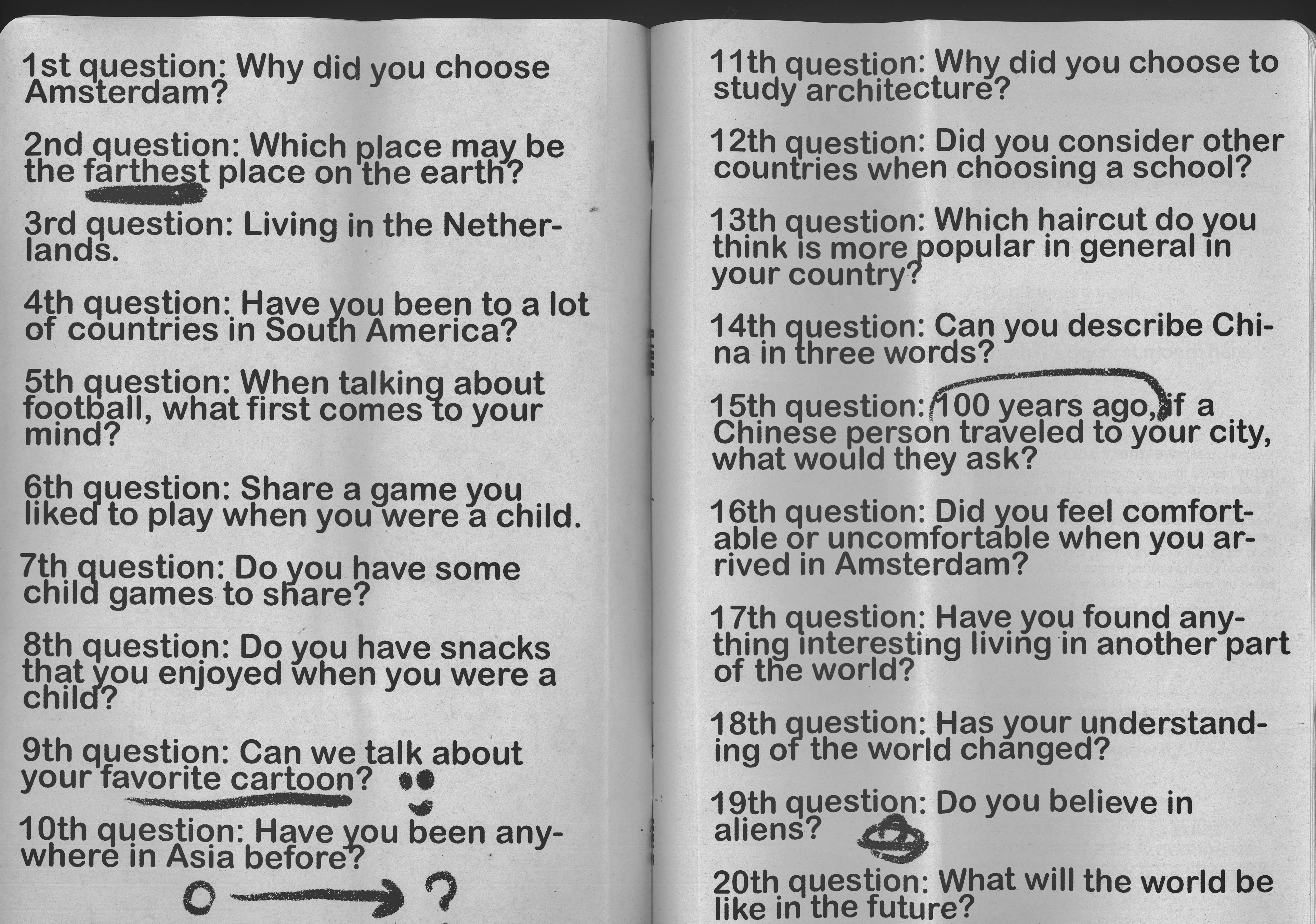
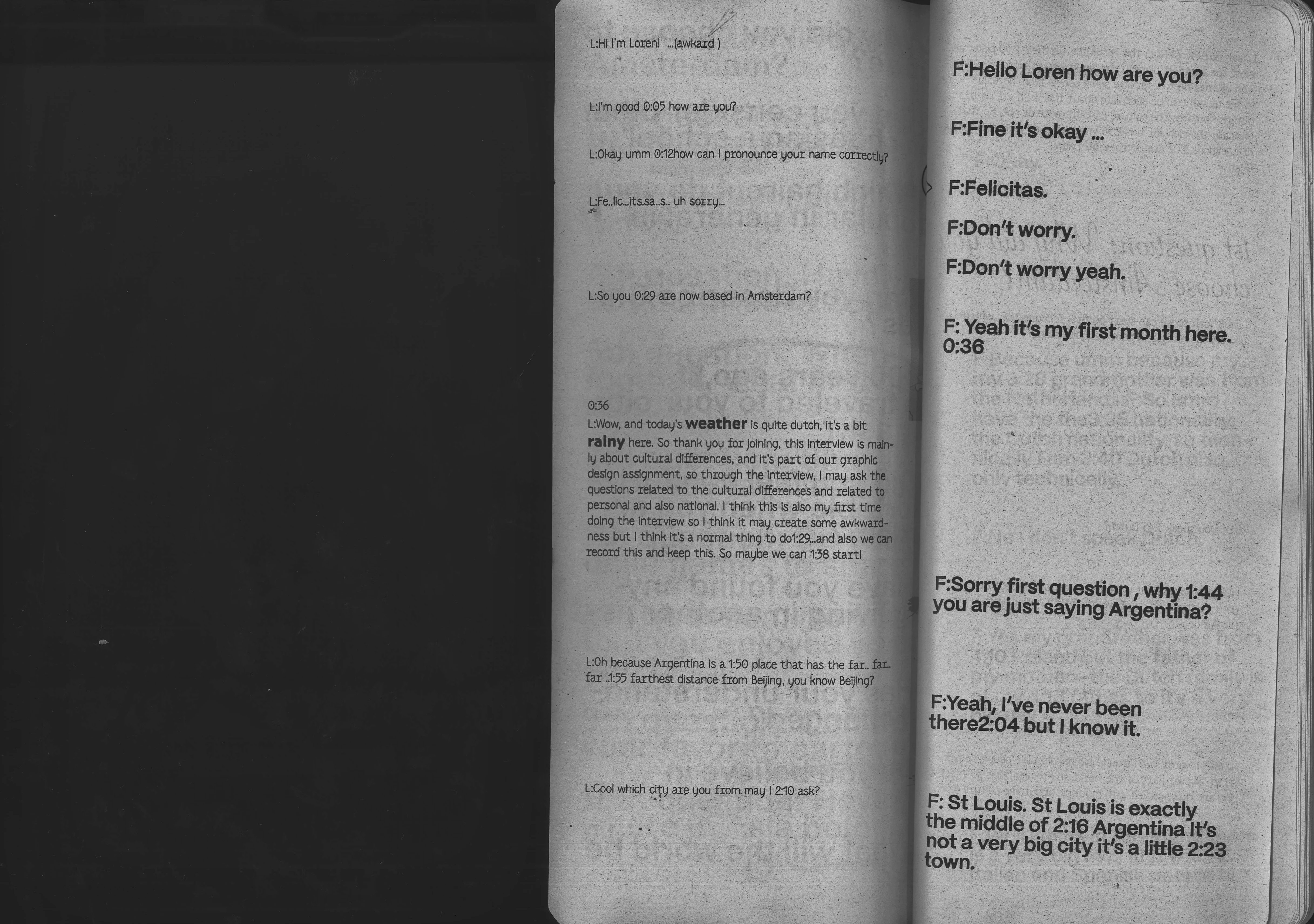
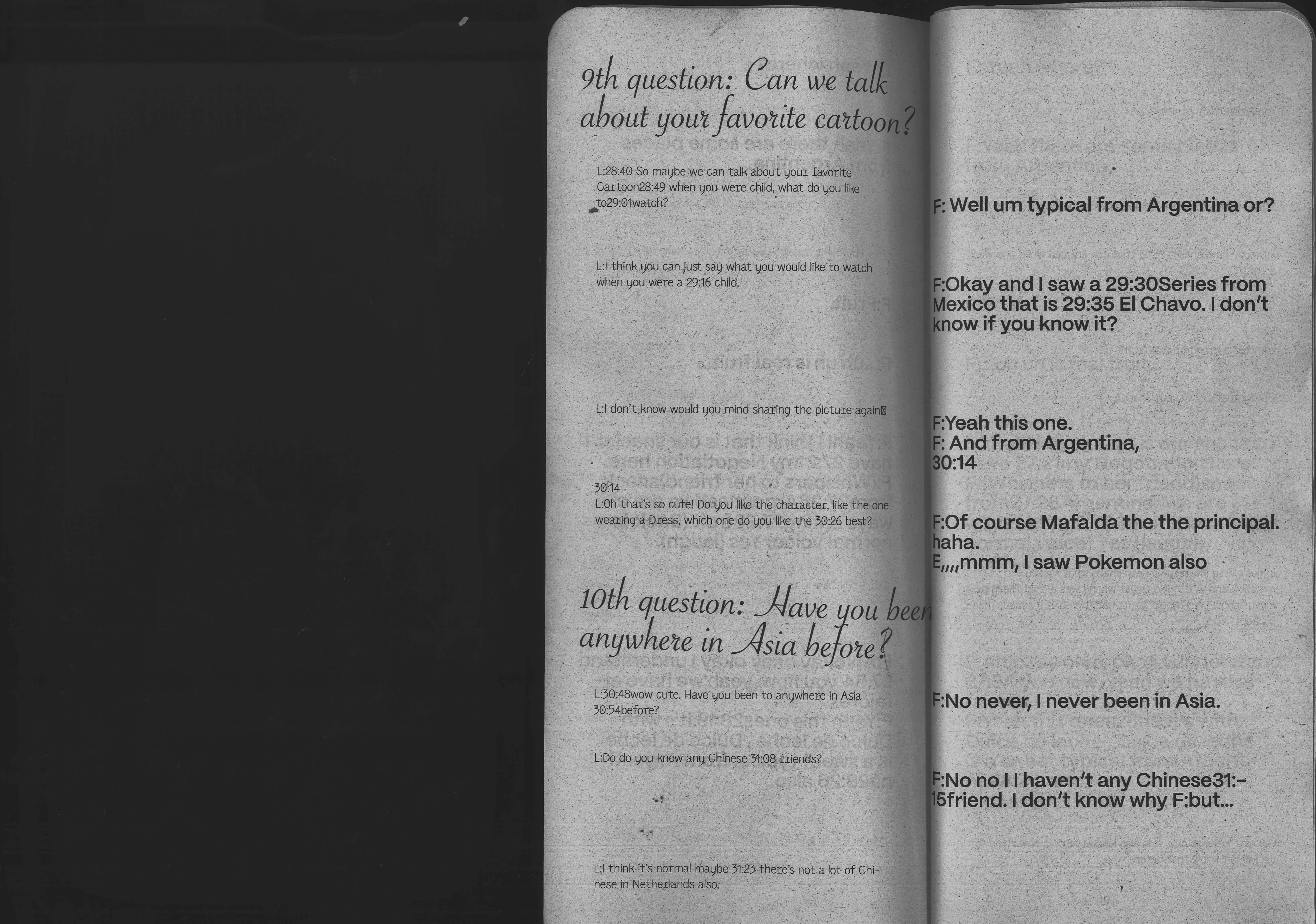
“Here and There” is an interview publication exploring differences. My point of departure was an Argentinian because she lives in the place that is geographically the farthest from Beijing. I wanted to see how this physical distance might affect cultural differences, as distance is an objective, measurable factor.
Jerome Ellis’s Poem Translation
Editorial design
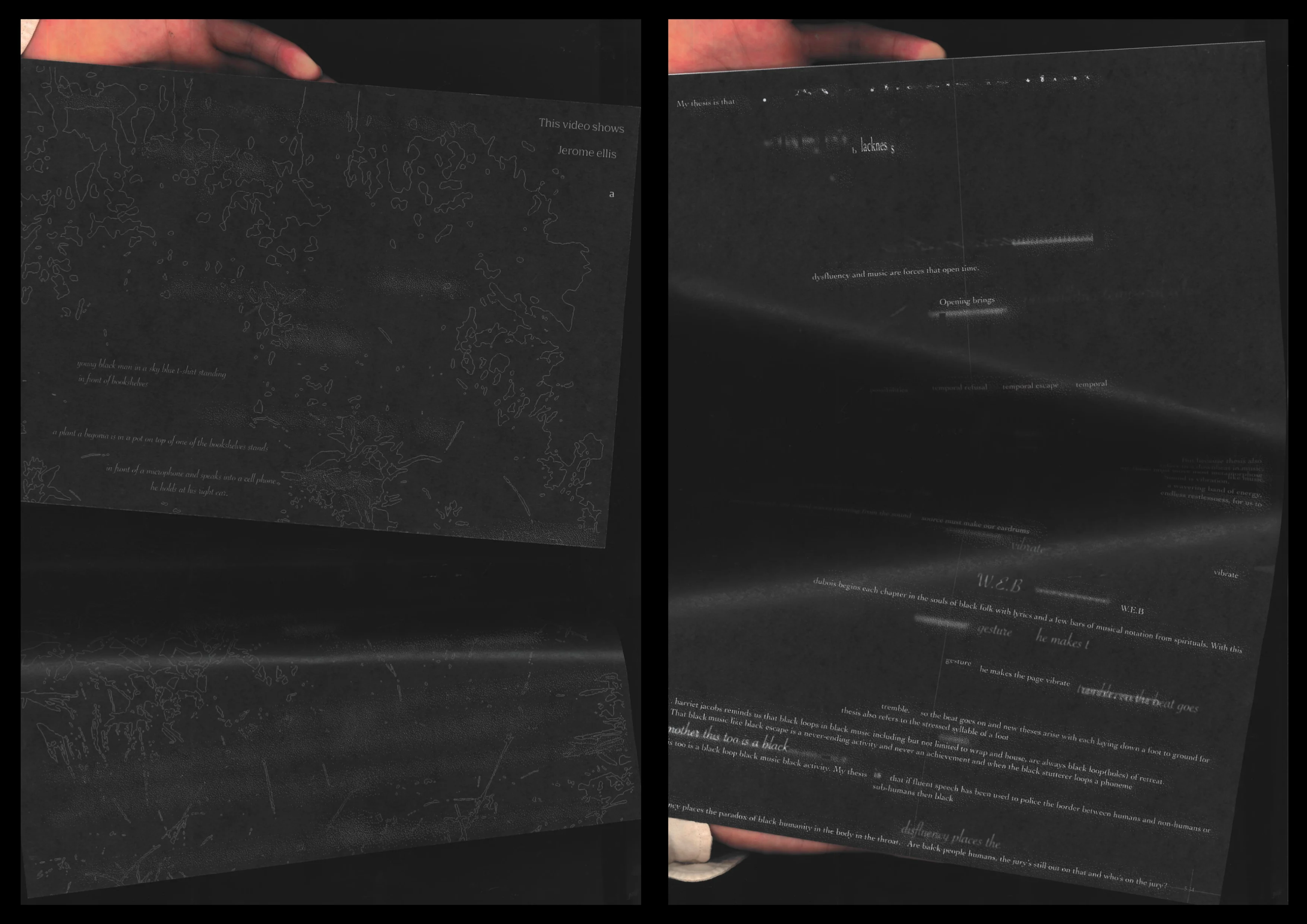
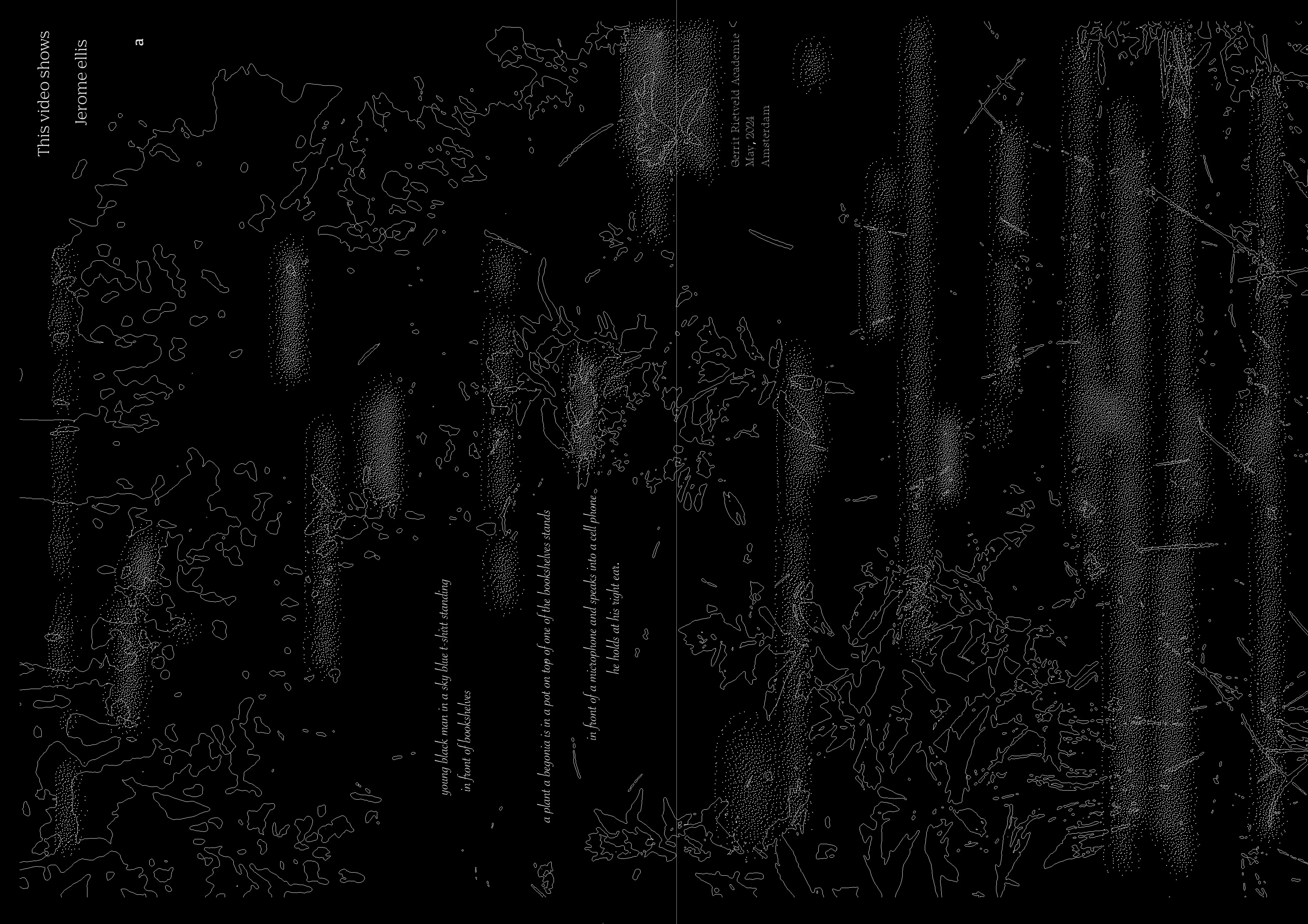
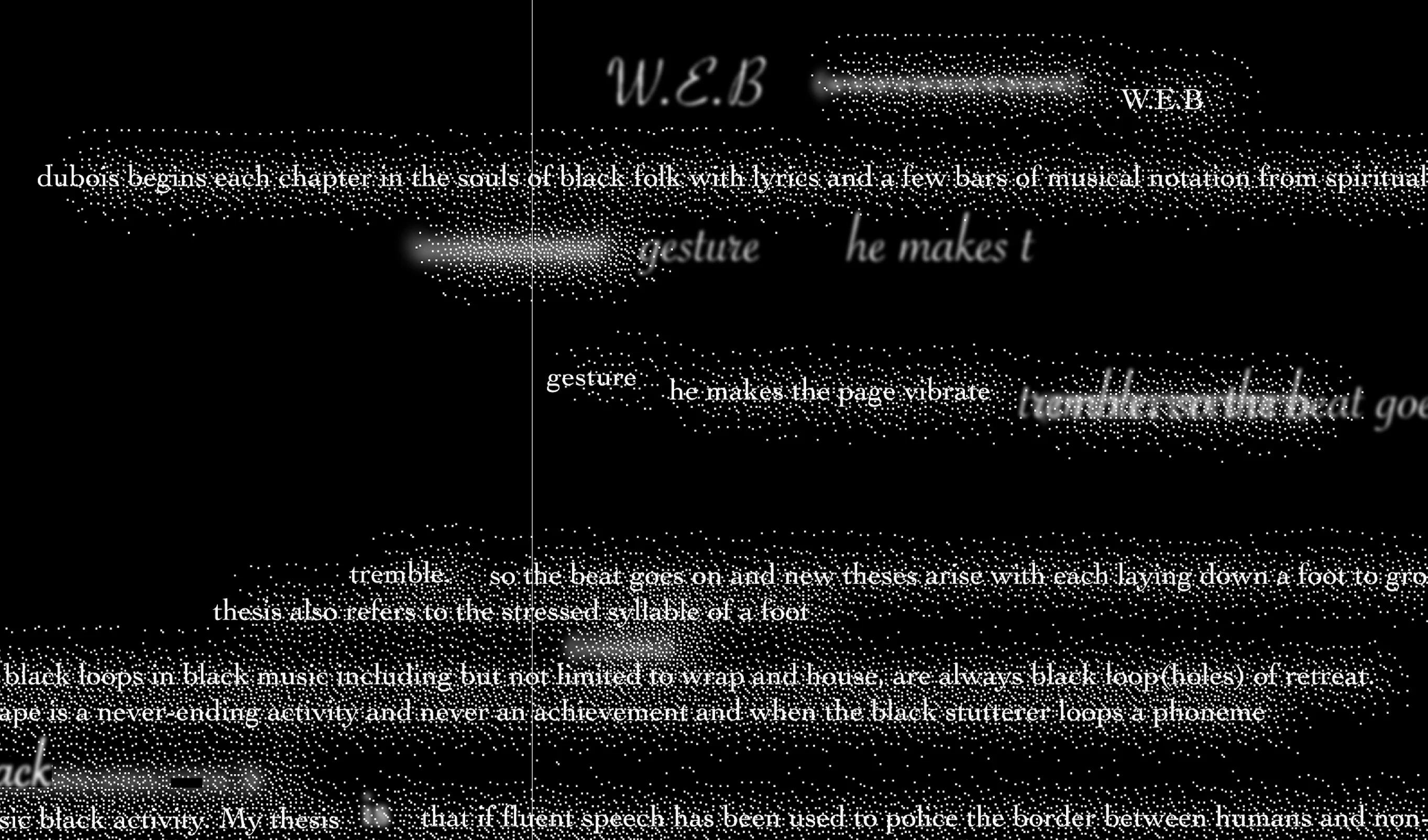
JJJJJerome Ellis (any pronoun) is a disabled Grenadian-Jamaican-American artist. In this poem, because of his stutter, his consciousness always precedes the words he utters, and this work is meant to visualize that feeling.
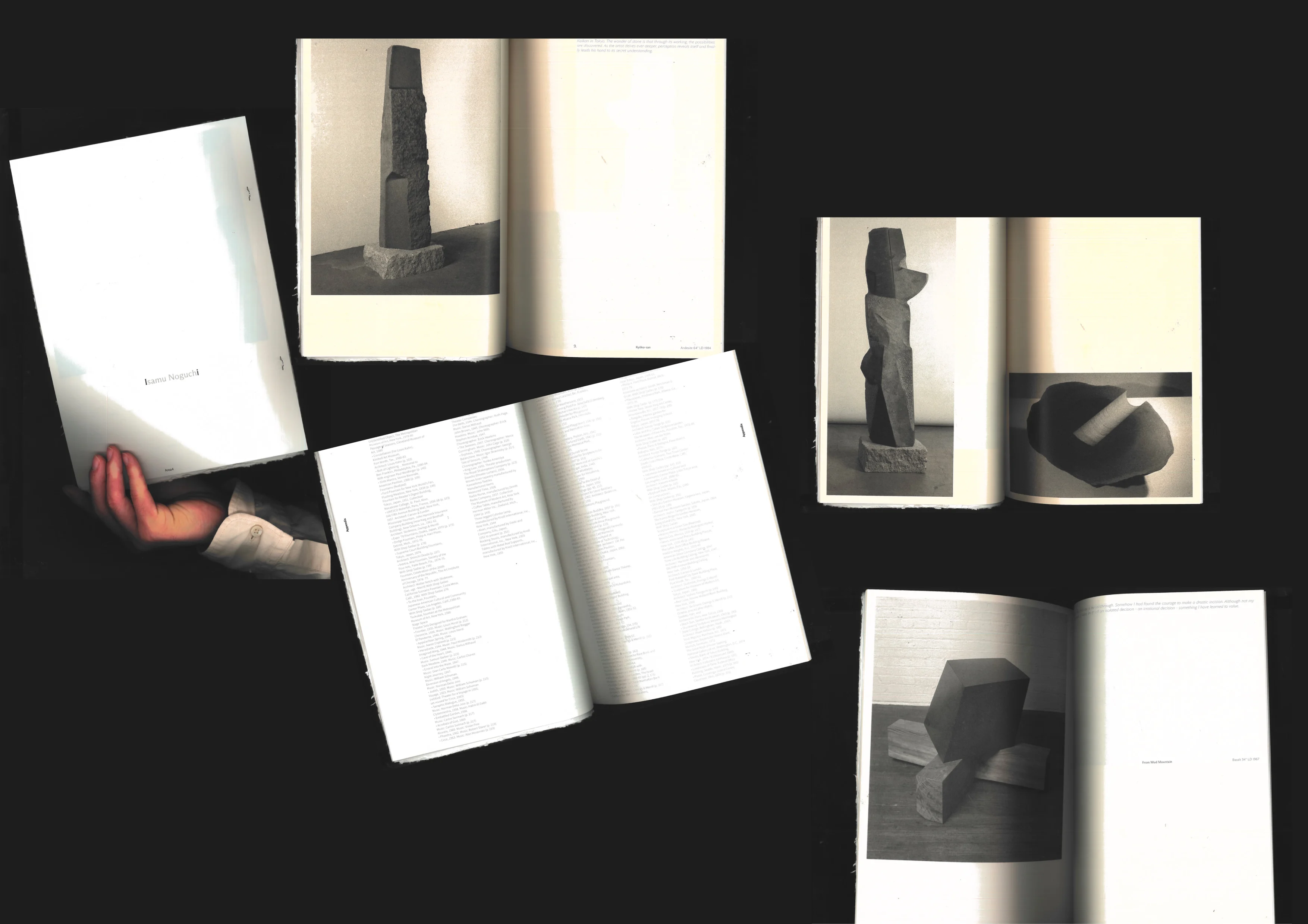

Isamu Noguchi Art Books Redesign
Editorial design
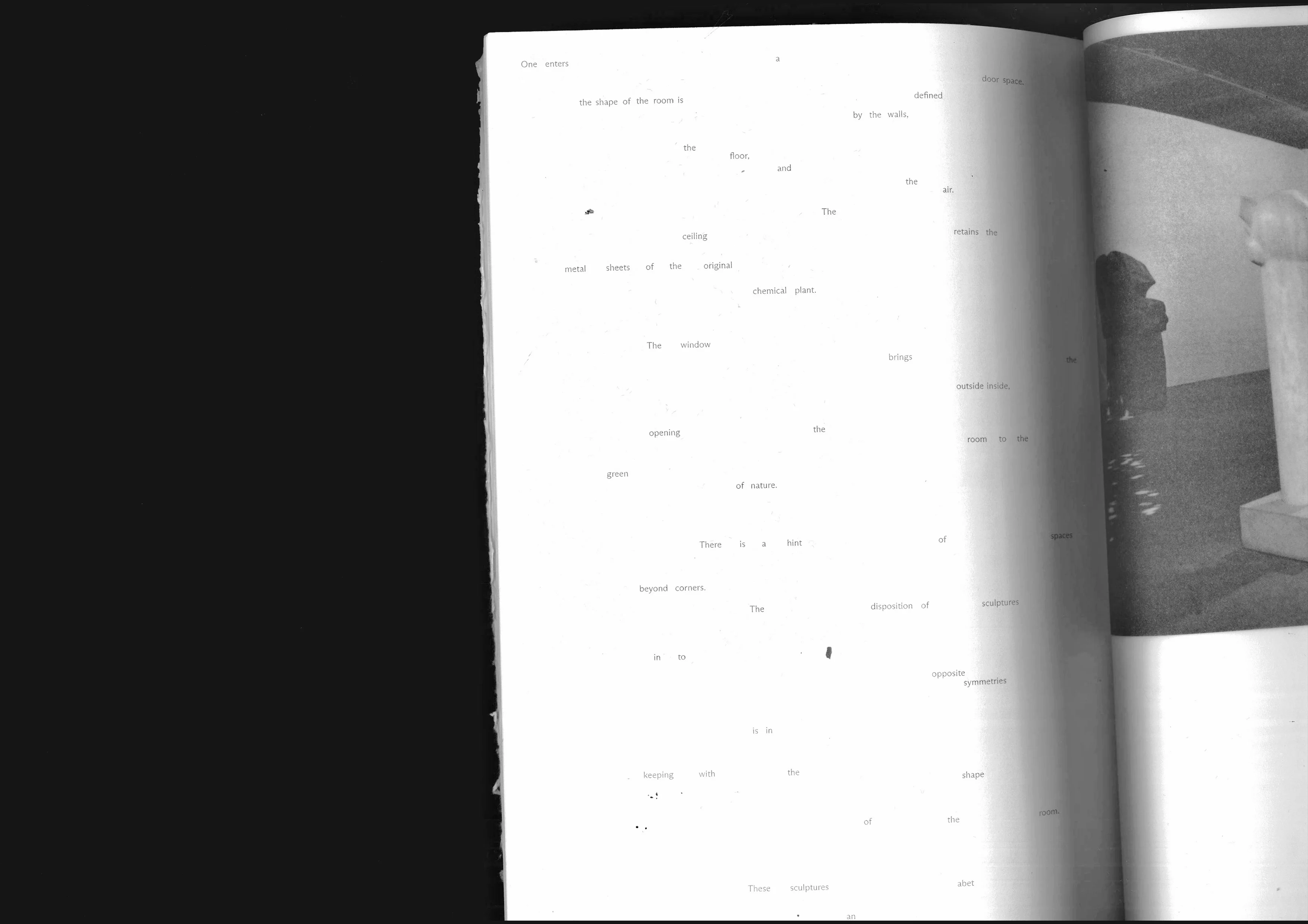
“This is how I learnt of honesty of sculptures as a prerequisite for overcoming the easy attractions of clay modeling” — Noguchi.

Similarly, in this publication redesign, I explored the essence of reading itself, using different types of paper to reflect Noguchi’s various working methods.
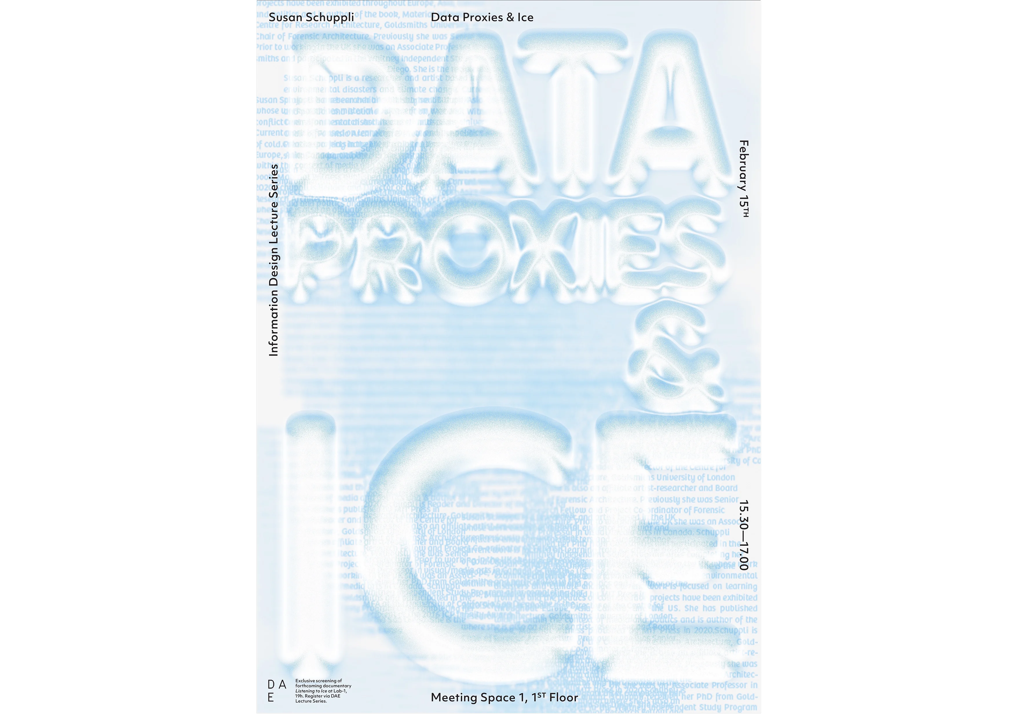
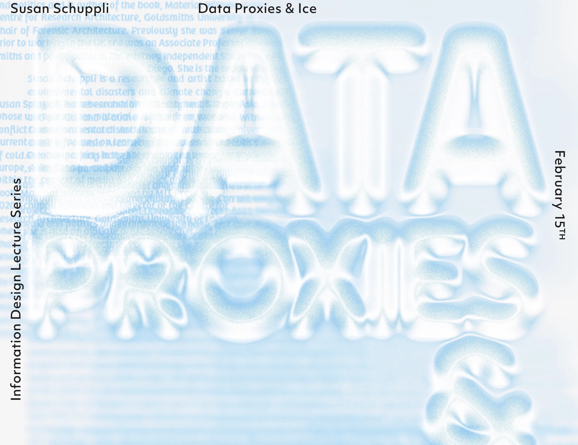
Data Proxies & Ice
Poster Design
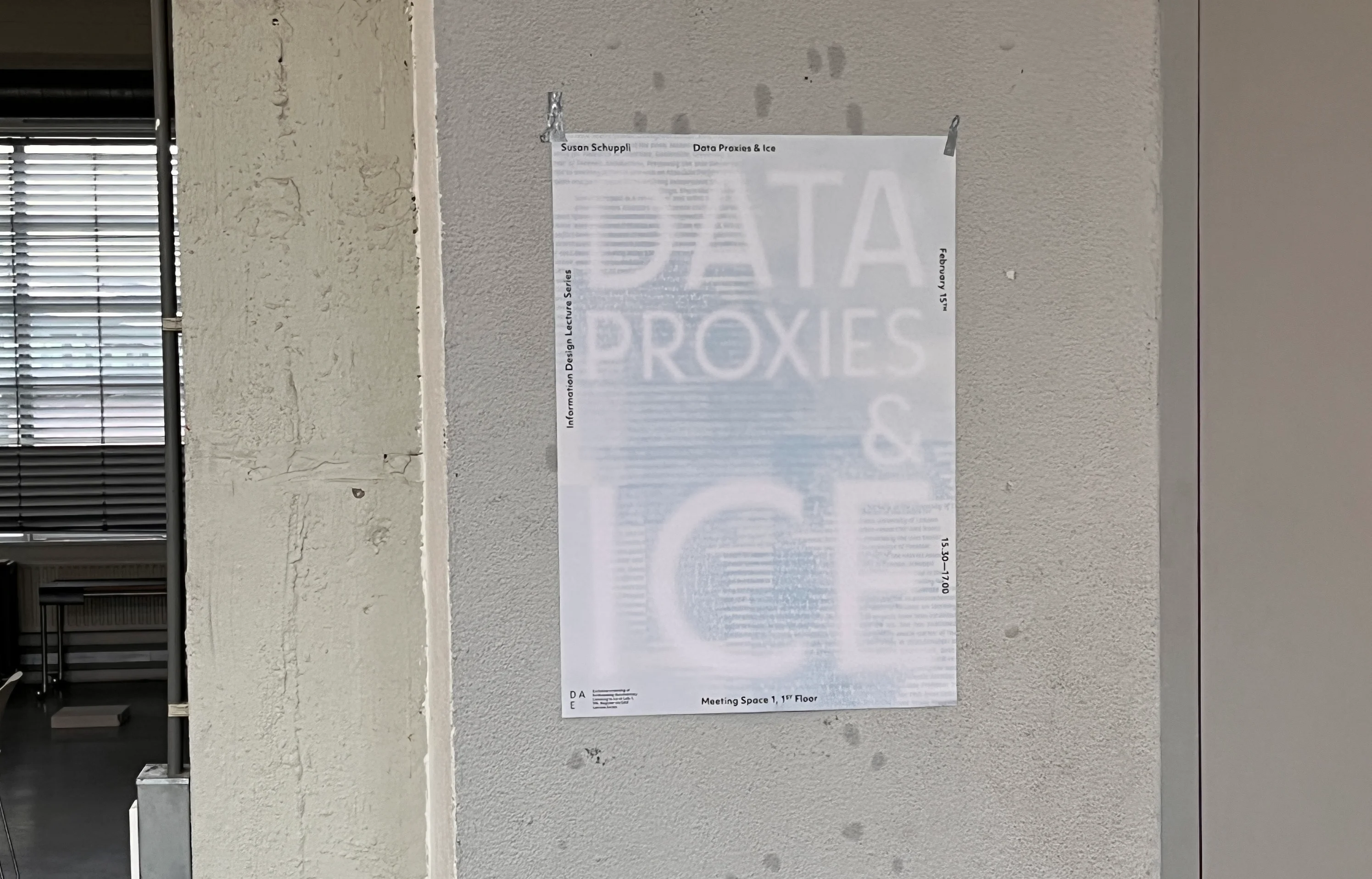
The lecture is related to the research project made by Susan Schuppli. With her ( ) method, she is able to detect the longevity of a period by analyzing the ice ( ), as well as climate change. So I put a second layer of information about the artist underneath the visualization ice ( ) for the lecture poster.
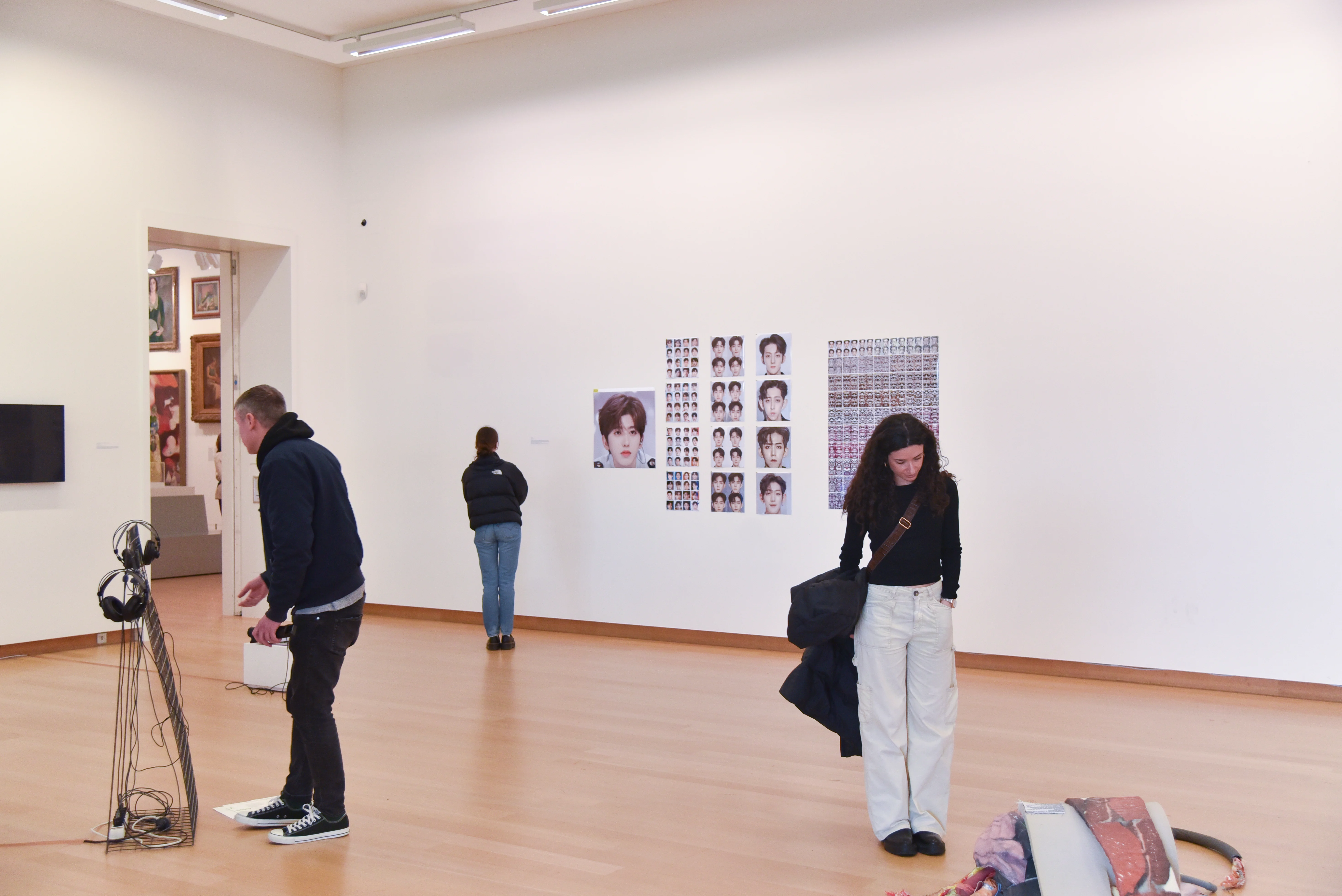
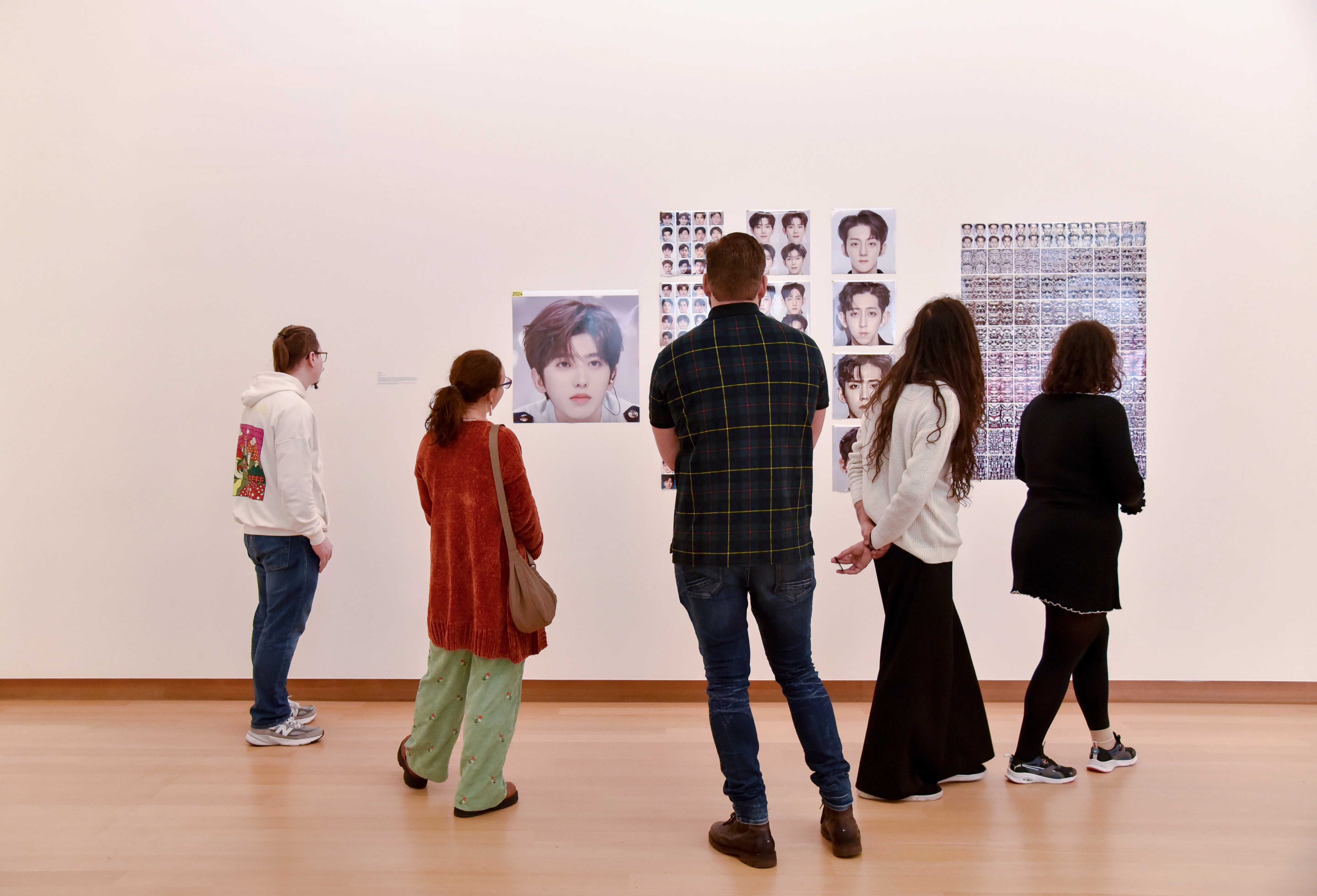
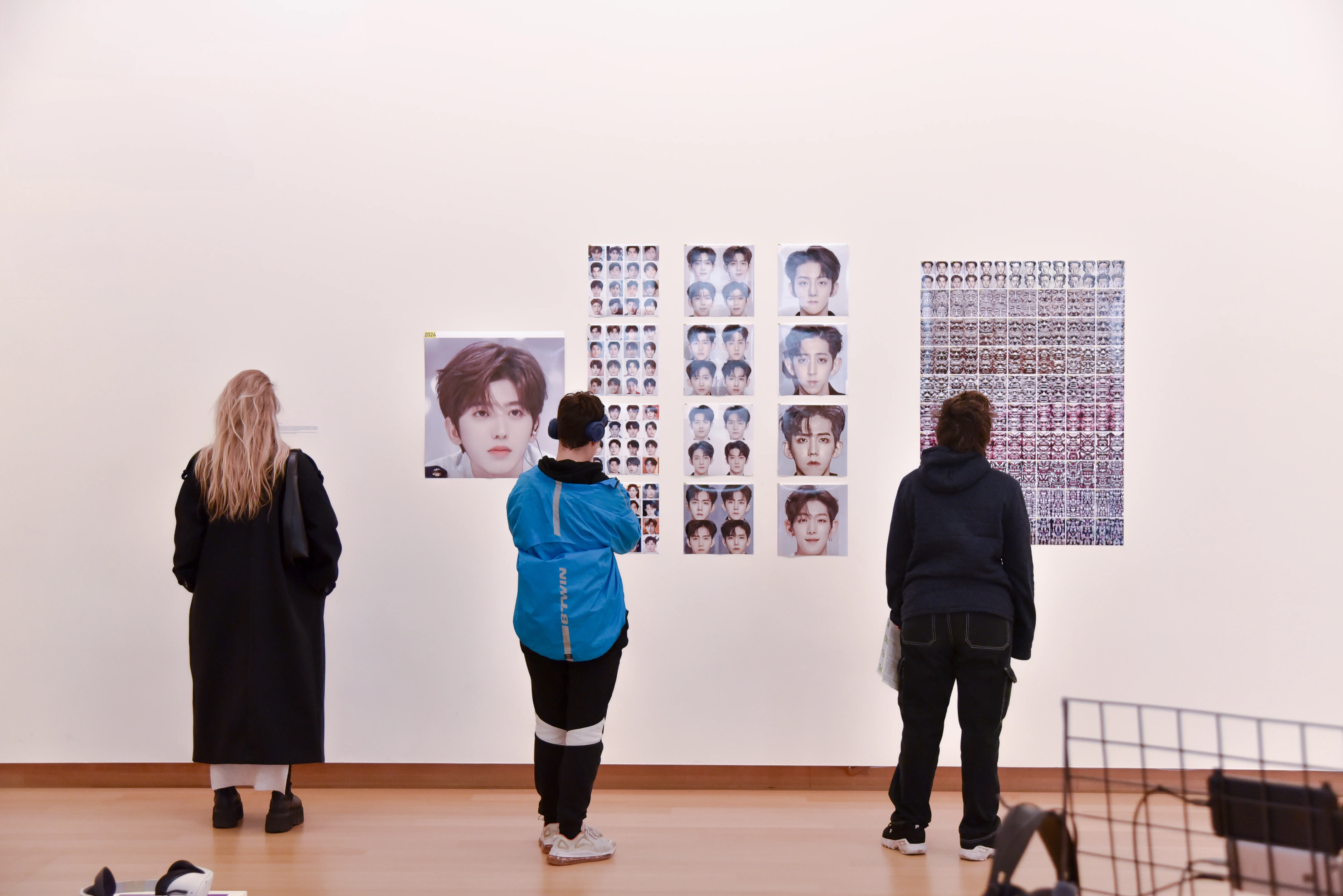
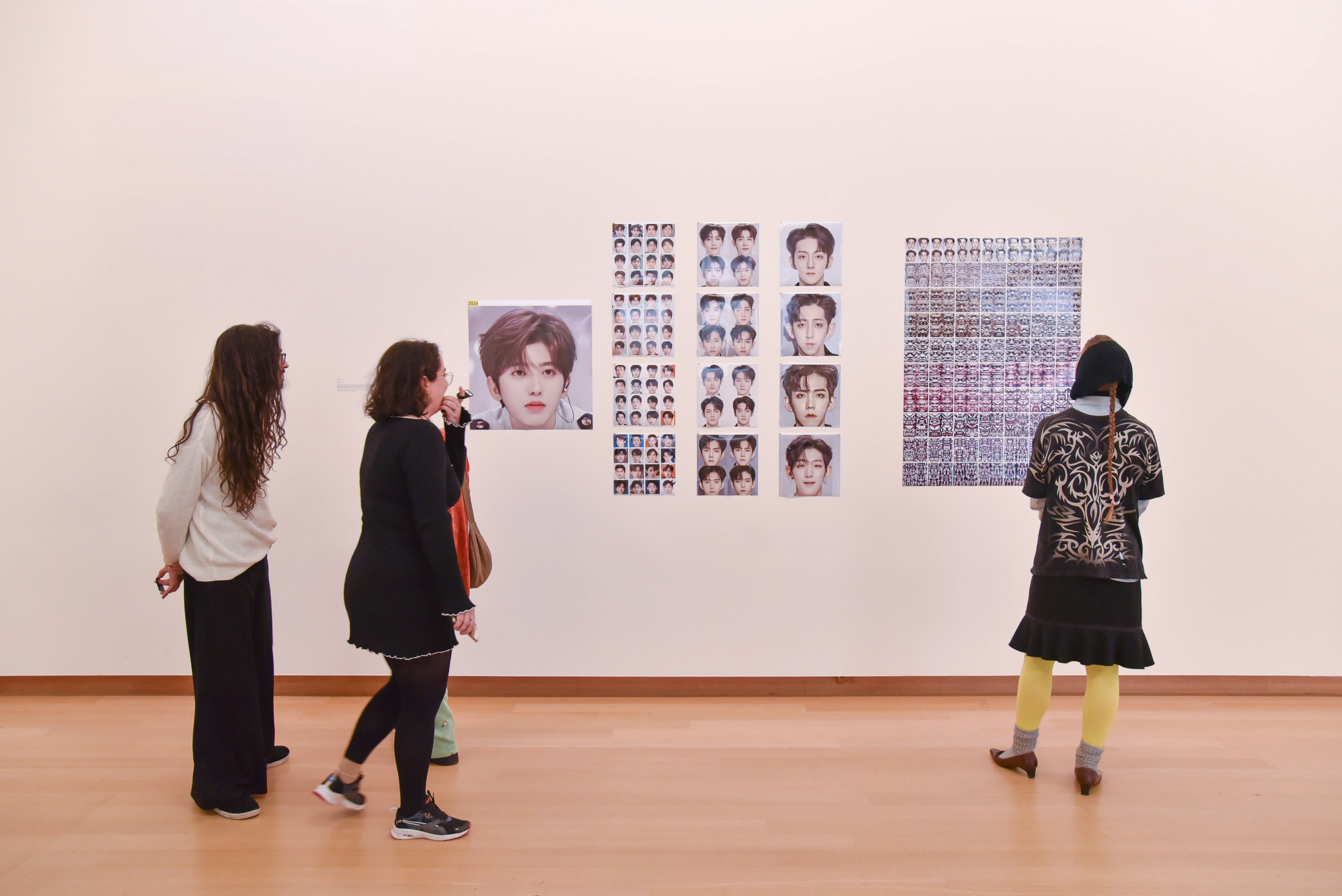
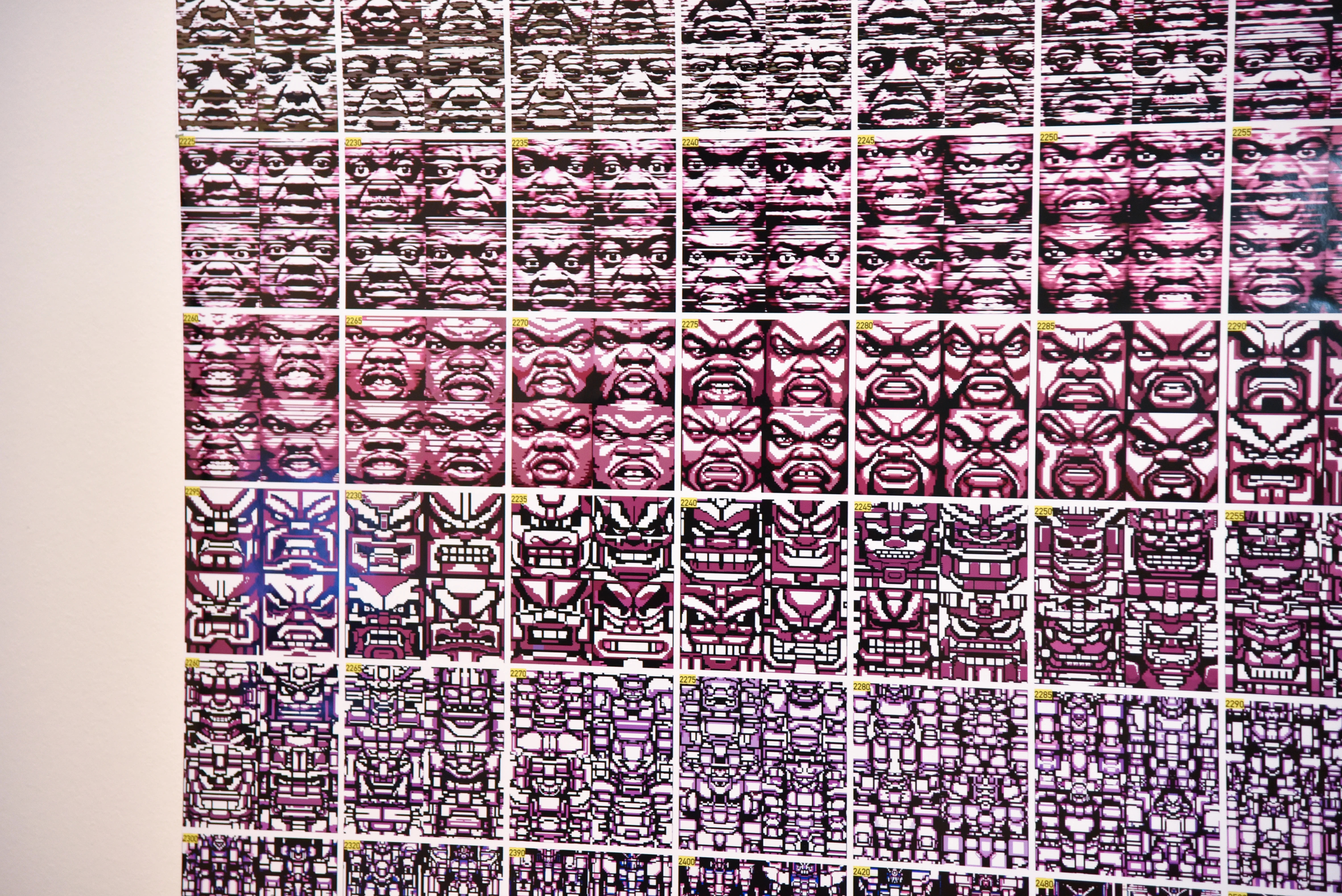
Someone living in 2500
Digital Print, Midjourney
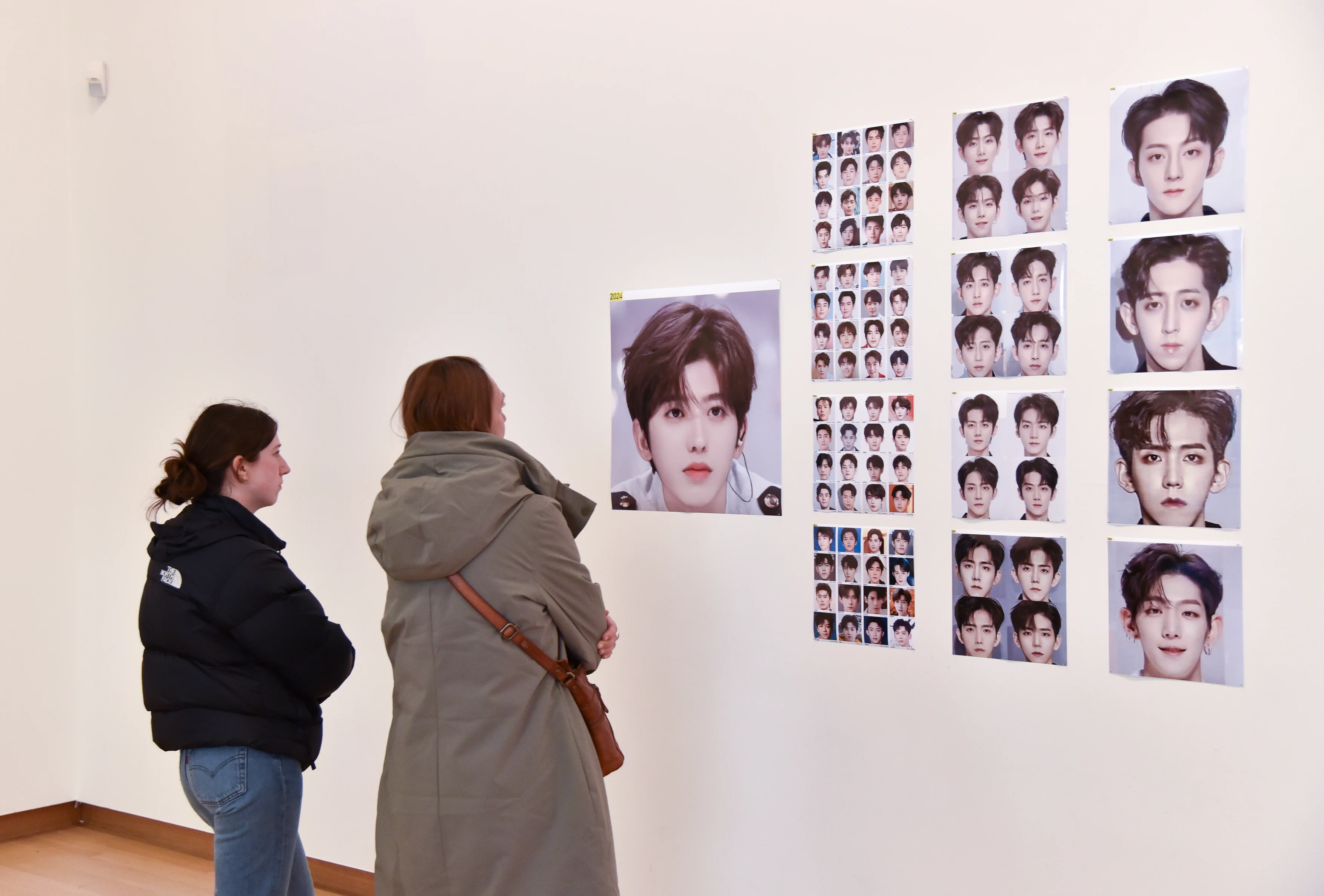
Assuming all current models are trained on previous ones, what might virtual models look like in the year 2500? — Exhibited in Stedelijk Museum.
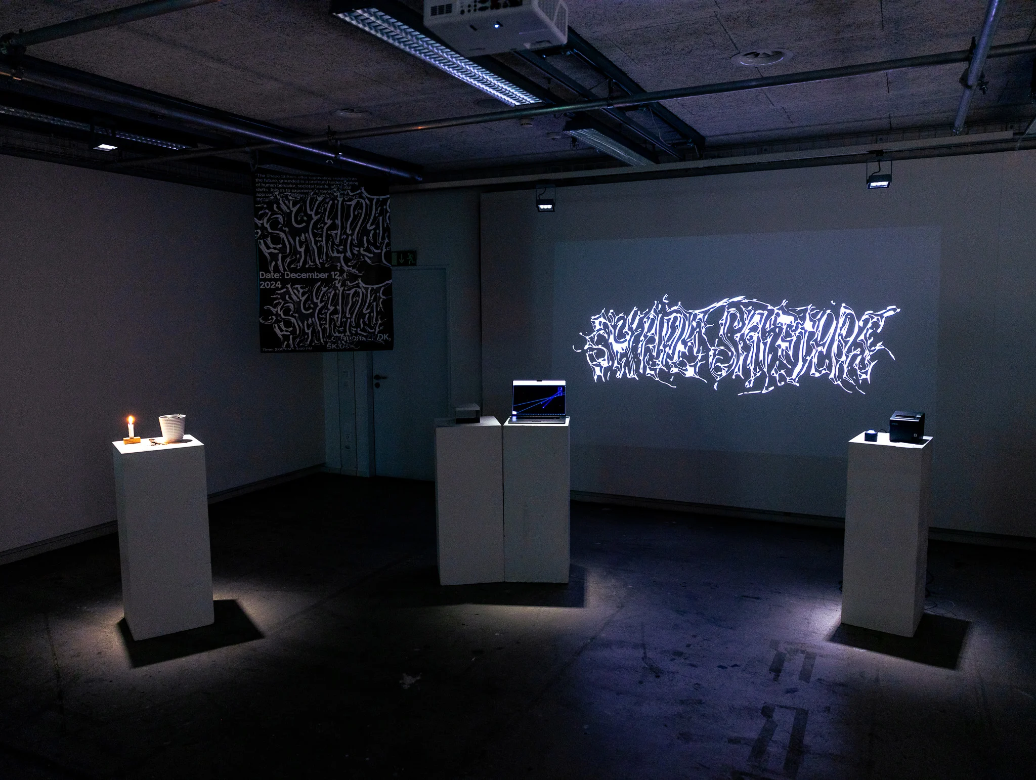
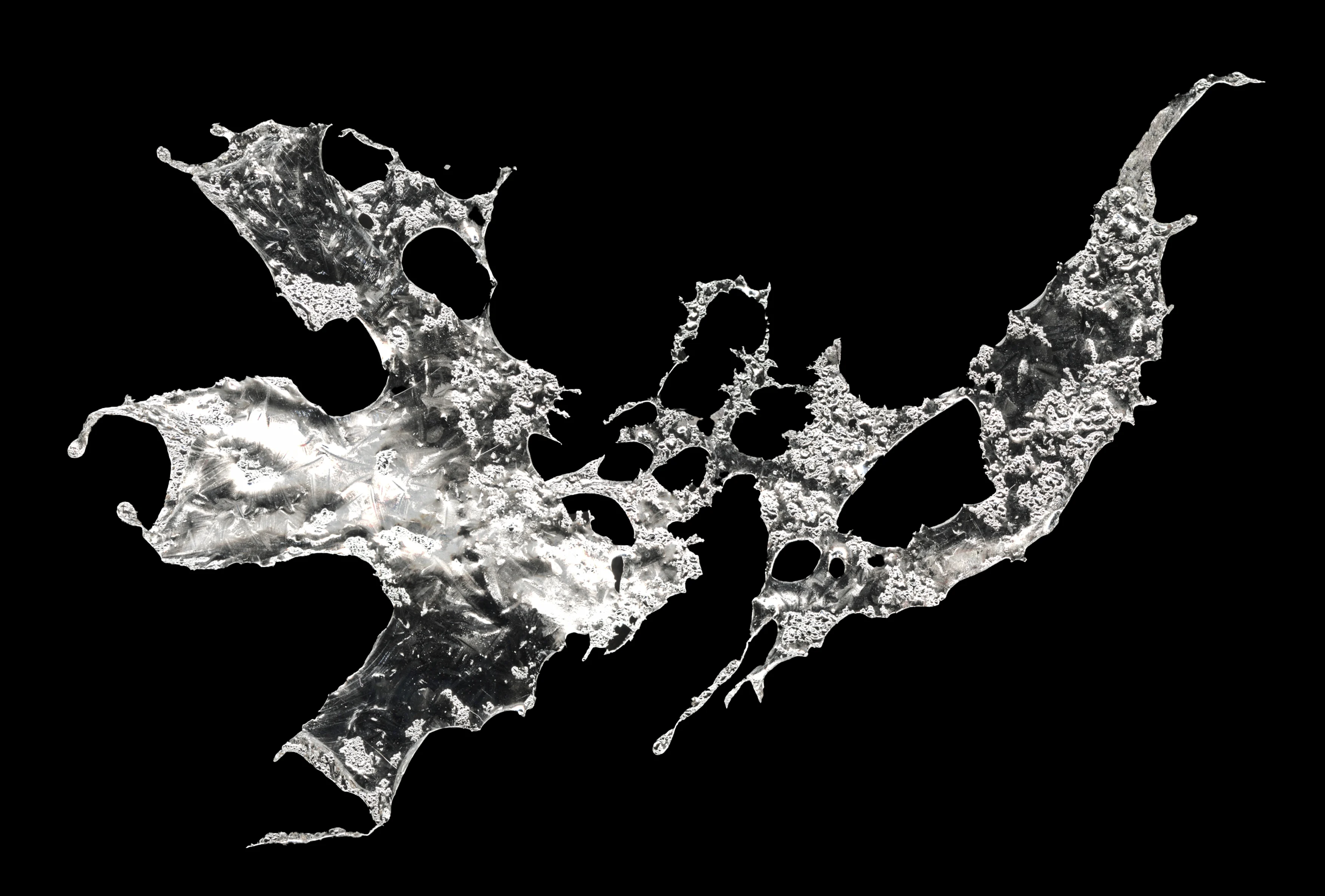
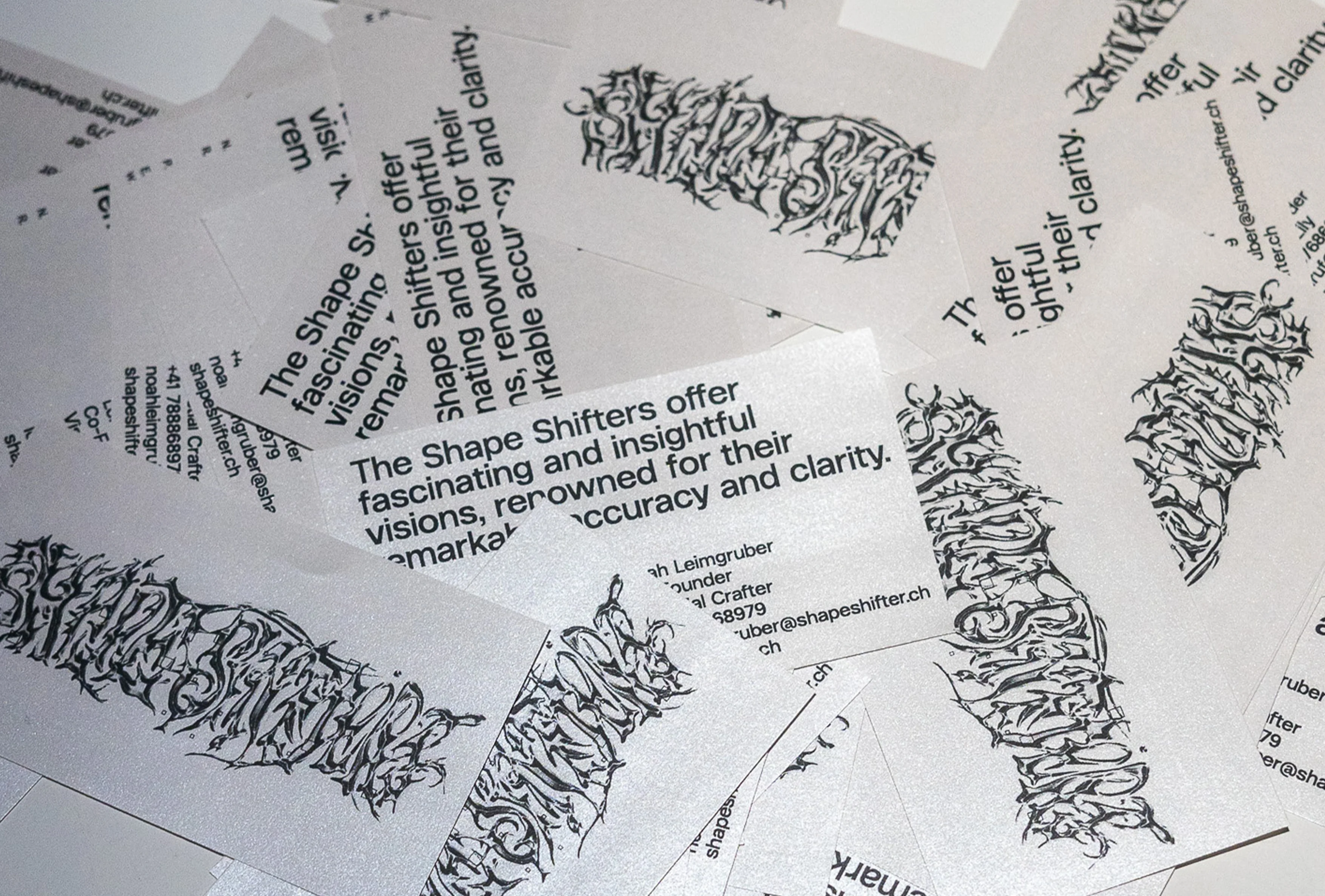
Shape Shifters
Interactive Installation
“Shape Shifters is a startup dedicated to fulfilling
people’s desires and helping them achieve their full
potential. Using our cutting-edge expertise, we craft figures
that can predict your future with 100% accuracy.”
— A project to satirize capitalist society by
redesigning a fictional fortune telling company.
Collaboration with Tim Ruf and Noah Leimgruber,
mentored by Sereina Rothenberger & Julia Born.
No Spacing Font
Font Design
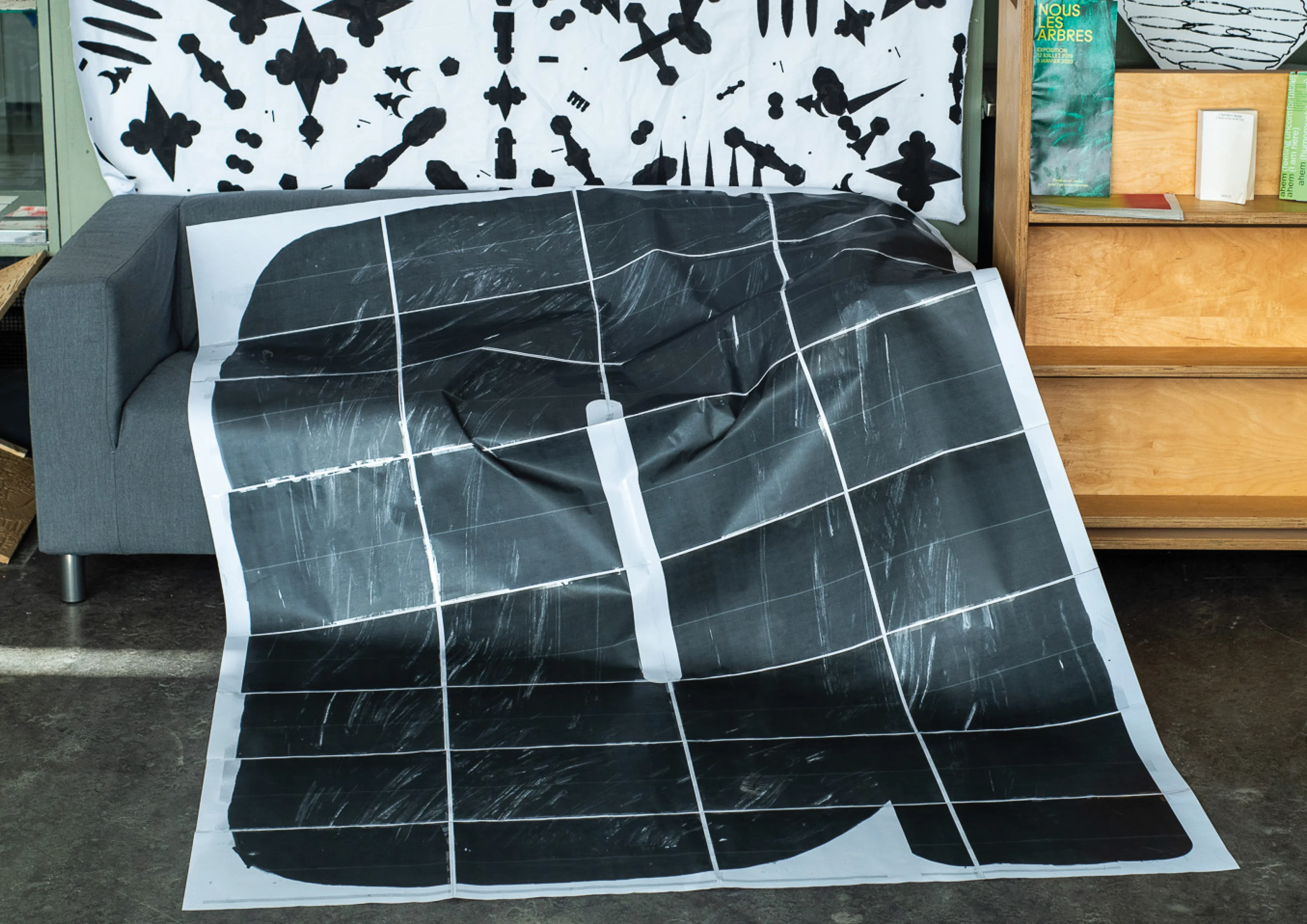
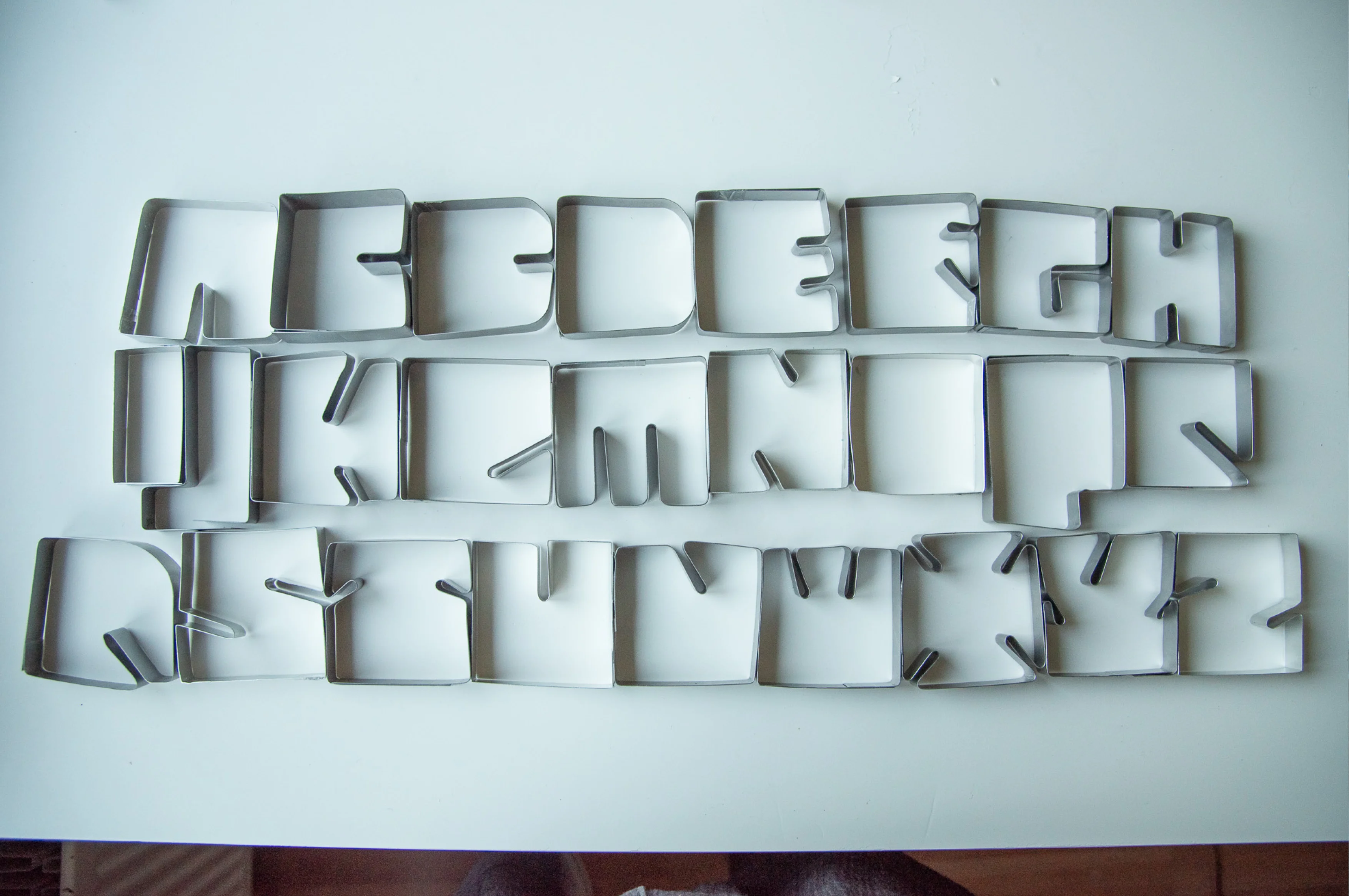
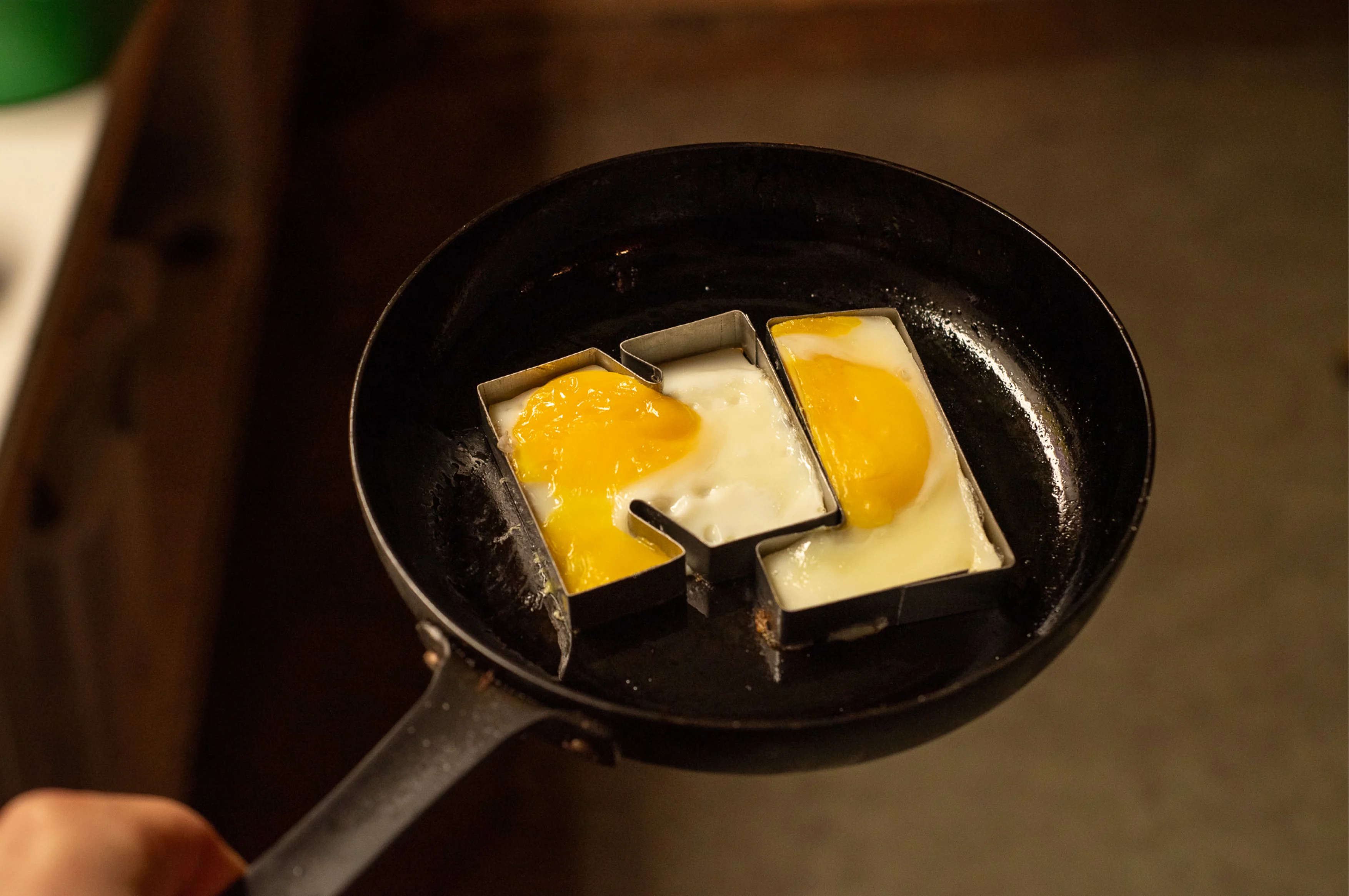
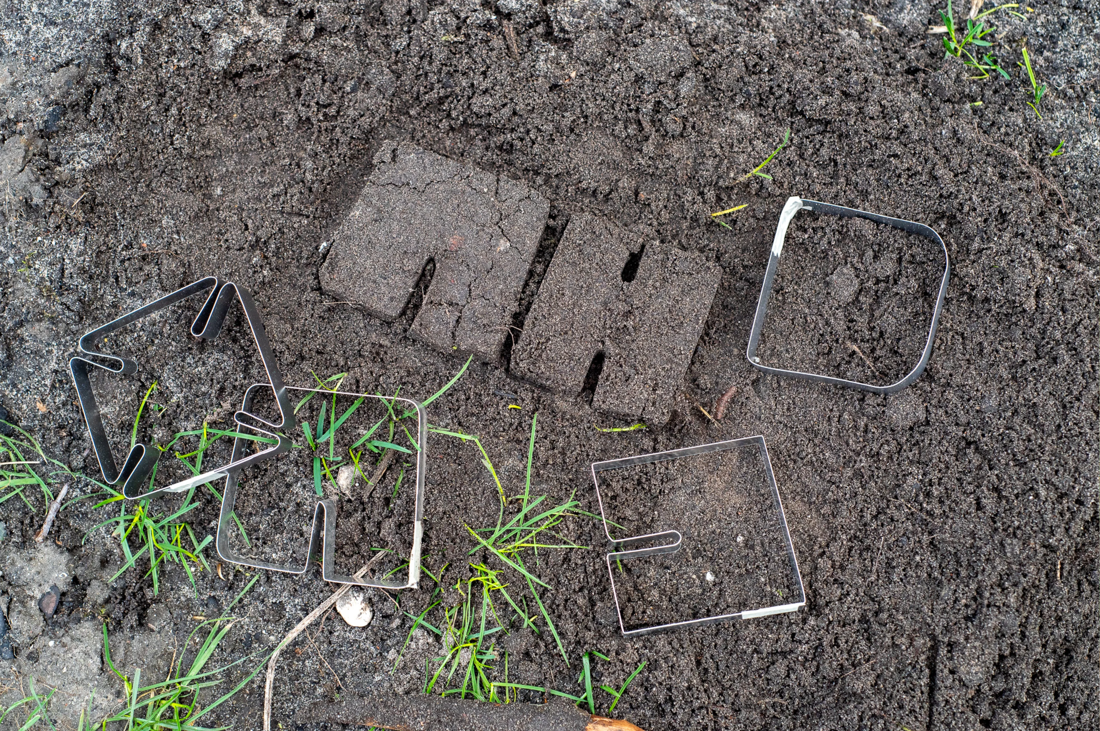
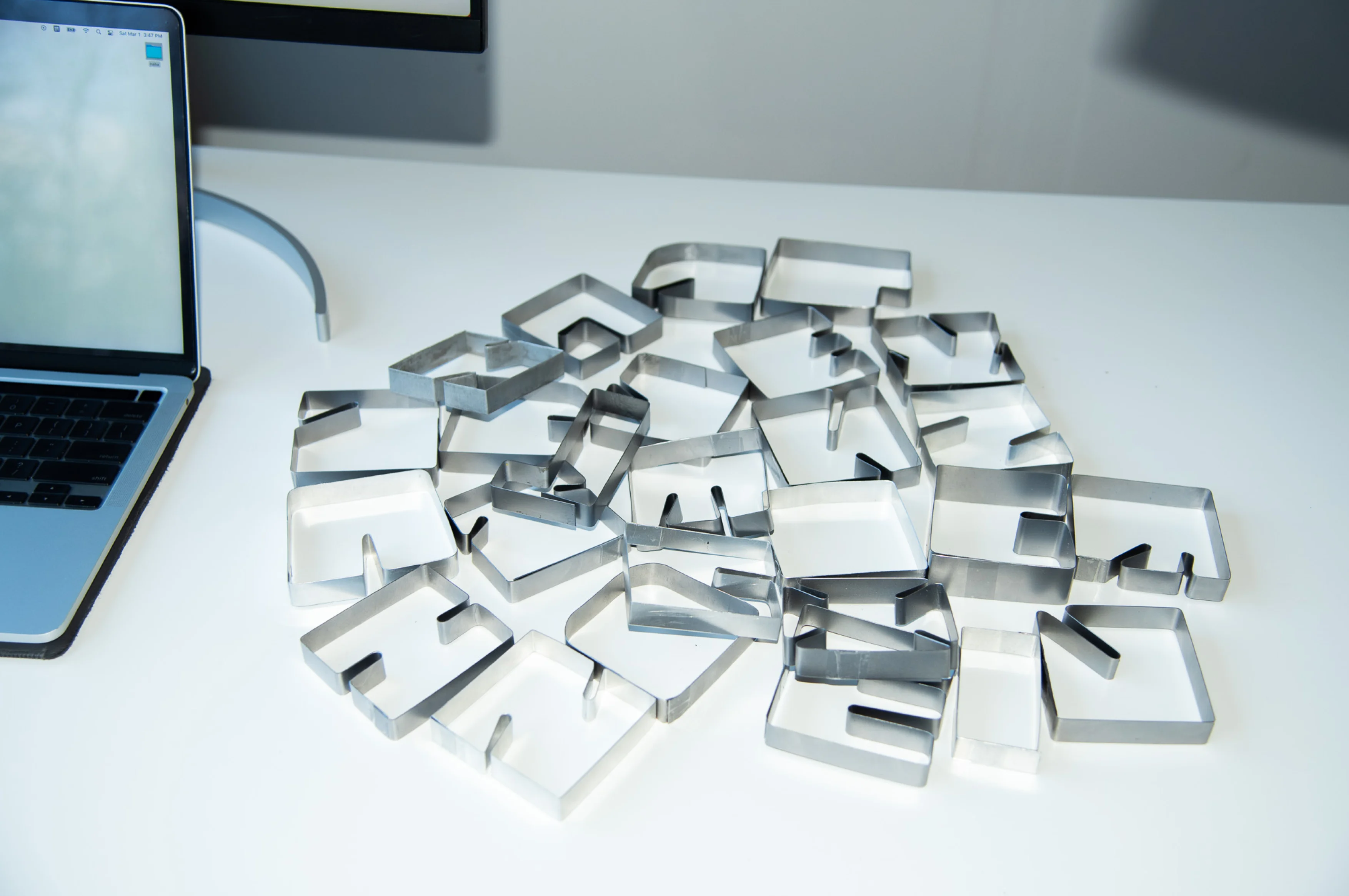
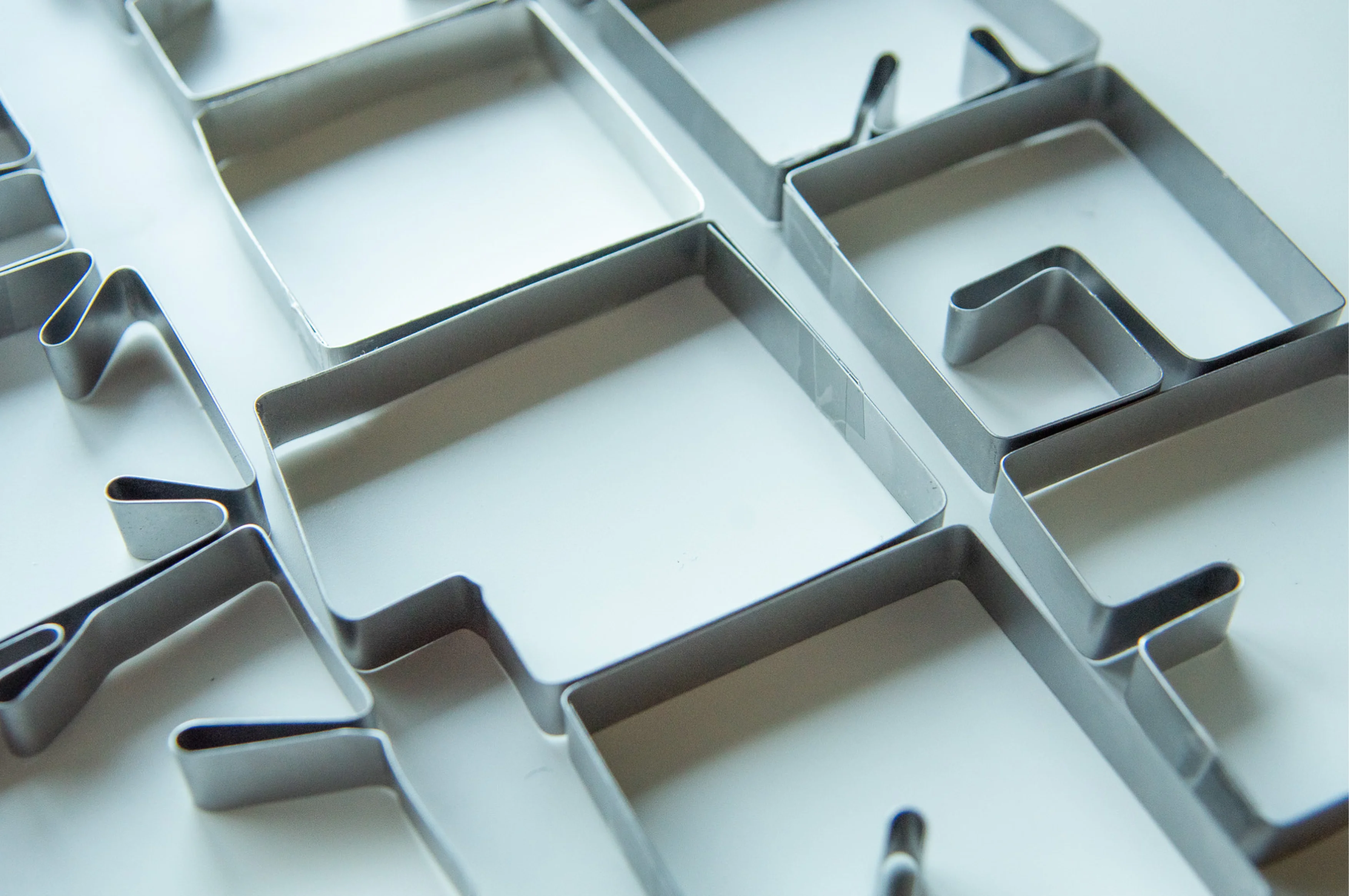
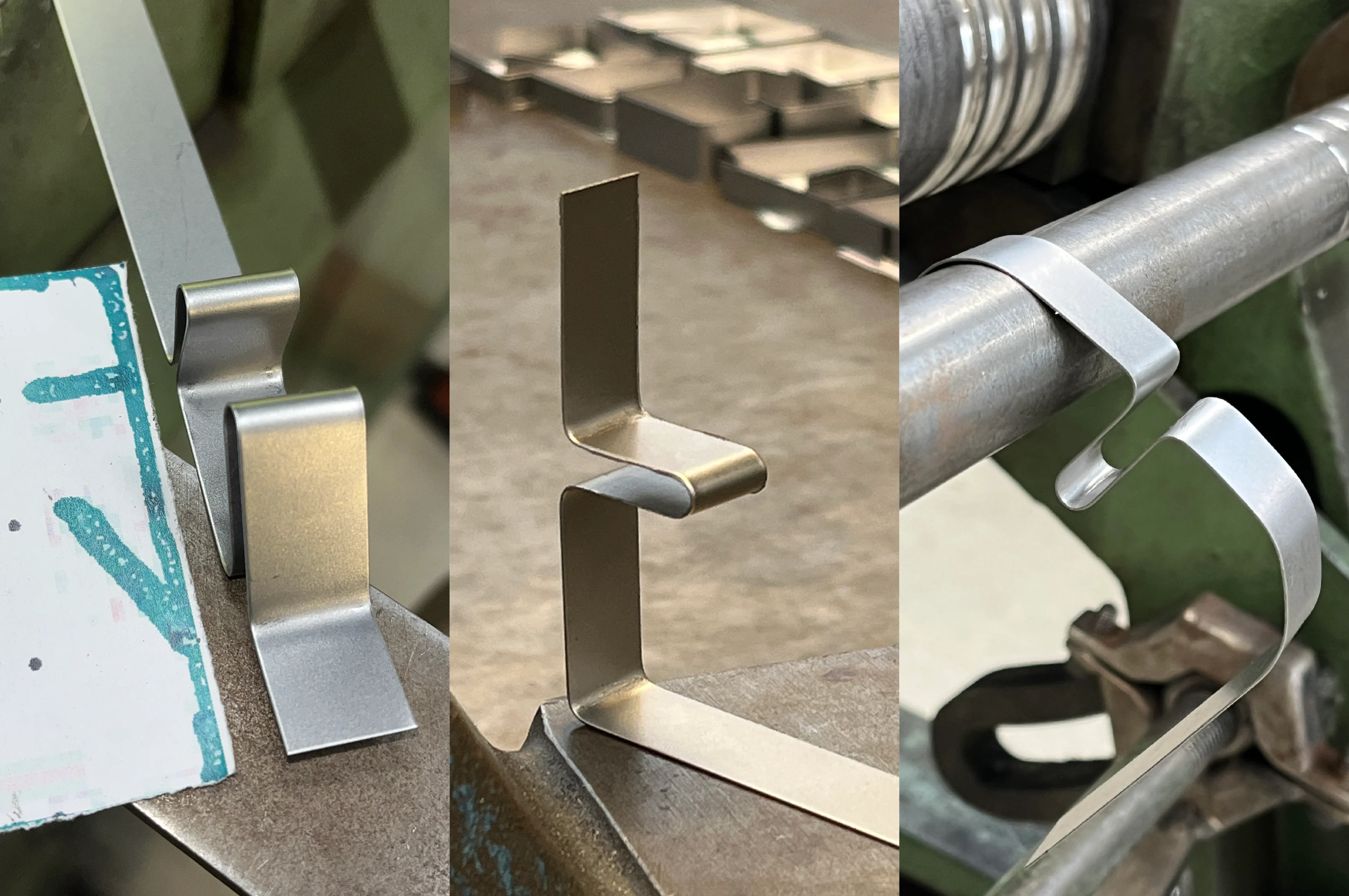
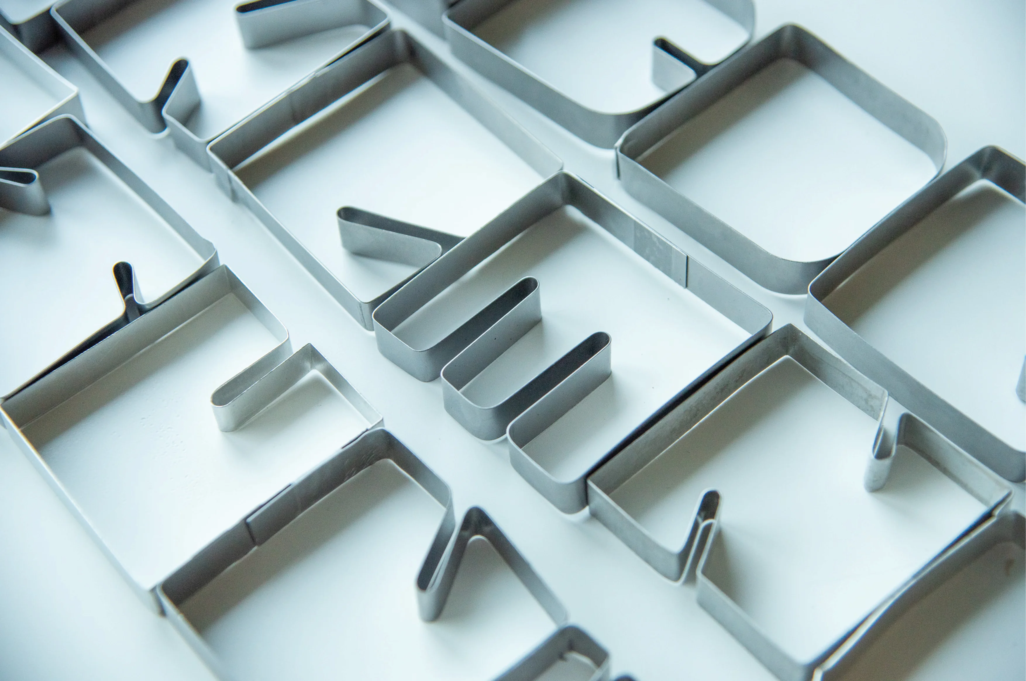
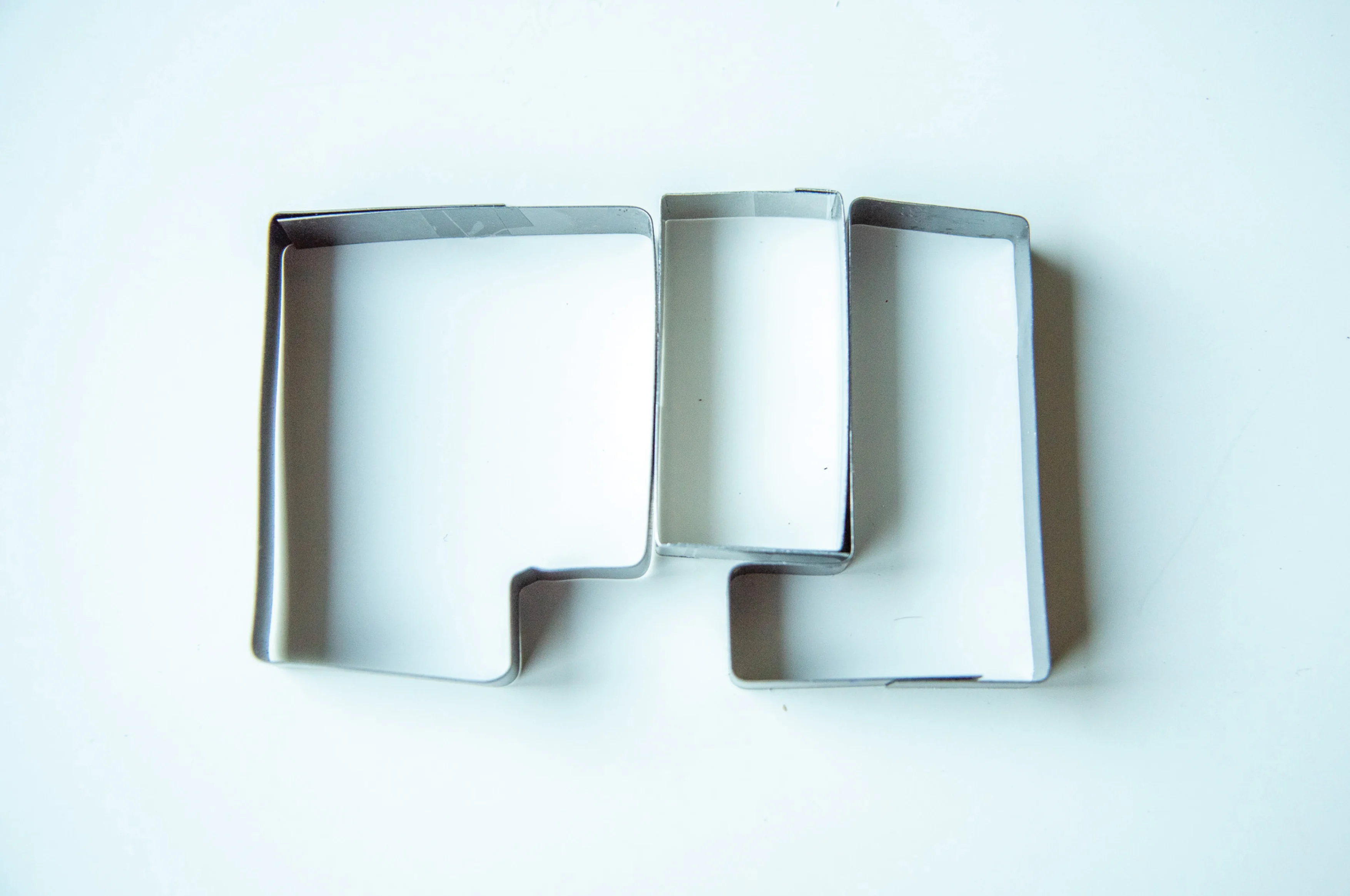
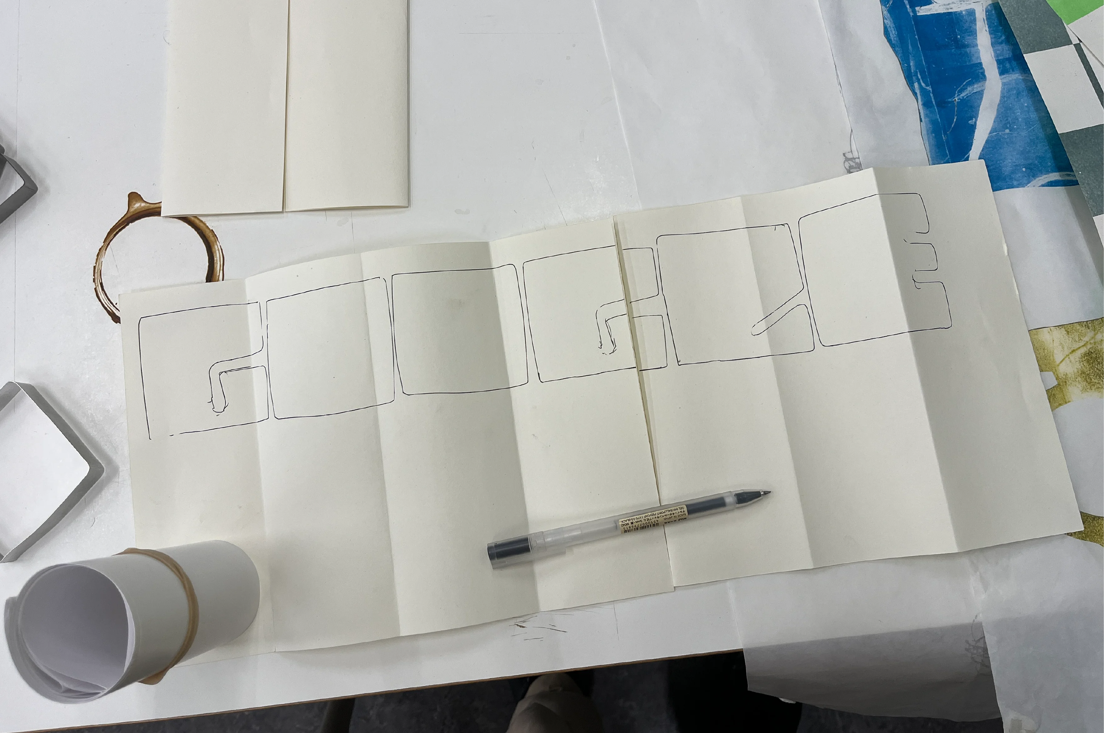
A meticulously handcrafted, multi-functional typeface—designed with precision, crafted with passion, and made in Amsterdam. Every letter is a work of art. Draw with it, sculpt with it, or even create a letter-shaped dinner for your family. The possibilities are as delightful as they are endless.
Welcome to My Stage
Interactive Installation
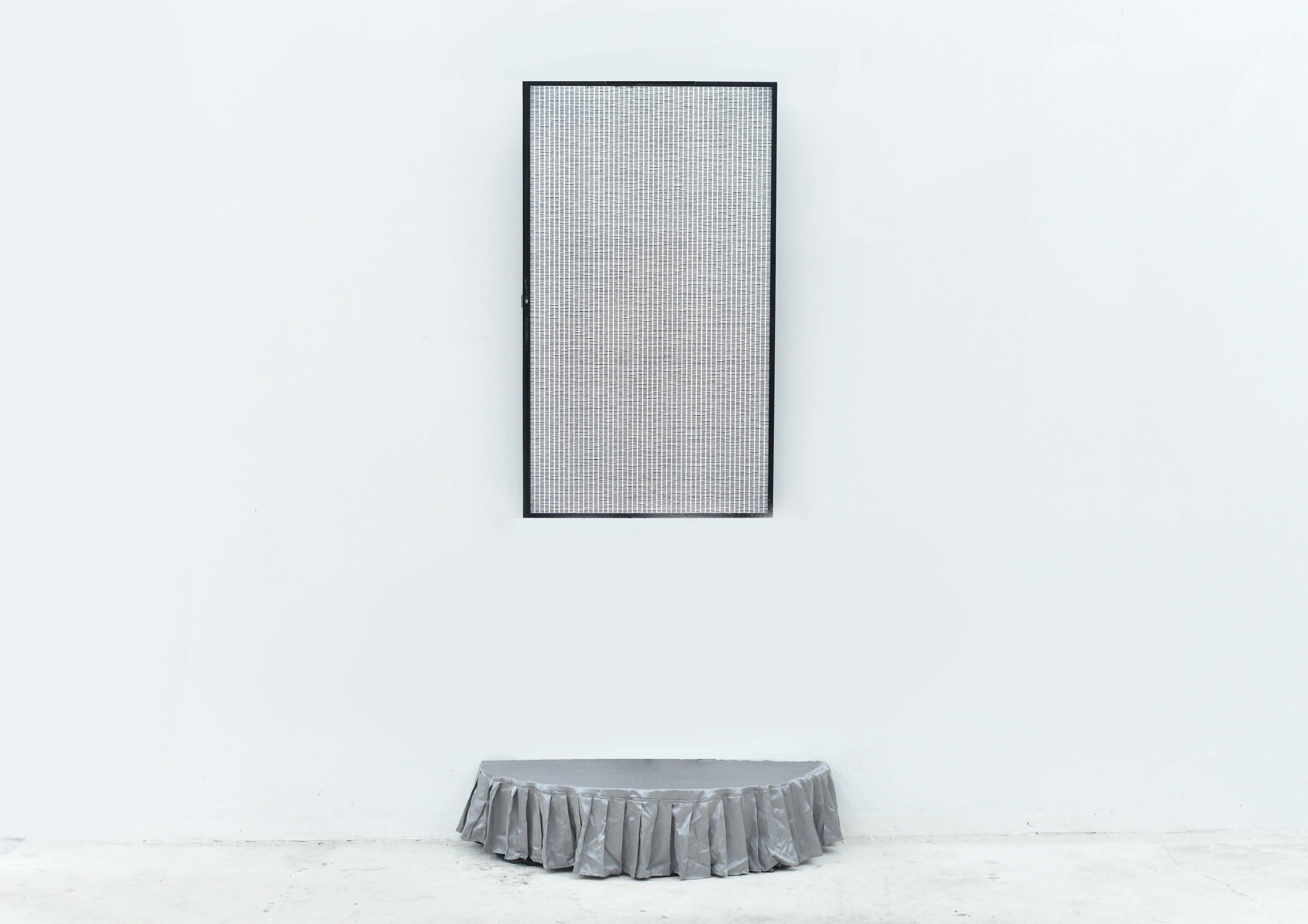
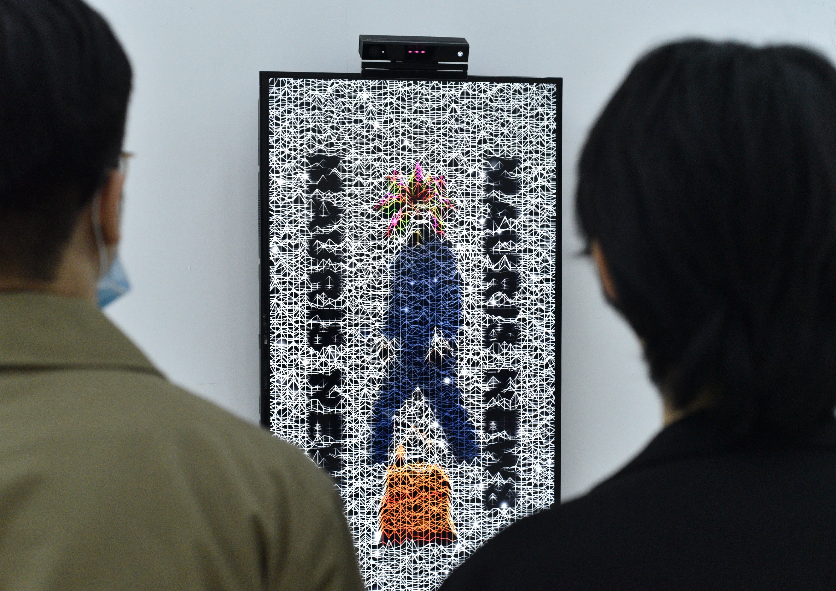
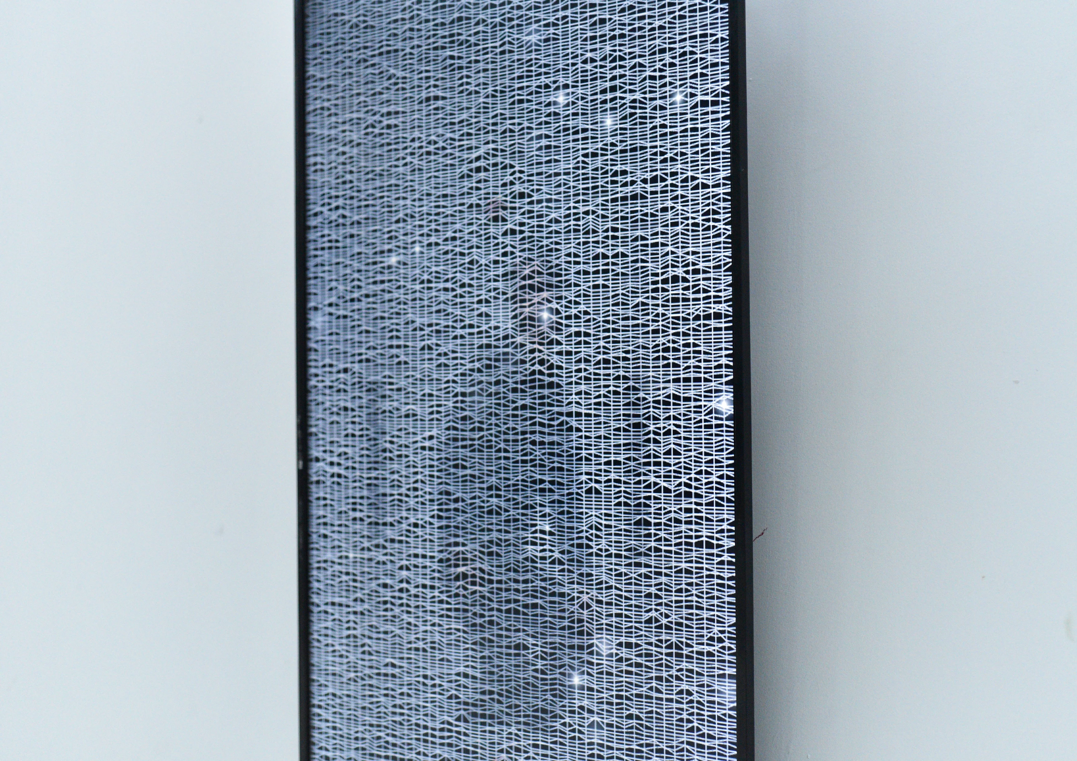
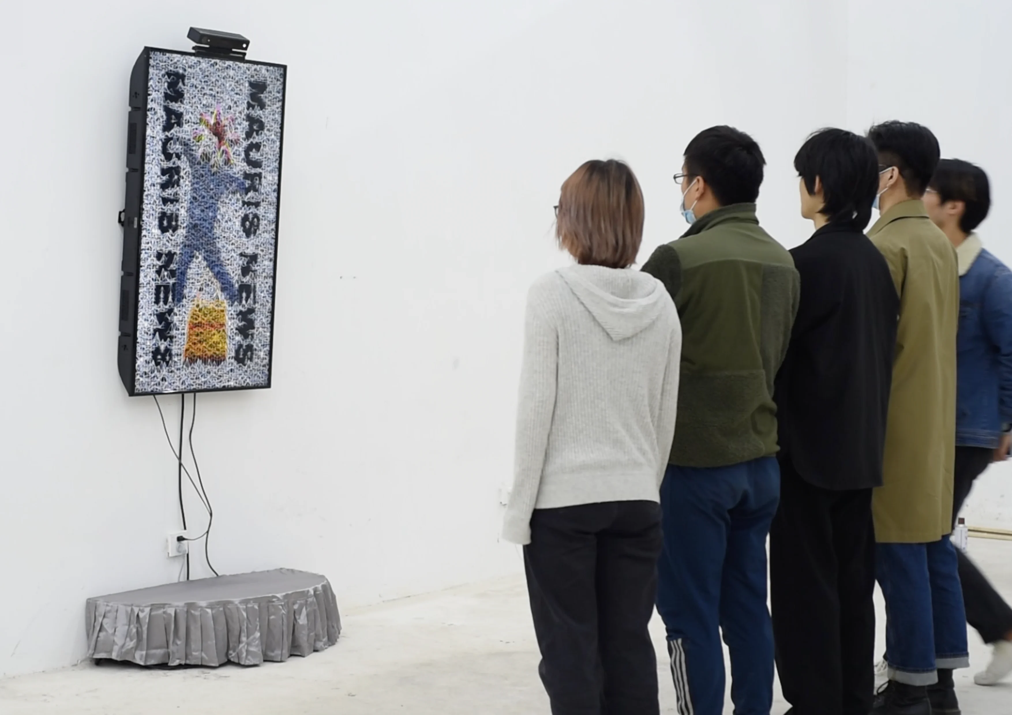
“My project aims to illustrate the evolution of photography and how its purpose has shifted over time through social media. The audience can see how people's motivation behind posting photos has evolved in this new era.”
The Biggest Body of Water
Interactive Installation
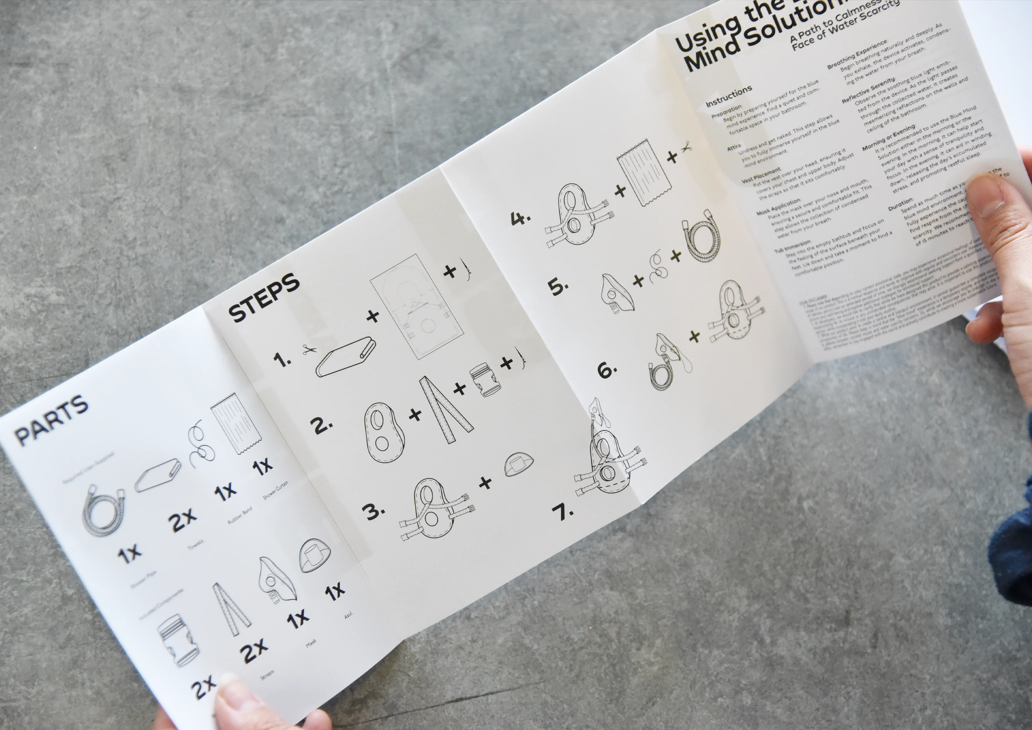
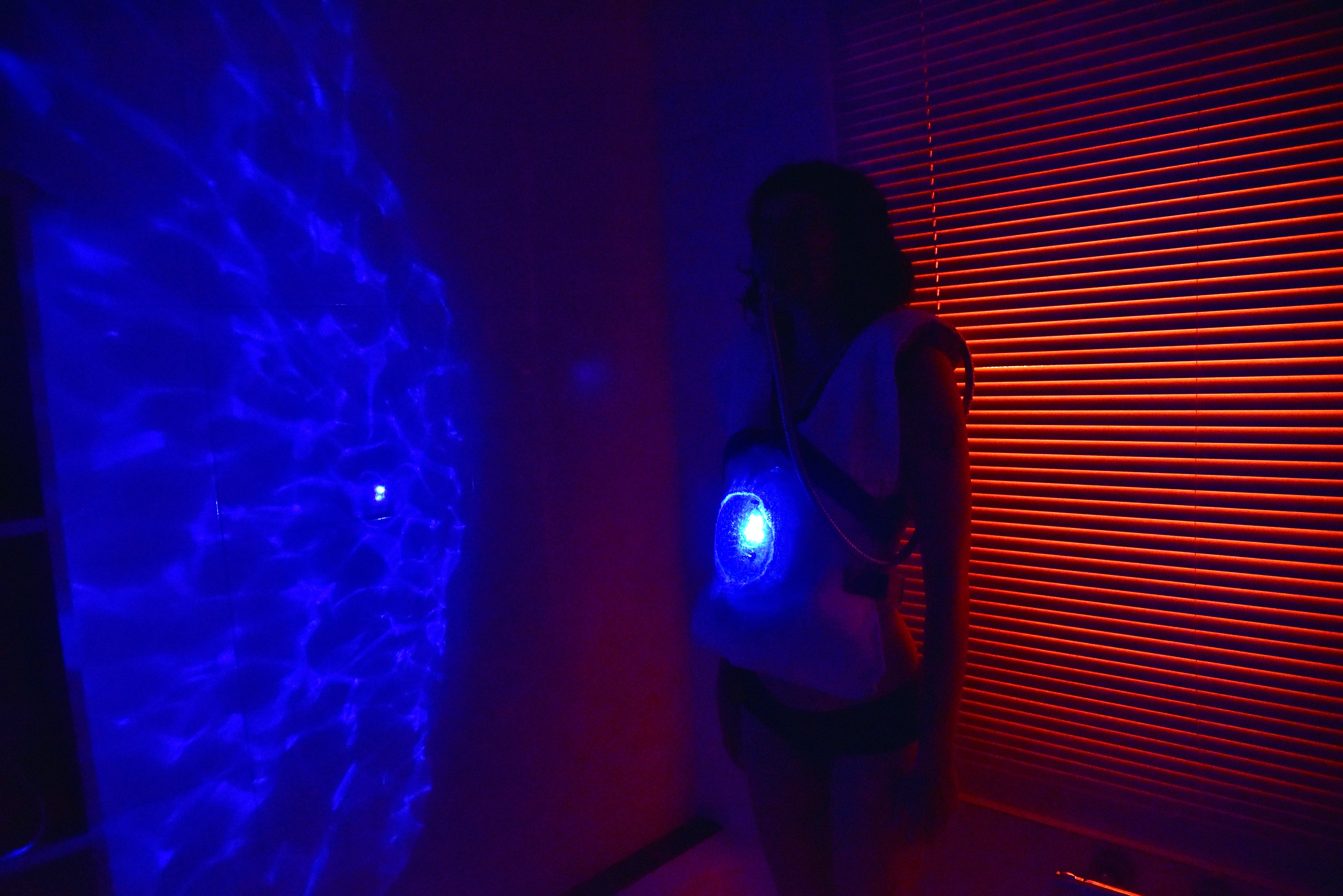
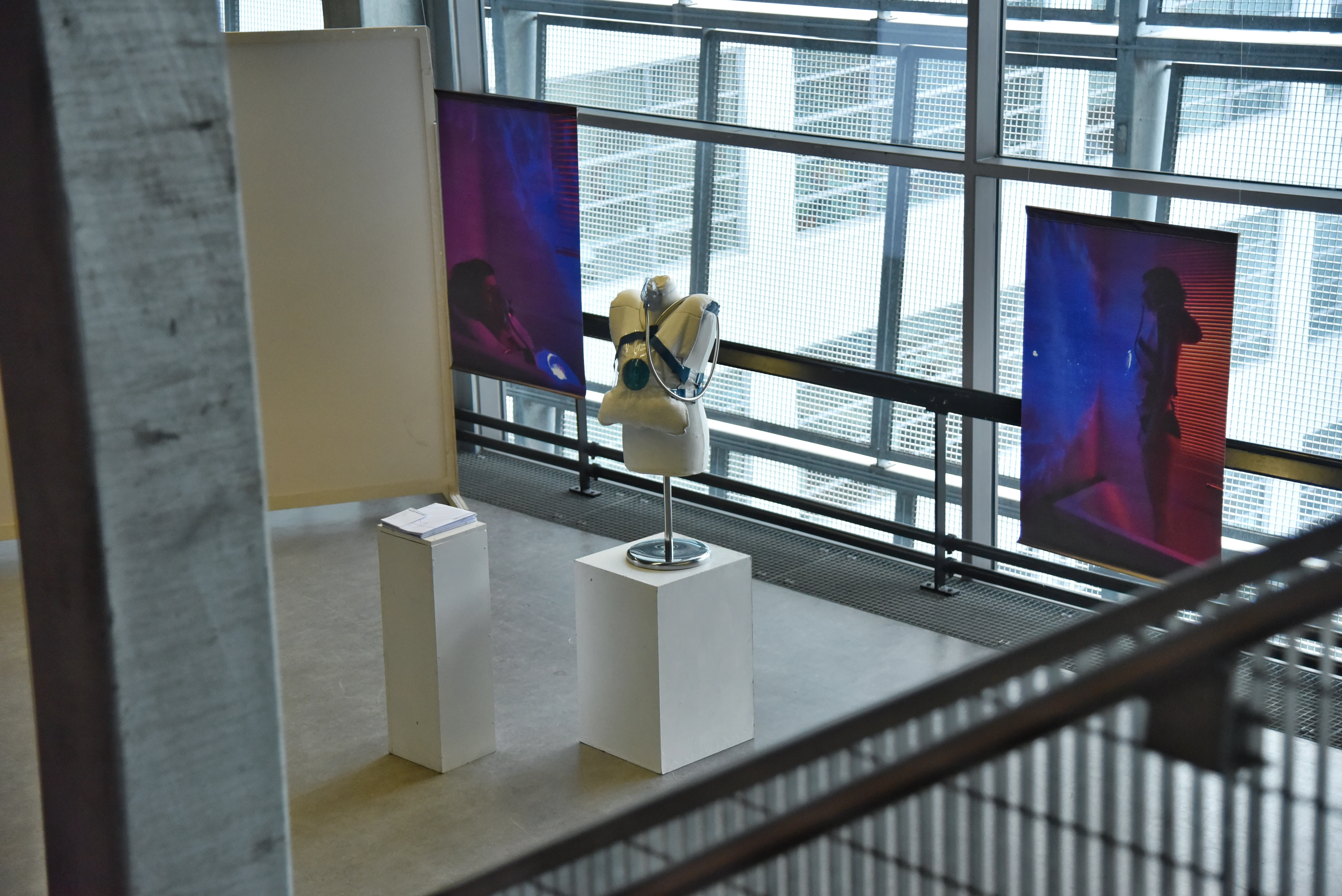
By the year 2031, the Netherlands will already be living in a critical water scarcity crisis for a year.
As (fictional) members of the Committee of Wellbeing within the official Water Councils, we propose a visionary
solution to repurpose unused bathrooms in people’s homes. Our concept centers around creating a serene environment,
inspired by the “blue mind” state, which is characterized by peacefulness, unity, and a sense of happiness in the present moment.
This concept, introduced by Wallace J. Nichols, recognizes the power of water to relax and calm our minds.
But what if water is so scarce, that people themselves end up being the biggest bodies of water in their home?
But what if water is so scarce, that people themselves end up being the biggest bodies of water in their home?
Loren is an interdisciplinary designer, based in Amsterdam (NL). His work involves everything related to digital, print, and installation art.